Onepage Saas of Front is built using Gutenberg Blocks.It has 7 blocks.
Overview

1. Hero Fancybox
Block Settings

Layout
Select style version for Hero Fancybox. select Style 3 as default.
General Settings
- Enable Container: Enable or disable container option. Default: Enable
- Display Title: Enable or disable block title. Default: Enable
- Display Description: Enable or disable block description. Default: Enable
- Enable Fancy Box: Enable or disable video popup. Default: Enable
- Display Background Image: Enable or disable background image. Default: Enable
- Enable Button: Enable or disable button. Default: Enable
- Play Video Icon: Choose the icon to display. Default: fas fa-play
Image Settings
You can either upload an image or select one from your Media Library. Note: For style 1, add mt-12 class name to position image
Color Settings
Use color picker to change block title, subtitle and description color.
Background Settings
Backgrounds have a significant impact on the design of a website. They help create a site’s look and feel. There are two types of settings are available: Single and Gradient.
- Single: Solid background color
- Gradient: Gradient ( Combination of two or more colors ) background color
In every style layout, different background types are used.
Button settings
Buttons allow you to take actions, and make choices, with a single tap.
- Button Design: There are 4 button designs are available. In default, Default button design is chosen.
- Button Background: Choose the background color for your button. White background color is chosen as default.
- Button Size: Extra Small, Small, Default and Large button size are available. The default size value for this block is Small
- Button Border Radius: Rounded, Default, Pill and Circle are the available border radius. The default border radius is Pill
- Button Icon: You can choose the icons for the button block. In default no icons are used for Deals Product button.
- Is Icon After text: Enable or disable the icon to position before the button text. set Disable option as default.
- Is Icon Button?: Enable or disable only icon ( without text ) as button. set Disable option as default.
- Enable Transition: Enable or disable transition effect for button. set Enable option as default.
Additional CSS Class
Enter the additional class name
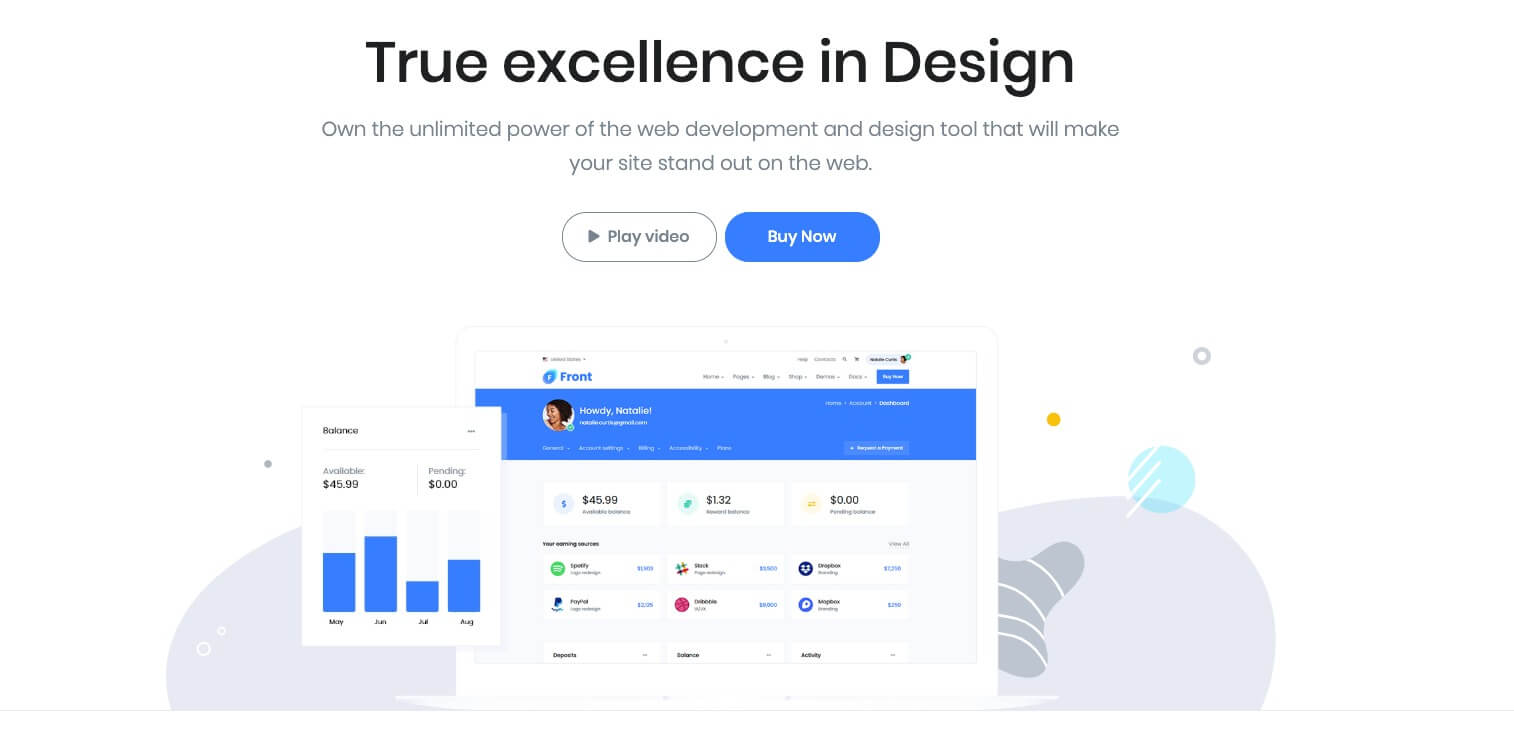
Output
2. Info Grid #5
Block Settings
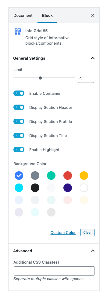
General Settings
Limit: Drag the slider to set the total number of blocks to be displayed. set 4 as the default limit.
Enable Container: Enable or Disable container class.
Display Header: Enable to show header options.
Display PreTitle: Enable to show block Title.Default is Enable.
Display Title: Enable to show block Title.Default is Enable.
Enable Highlight: Enable to highlight a particular block with the background color.Default is Enable.
Background Color: Choose background color for highlighting a block.Default color is Primary.
Additional CSS Class
Add extra class name for the block.
Output

3. Call To Action
Block Settings
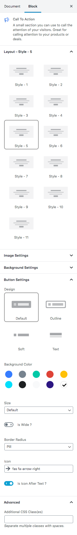
Layout
Select style version for Call To Action. select Style 5 as default.
Overlay Settings
- Overlay color: Select the overlay color.
- Overlay Image: Upload overlay image.
Icon Settings
Svg icon: Select the icon from the dropdown menu.
Button Settings
Buttons allow you to take actions, and make choices, with a single tap.
- Button Design: There are 4 button designs available. Choose Default button design as default.
- Button Background: Choose the background color for your button. Choose warning as default button color.
- Button Size: Extra Small, Small, Default and Large button size are available. The default size for this block is Default
- Button Border Radius: Rounded, Default, Pill and Circle are the available border radius. The default border radius is Default
- Button Icon: You can choose the icons for the button block.The default icon is fa-angle-right .
- Is Icon After text: Enable or disable the icon to position before the button text. set Enable option as default.
Additional CSS Class
Enter the extra class name for the block
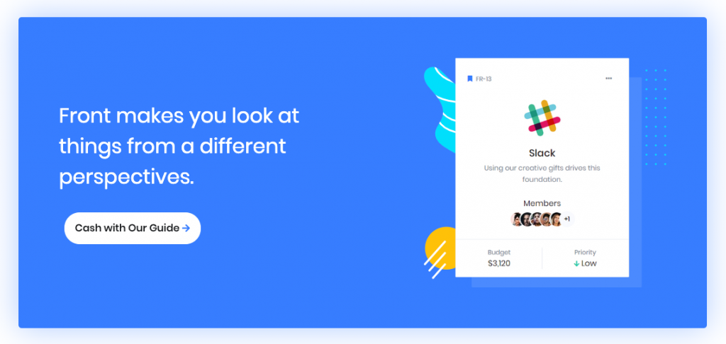
Output
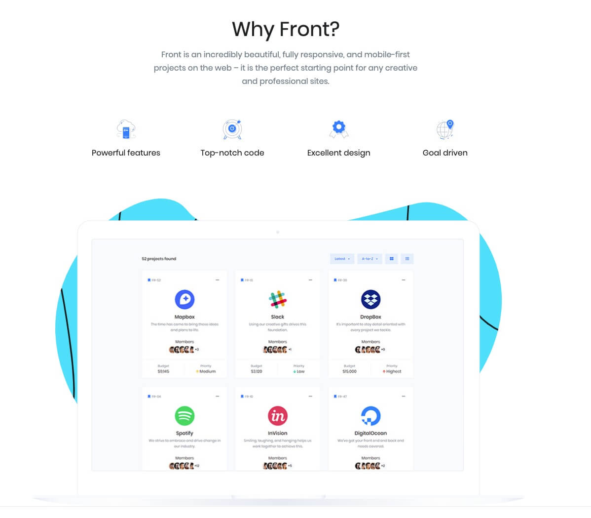
4. Hero Block
Block Settings

Layout
In Hero Block, there are totally 18 layout styles are available. Select the layout for Hero Block. set Style v16 as default.
General Settings
- Enable Parallex Effect: On or Off parallex effect. Default: On
- Enable Container: On or Off container option. Default: On
- Enable Subtitle: On or Off subtitle. Default: On
- Enable Icon Block Section: On or Off icon block. Default: On
- Display Bottom Image: On or Off bottom image. Default: On
- Display Icon Block Text: On or Off icon block text. Default: On
- Enable Separator: On or Off separator. Default: Off
- No of icons: Drag the slider to set the number of icons to be displayed. Default: 4
Color Settings
Use color picker to change the block pretitle, title and subtitle color.
Background Settings
Backgrounds have a significant impact on the design of a website. They help create a site’s look and feel. There are three types of settings are available: Single, Gradient and Image.
- Single: Solid background color
- Gradient: Gradient ( Combination of two or more colors ) background color
- Image: Upload image as background
In every style layout, different background types are used.
Upload Image
Import image from your Media Library or import a new one.
Additional CSS Class
Enter the additional class name
Output
5. Pricing Interactive #2 , Icon Bock – Left and Testimonial Static Block
Pricing Interacive #2 Block Settings
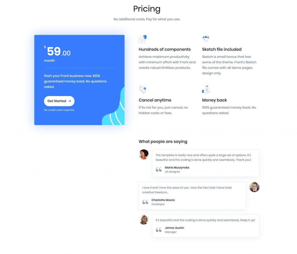
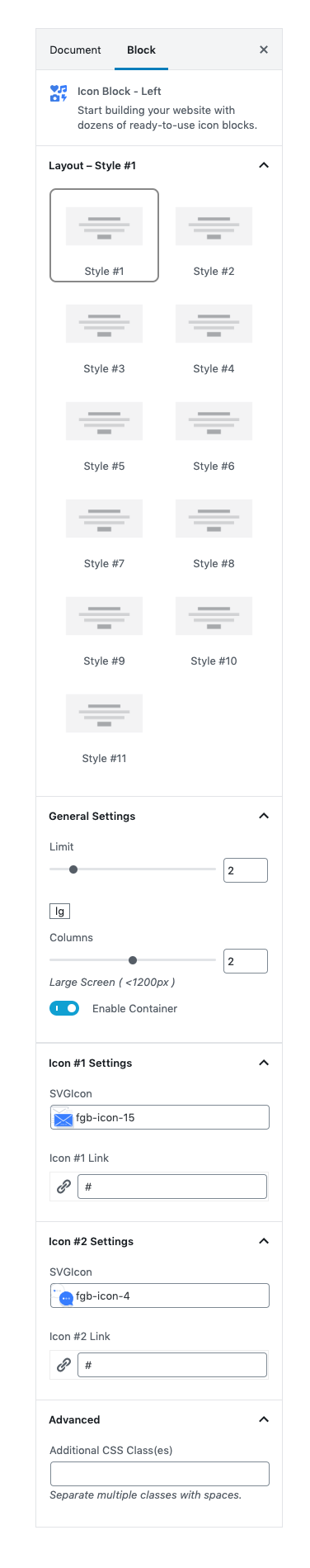
Icon Block – Left Settings
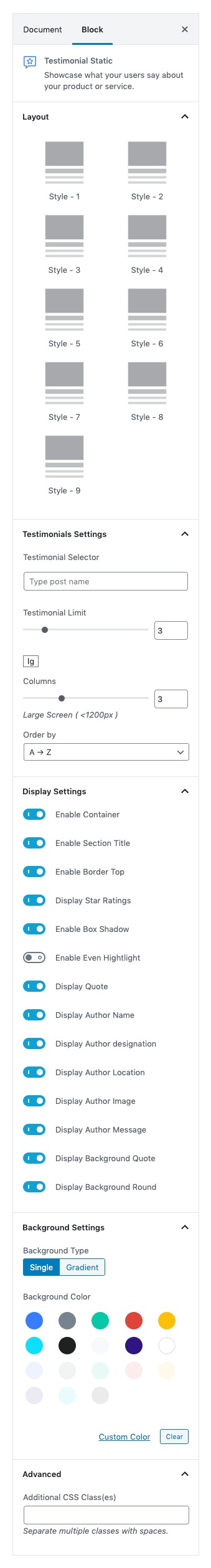
Testimonial Static Settings
There are 3 different blocks are combined in this portion, Pricing Interactive #2 which is located in left side, Icon Block – Left and Testimonial Static block are located in right side. Both Icon block – Left and Testimonial Static are inner blocks, you can remove it or add a new block beside Pricing Interactive # 2 block.
Click here to know more details about Pricing Interactive #2, Icon Block – Left and Testimonial Static.
Output
