App Payment of Front is built using Gutenberg Blocks.It has 7 blocks.
Overview
The Details
1. Hero Actions
Hero Actions settings

Layout
In Hero Actions, there are 4 layout styles are available. Default: Style 2
General Settings
- Enable Container: Enable or disable container option. Default: Enable
- Display Title: Enable or disable block title. Default: Enable
- Display Description: Enable or disable block description. Default: Enable
- Display Buttons: Enable or disable button. Default: Enable
- Display Laptop Image: Enable or disable laptop image. Default: Enable
- Display SVG Background Shape: Enable or disable SVG background shape. Default: Enable
- Display SVG Background Circle: Enable or disable SVG background circle. Default: Enable
- Display Card Info: Enable or disable card information. Default: Enable
- Display Card Title: Enable or disable card title. Default: Enable
- Display Card Description: Enable or disable card description. Default: Enable
- Display Card User Image: Enable or disable card user image. Default: Enable
- Display Card User Name: Enable or disable card user name. Default: Enable
- Display Card User Designation: Enable or disable card user name. Default: Enable
- Number of Buttons: Drag the slider to set number of action buttons to displayed. Default: 2
Color Settings
Use color picker to change block title, subtitle and description color.
Background Settings
Backgrounds have a significant impact on the design of a website. They help create a site’s look and feel. There are three types of settings are available: Single and Gradient.
- Single: Solid background color
- Gradient: Gradient ( Combination of two or more colors ) background color
In every style layout, different background types are used.
Upload Image
Upload image from your Media Library or import a new one
Button settings
Buttons allow you to take actions, and make choices, with a single tap.
- Button Design: There are 4 button designs are available. In default, Default button design is chosen.
- Button Background: Choose the background color for your button. White background color is chosen as default.
- Button Size: Extra Small, Small, Default and Large button size are available. The default size value for this block is Small
- Button Border Radius: Rounded, Default, Pill and Circle are the available border radius. The default border radius is Pill
- Button Icon: You can choose the icons for the button block. In default no icons are used for Deals Product button.
- Is Icon After text: Enable or disable the icon to position before the button text. set Disable option as default.
- Is Icon Button?: Enable or disable only icon ( without text ) as button. set Disable option as default.
- Enable Transition: Enable or disable transition effect for button. set Enable option as default.
Card Background Settings
Backgrounds have a significant impact on the design of a website. They help create a site’s look and feel. There are two types of settings are available: Single and Gradient.
Additional CSS Class
Enter the additional class name
Hero Actions Output

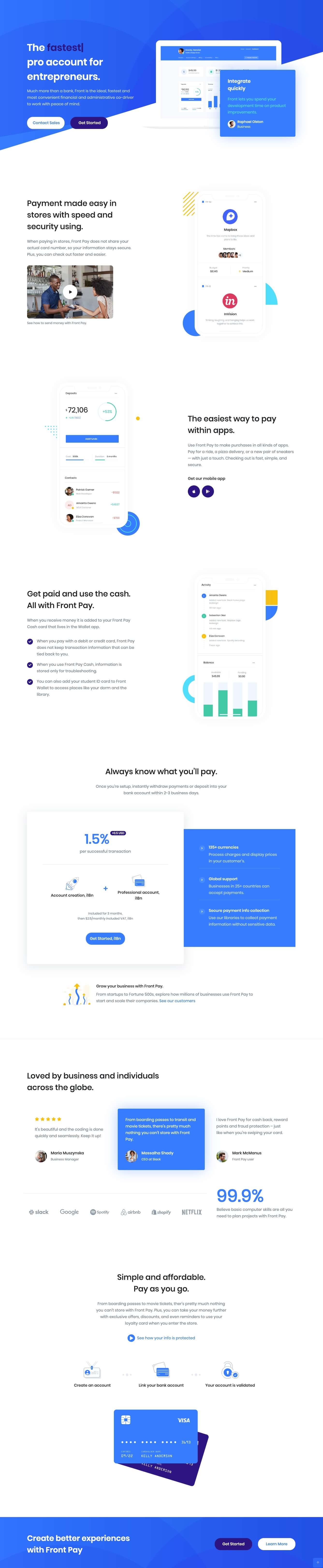
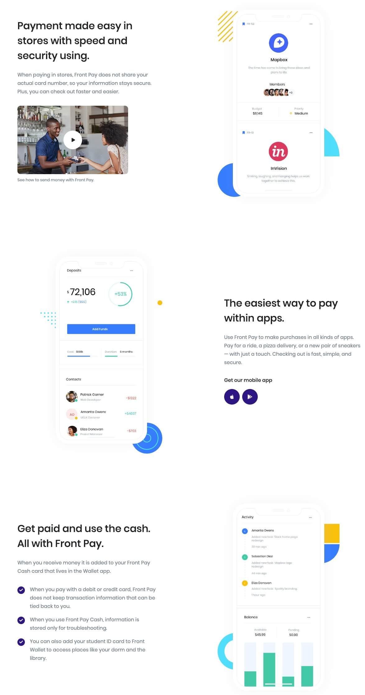
2. Info Section 17
Block Settings

Limit :
You can select limit by using rangecontrol.
Enable Container :
You can Enable or disable container.
Mobile Image Alignment :
You can align Left or right by using rangecontrol.
Color Settings :
You can select color or custom color of title, description, video title, icon background, Icon title in the color palette.
Display Mobile Image:
You can enable or disable mobile image by using toggle control.
Display Title :
You can enable or disable title by using toggle control.
Display Description :
You can enable or disable description by using toggle control.
Display Video :
You can enable or disable video by using toggle control.
Display Video Title:
You can enable or disable video title by using toggle control.
Video Image :
Upload your video image.
Mobile Image :
Upload your mobile image.
Icon Limit :
You can select icons by using rangecontrol.
Icon :
Enter your icon by using icon-class.
Icon Link :
Enter Your icon link.
Display Icon :
You can enable or disable icon by using toggle control.
Display Button Title :
You can enable or disable button title by using toggle control.
Advanced Css class :
Enter additional class name.
Ouput
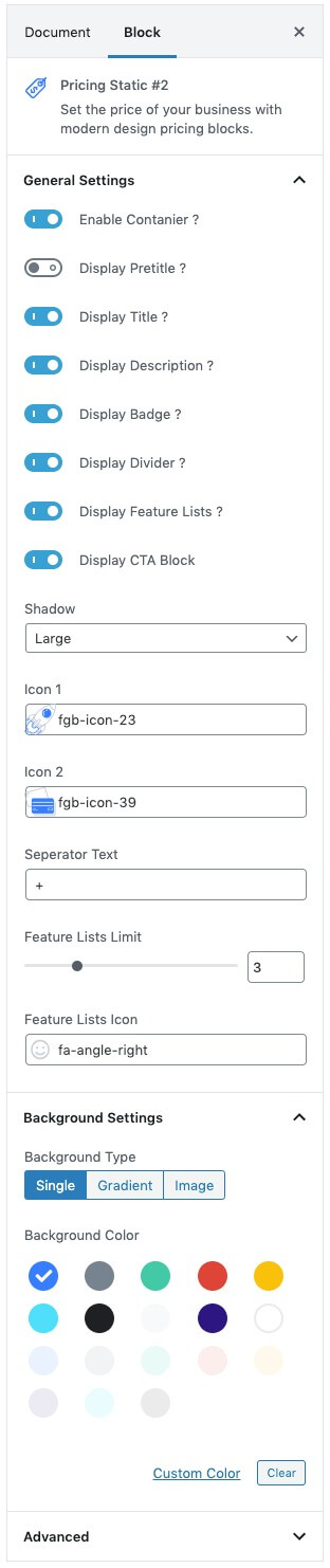
3. Pricing Static 2
Block Settings
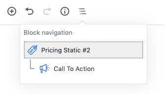
Block navigateion
Call To Action settings
Click here to know more details about Pricing Static 2 and Call To Action
Pricing Static 2 Output

4. Testimonial Static
Block Settings
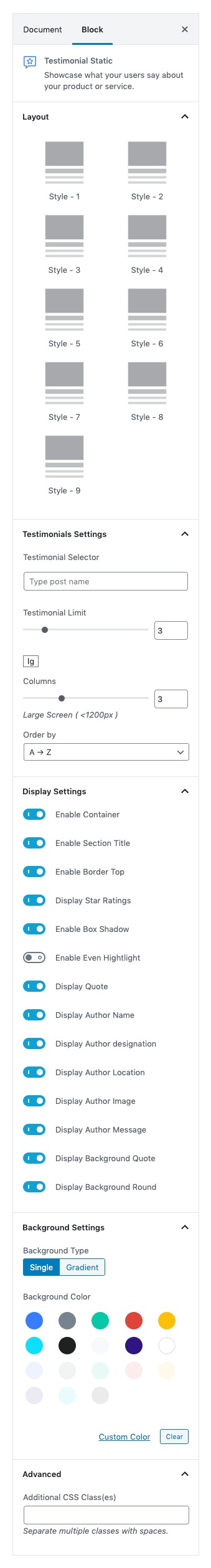
Layout
- In layout panel you can choose block style. Default: Style – 1
Testimonials Settings
- Testimonial Selector: Search and select the testimonial that you want to show.
- Testimonial Limit: Select number of testimonials you want to show.
- Columns: Drag the slider to set the number of columns.
- Order by: Order the testimonial by Newest to Oldest, Oldest to Newest, A → Z and Z → A.
Display Settings
- Enable Container: Enable or disable container.
- Enable Section Title: Enable or disable section title.
- Enable Border Top: Enable or disable border top.
- Display Star Ratings: Enable or disable star ratings.
- Display Even Highlight: Enable or disable even highlight.
- Display Quote: Enable or disable quote.
- Enable Box Shadow: Enable or disable star ratings.
- Display Author Name: Enable or disable the author name.
- Display Author Designation: Enable or disable the author designation.
- Display Author Location: Enable or disable author location.
- Display Author Image: Enable or disable the author image.
- Display Author Message: Enable or disable the author message.
- Display Background Quote: Enable or disable background quote.
- Display Background Round: Enable or disable background round.
Background Settings
- Background Type: Choose single or gradient background type.
- Background Color: Choose the background color.
Advanced Panel
- Additional CSS class: Enter additional class.
Ouput

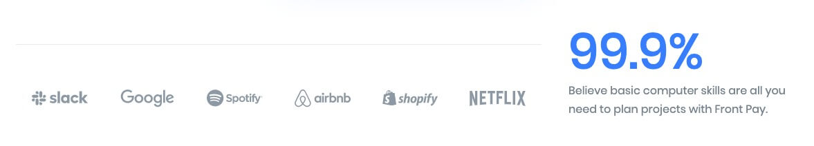
5. Clients
Block Settings
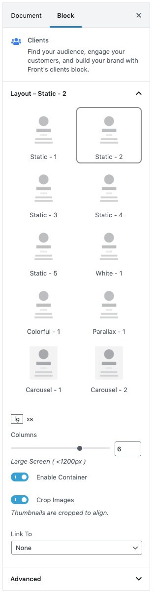
Layout
Static, White, Colorful, Parallex and Carousel style layouts are available. Default: Static -2
Columns
Drag the slider to set the number of columns, for above the screen 1200px
Enable Container
Enable or disable container. Default: Enable
Crop Images
Enable or disable thumbnails are cropped to align. Default: Enable
Link To
Link image to attachment page, media file or nothing. Default: None
Additional CSS Class(es)
Enter the additional class name needed for the block
Ouput
6. Info section 8
Block Settings
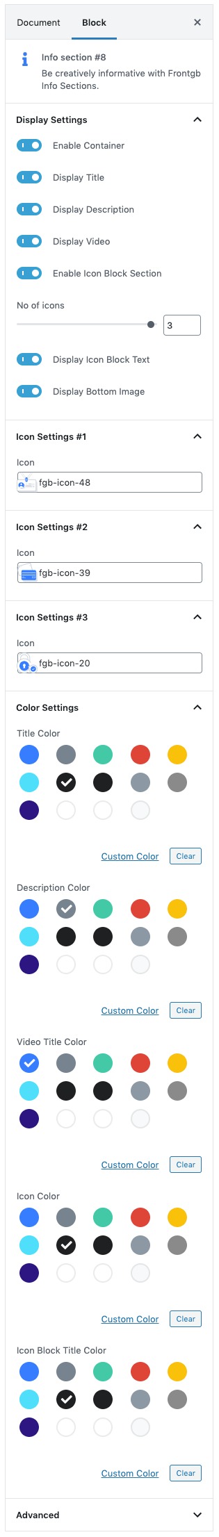
Display Settings
- Enable Container: Enable or disable container. Default: Enable
- Display Title: Enable or disable title. Default: Enable
- Display Description: Enable or disable description. Default: Enable
- Display Video: Enable or disable video. Default: Enable
- Enable Icon Block Section: Enable or disable icon block section. Default: Enable
- Display Icon Block Text: Enable or disable icon block text. Default: Enable
- Display Bottom Image: Enable or disable bottom image. Default: Enable
- No of icons: Drag the slider to set the number of icons to be displayed. Default: 3
Icon Settings
Choose the icon from the dropdown to display in the icon block section.
Color Settings
Use color picker to change block title, subtitle and description color.
Additional CSS Class
Enter the additional class name
Output

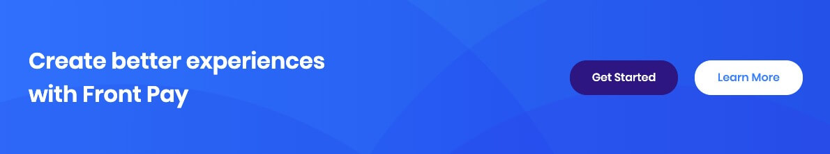
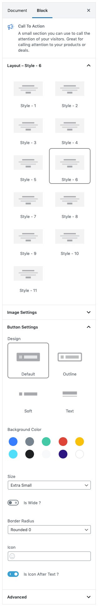
7. Call To Action
Block Settings
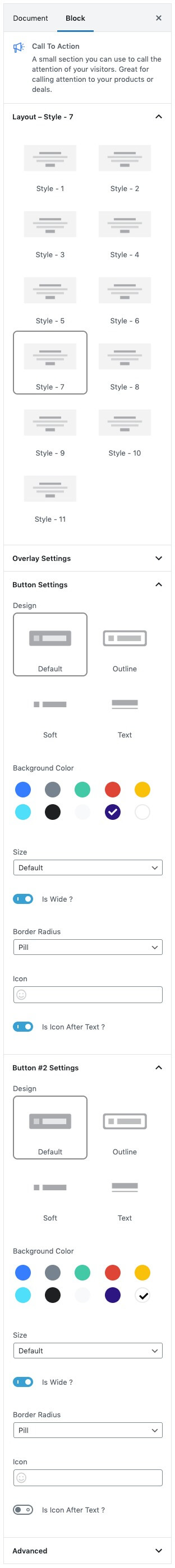
Layout
Select style version for Call To Action. select Style – 7 as default.
Overlay Settings
- Overlay color: Select the overlay color.
- Overlay Image: Upload overlay image.
Icon Settings
Svg icon: Select the icon from the dropdown menu.
Button Settings
Buttons allow you to take actions, and make choices, with a single tap.
- Button Design: There are 4 button designs available. Choose Default button design as default.
- Button Background: Choose the background color for your button. Choose warning as default button color.
- Button Size: Extra Small, Small, Default and Large button size are available. The default size for this block is Default
- Button Border Radius: Rounded, Default, Pill and Circle are the available border radius. The default border radius is Default
- Button Icon: You can choose the icons for the button block.The default icon is fa-angle-right .
- Is Icon After text: Enable or disable the icon to position before the button text. set Enable option as default.
Additional CSS Class
Enter the extra class name for the block
Output