Docs Home of Front is build using Gutenberg blocks. It has 4 blocks.
Overview

The Details
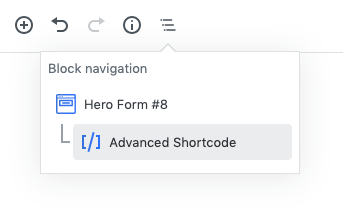
1.Hero Form #8
Block Navigation :
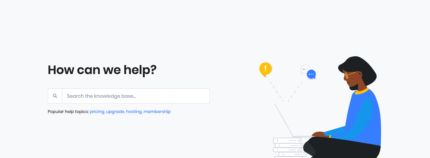
Paste your form html into advanced shortcode block.
Example:
<form role="search" method="get" action="https://example.com/" class="js-focus-state input-group mb-3">
    <div class="input-group-prepend">
        <span class="input-group-text" id="askQuestions">
            <span class="fas fa-search"></span>
        </span>
    </div>
    <input type="hidden" name="post_type" value="docs">
    <input type="search" class="form-control" placeholder="Search the knowledge base..." aria-label="Search the knowledge base..." name="s" aria-describedby="askQuestions">
</form>
Block Settings :
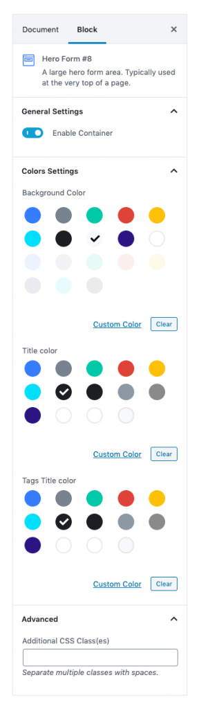
Enable Container :
You can enable or disable container.
Color Settings :
You can select color or custom color of background, title and description in the color palette.
Advanced Css class :
Enter additional class name.
Output :
2. Docs
Block Settings
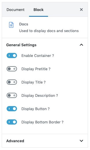
General Settings
- Enable Container ?: Enable or disable container. Default: Enable
- Display Pretitle ?: Enable or disable pretitle. Default: Disable
- Display Title ?: Enable or disable title. Default: Disable
- Display Description ?: Enable or disable description. Default: Disable
- Display Button ?: Enable or disable button. Default: Enable
- Display Bottom Border ?: Enable or disable bottom border. Default: Enable
Advanced panel
Additional CSS Class(es): Enter additional class.
Output

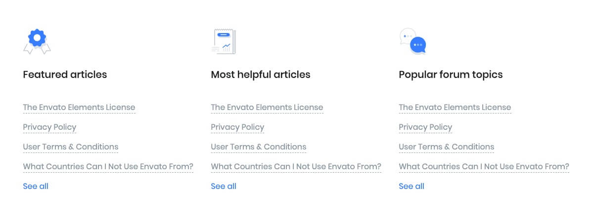
3. Docs List
Block Settings

Choose the icon from the dropdown list to displayed in Docs List Content. Title and list of content are editable.
Ouput
4. Call To Action
Block Settings
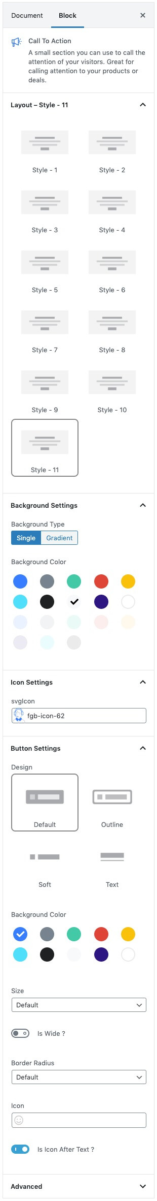
Layout
Select style version for Call To Action. select Style-11 as default.
Background Settings
Backgrounds have a significant impact on the design of a website. They help create a site’s look and feel. There are two types of settings are available: Single and Gradient.
- Single: Solid background color
- Gradient: Gradient ( Combination of two or more colors ) background color
In default, Single type is used in this block.
Icon Settings
Svg icon: Select the icon from the dropdown menu.
Button settings
Buttons allow you to take actions, and make choices, with a single tap.
- Button Design: There are 4 button designs available. Choose Default button design as default.
- Button Background: Choose the background color for your button. Choose warning as default button color.
- Button Size: Extra Small, Small, Default and Large button size are available. The default size for this block is Default
- Button Border Radius: Rounded, Default, Pill and Circle are the available border radius. The default border radius is Default
- Button Icon: You can choose the icons for the button block.The default icon is fa-angle-right .
- Is Icon After text: Enable or disable the icon to position before the button text. set Enable option as default.
Additional CSS Class
Enter the extra class name for the block
Output
