Customers of Front is built using Gutenberg.It has 4 blocks.

1. Hero Block
Block Settings

Layout
In Hero Block, there are totally 19 layout styles are available. You can choose the style 19.
General Settings
- Enable Parallex Effect: On or Off parallex effect. Default: On
- Enable Container: On or Off container option. Default: On
- Enable Subtitle: On or Off subtitle. Default: On
- Enable Separator: On or Off separator. Default: Off
Color Settings
Use color picker to change the block pretitle, title and subtitle color.
Background Settings
Backgrounds have a significant impact on the design of a website. They help create a site’s look and feel. There are three types of settings are available: Single, Gradient and Image.
- Single: Solid background color
- Gradient: Gradient ( Combination of two or more colors ) background color
- Image: Upload image as background
Layout Settings
You can select the SVG as separator.
Additional CSS Class
Enter the additional class name
Block Output

2. Clients Block
Block Settings
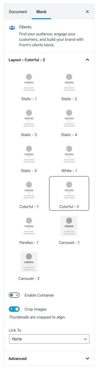
Layout
In Clients Block, there are totally 11 layout styles are available. You can choose the style Colorful – 2.
Enable Container: On or Off container option. Default: Of
Crop images: On or Off Crop images option. Default: On
Link To: You can link to media file or attachment page.
Additional CSS Class
Enter the additional class name
Block Output

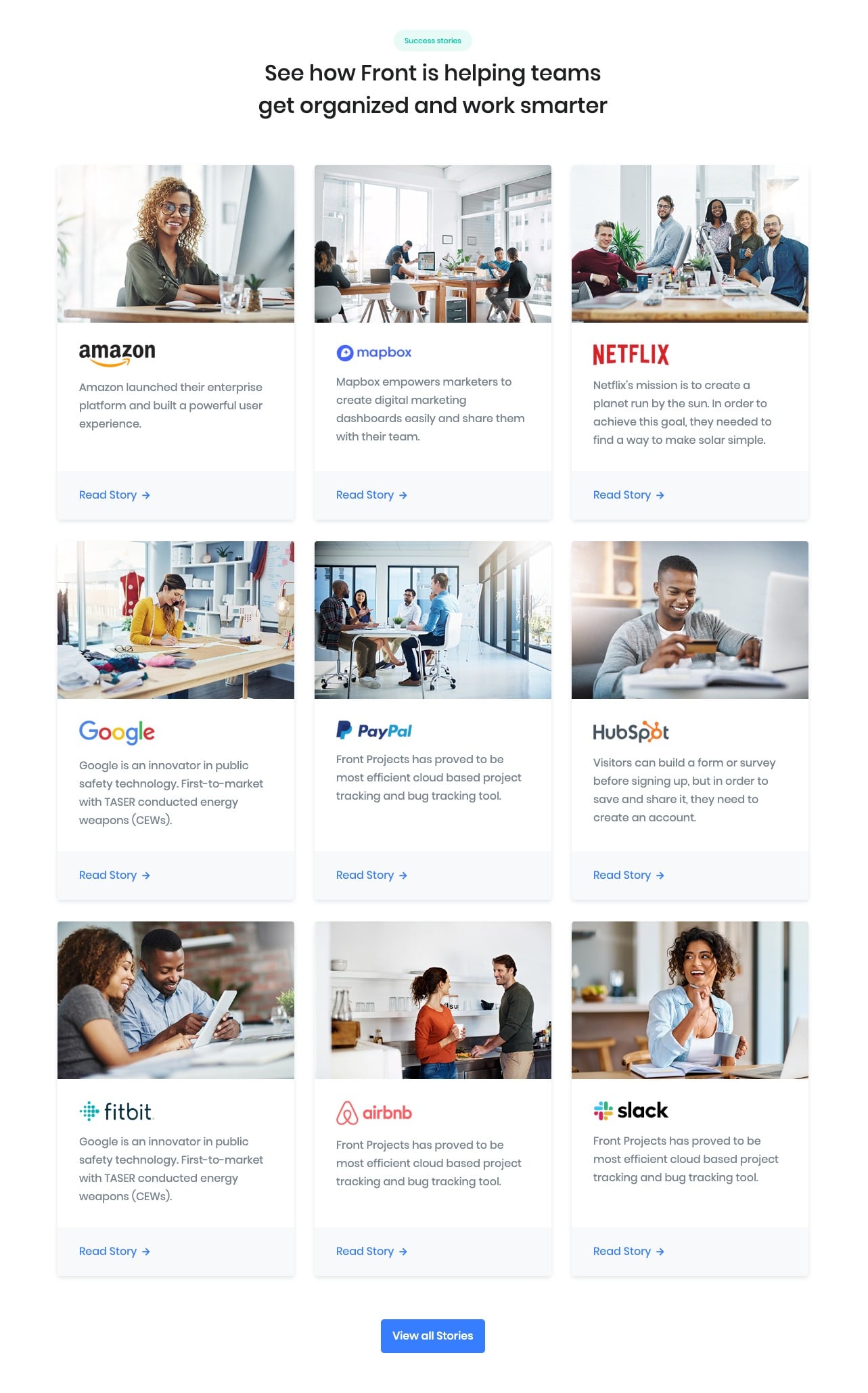
3. Customer Stories
Block Settings
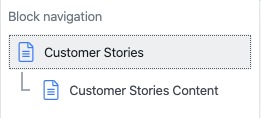
Customer Stories block contains a inner block of Customer Stories Content.
Customer Stories Block Settings
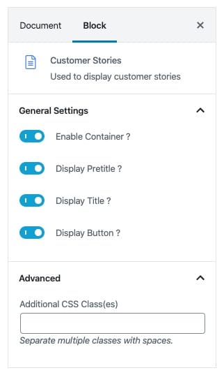
General Settings
- Enable Container: On or Off container option. Default: On
- Display Pretitle: On or Off pretitle option. Default: On
- Display Title: On or Off title option. Default: On
- Display Button: On or Off button option. Default: On
Additional CSS Class
Enter the additional class name
Customer Stories Content Block Settings
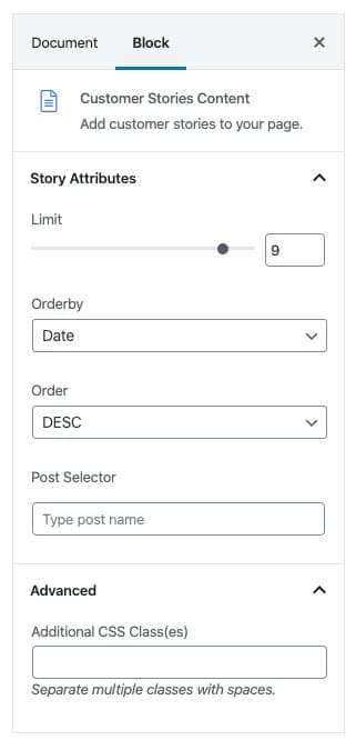
Story Attributes Settings
- Limit: set the post limit.
- Orderby: select the orderby option.
- Order: select the order option.
- Post Selector: search and select the post you want show.
Additional CSS Class
Enter the additional class name
Block Output
4. Call to Action Block
Block Settings
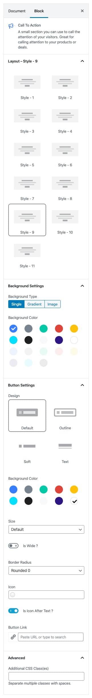
Layout
Call To Action has 11 styles. select Style 9 .
Background Settings
Backgrounds have a significant impact on the design of a website. They help create a site’s look and feel. There are three types of settings are available: Single, Gradient and Image.
- Single: Solid background color
- Gradient: Gradient ( Combination of two or more colors ) background color
- Image: Upload image as background
Button settings
Buttons allow you to take actions, and make choices, with a single tap.
- Button Design: There are 4 button designs available. Choose Default button design as default.
- Button Background: Choose the background color for your button. Choose warning as default button color.
- Button Size: Extra Small, Small, Default and Large button size are available. The default size for this block is Default
- Button Border Radius: Rounded, Default, Pill and Circle are the available border radius. The default border radius is Default
- Id Wide: Enable or Disable is wide option.
- Button Icon: You can choose the icons for the button block.The default icon is fa-angle-right .
- Is Icon After text: Enable or disable the icon to position before the button text. set Enable option as default.
- Button Link: Insert button link. .
Additional CSS Class
Enter the extra class name for the block
Block Output