Home page of Front Jobs is built using Gutenberg. It has 8 Main blocks and some additional / inner blocks.
Page Blocks Navigation
Output
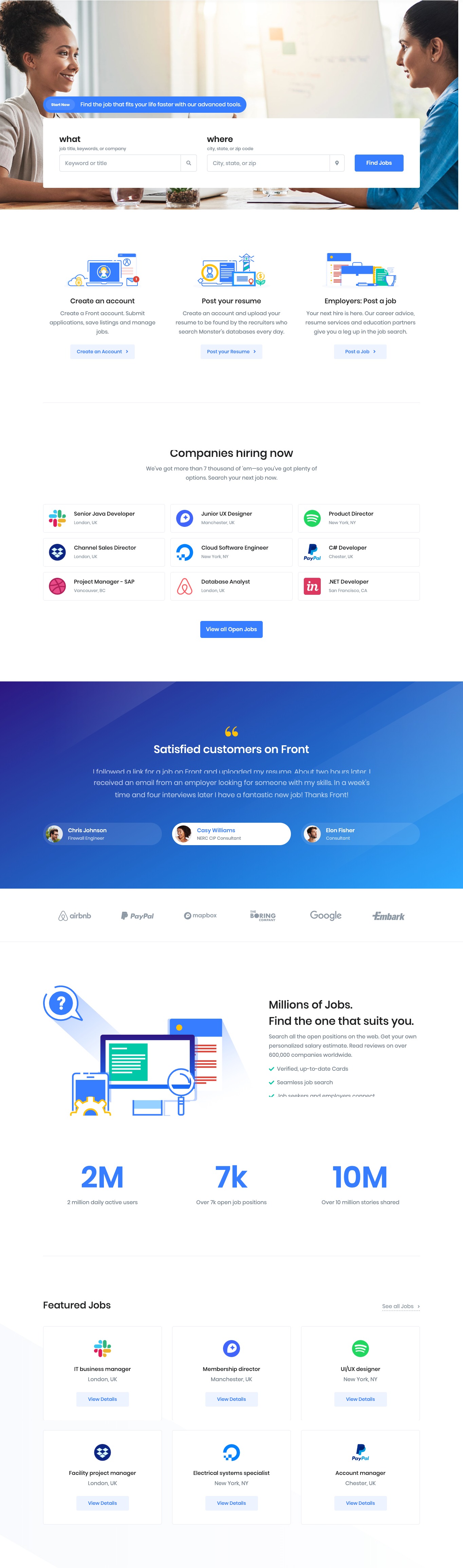
The Details
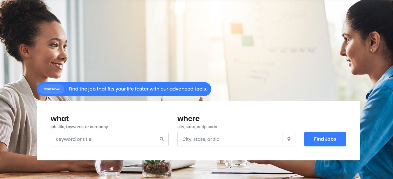
Jobs Hero Search
Block Navigation

Jobs Hero Search Settings
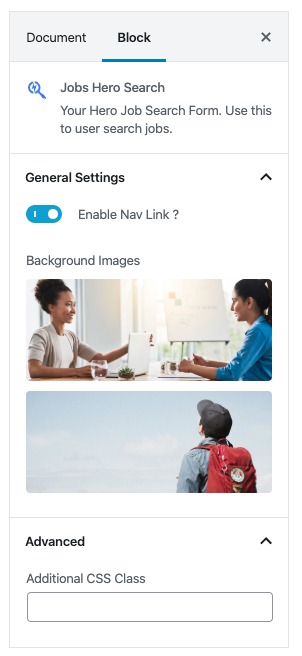
You can edit or change nav text and nav link in page editor.
| Field | Type | Description | Default |
|---|---|---|---|
| Enable Nav Link? | Toggle | You can enable or disable navlink | Enable |
| Background Images? | Media | You can upload and select multiple images for background. | – |
| Additional CSS Class | Text | Enter additional class name. | None |
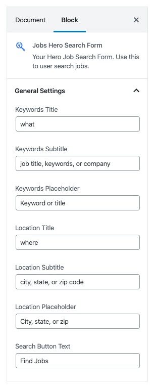
Jobs Hero Search Form Settings
| Field | Type | Description | Default |
|---|---|---|---|
| Keywords Title | Text | Enter text for keywords label. | what |
| Keywords Subtitle | Text | Enter text for keywords sub label. | job title, keywords, or company |
| Keywords Placeholder | Text | Enter text for keywords Placeholder. | Keyword or title |
| Location Title | Text | Enter text for Location label. | where |
| Location Subtitle | Text | Enter text for Location sub label. | city, state, or zip code |
| Location Placeholder | Text | Enter text for Location Placeholder. | City, state, or zip |
| Search Button Text | Text | Enter text for Submit button. | Find Jobs |
| Additional CSS Class | Text | Enter additional class name. | None |
Output
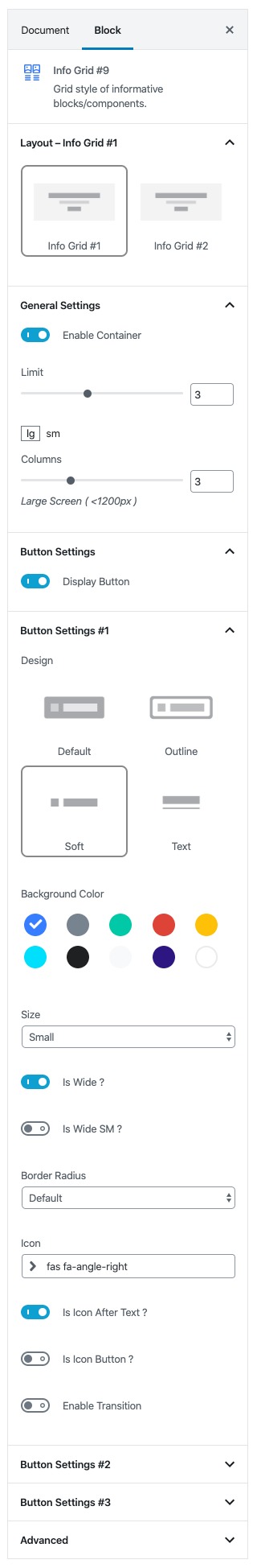
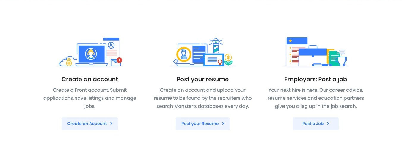
Info Grid #9
Settings
You can edit or change info image, title, description, button text and button link of each info grid elements in page editor.
| Field | Type | Description | Default |
|---|---|---|---|
| Layout | Select Control | You can select layout style version. | Style 1 |
| Enable Container | Toggle | You can enable or disable block container. | Enable |
| Columns | Range Control | You can choose width of column | lg = 3, sm = 2 |
| Display Button | Toggle | You can enable or disable buttons | Enable |
| Design | Select Control | You can select design for buttons. | Soft |
| Background color | Select Control | You can select background color by color palette. | Primary |
| Size | Select Control | You can select size for buttons. | Small |
| Is wide? | Toggle | You can enable for button is wide. | Enable |
| Is wide sm? | Toggle | You can enable for button is wide sm. | Disable |
| Border Radius | Select Control | You can select button border radius. | Default |
| Icon | Text | Enter your icon. | fa-angle-right |
| Is Icon After Text? | Toggle | You can enable or disable icon after text. | Enable |
| Is Icon Button? | Toggle | You can enable or disable icon is button. | Disable |
| Is Transition? | Toggle | You can enable or disable button transition. | Disable |
| Additional CSS Class | Text | Enter additional class name. | None |
Output
Section With Divider
These blocks used to add separator line with the size of container width in between two blocks.
Block Navigation
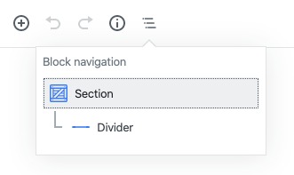
Section Settings
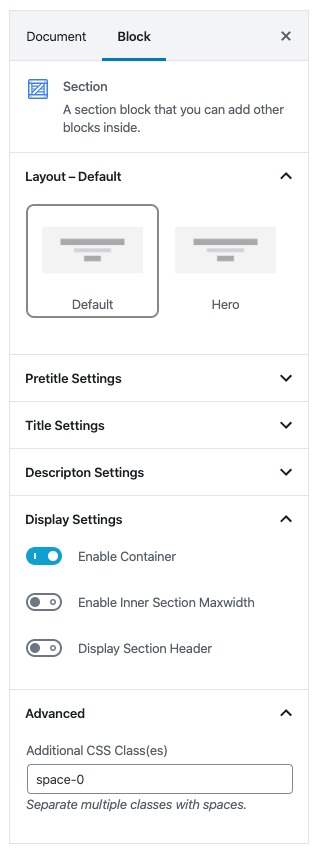
You have to add “space-0” on Addition CSS Class(es)
Divider Settings
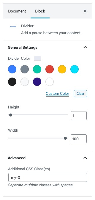
You have to set value of as “100“, choose the value “#e7eaf3” in Diver Color (Custom Color) and add “my-0” on Addition CSS Class(es)
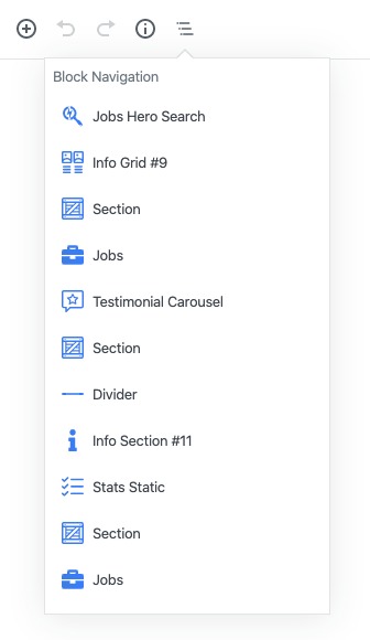
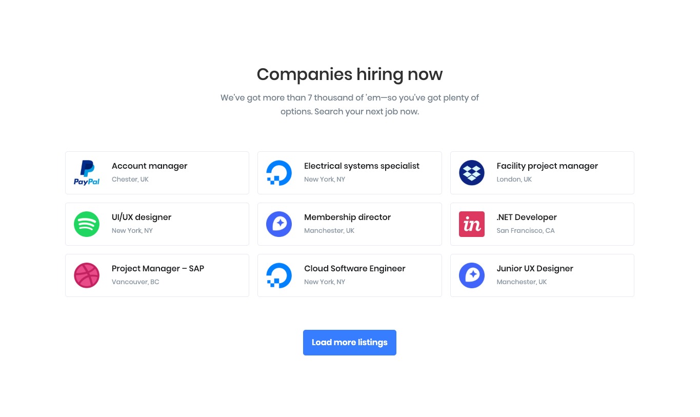
Jobs
Block Navigation
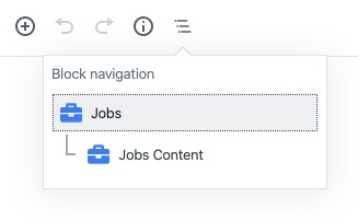
Jobs Settings
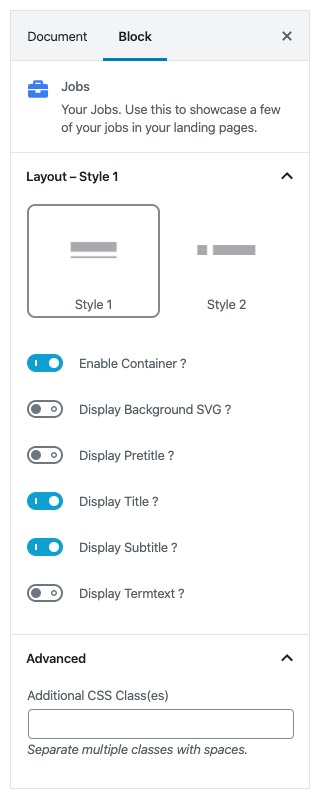
| Field | Type | Description | Default |
|---|---|---|---|
| Layout | Select Control | You can select layout style version. | Style 1 |
| Enable Container | Toggle | You can enable or disable block container. | Enable |
| Display Background SVG ? | Toggle | You can enable or disable background SVG. | Disable |
| Display Pretitle ? | Toggle | You can enable or disable block pretitle. | Disable |
| Display Title ? | Toggle | You can enable or disable block title. | Enable |
| Display Subtitle ? | Toggle | You can enable or disable block subtitle. | Enable |
| Display Termtext ? | Toggle | You can enable or disable termtext. | Disable |
| Additional CSS Class | Text | Enter additional class name. | None |
Jobs Content Settings
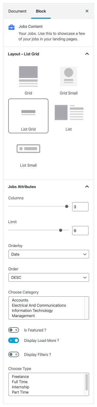
| Field | Type | Description | Default |
|---|---|---|---|
| Layout | Select Control | You can select layout style version. | List Grid |
| Columns | Range Control | You can choose width of columns. | 3 |
| Limit | Range Control | You can select limits to display. | 9 |
| Orderby | Select Control | Choose the order of your jobs, either by Title, Date, Id.. | Date |
| Order | Select Control | Choose the order of your jobs to be displayed either in Ascending or Descending Order. | DESC |
| Choose Category | Multi-Select | Choose the category(ies) to display. | None |
| Is Featured ? | Toggle | You can enable or disable feature. | Disable |
| Display Load More ? | Toggle | You can enable or disable load more option. | Enable |
| Display Filters ? | Toggle | You can enable or disable filter option. | Disable |
| Choose Type | Multi-Select | Choose the type(s) of jobs to display. | None |
Output
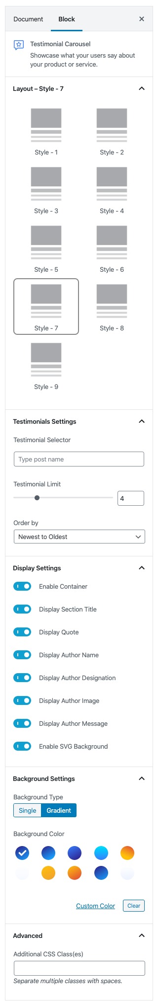
Testimonial Carousel
Settings
| Field | Type | Description | Default |
|---|---|---|---|
| Layout | Select Control | You can select layout style version. | Style – 7 |
| Testimonial Selector | Post Selector | You can search and choose decided testimonial(s) to display | None |
| Testimonial Limit | Range Control | You can select limits to display. | 4 |
| Order by | Select Control | Choose the order of testimonials | Newest to Oldest |
| Enable Container | Toggle | You can enable or disable block container. | Enable |
| Display Section Title | Toggle | You can enable or disable title. | Enable |
| Display Quote | Toggle | You can enable or disable Quote symbol. | Enable |
| Display Author Name | Toggle | You can enable or disable testimonial author name. | Enable |
| Display Author Designation | Toggle | You can enable or disable testimonial author designation. | Enable |
| Display Author Image | Toggle | You can enable or disable testimonial author image. | Enable |
| Display Author Message | Toggle | You can enable or disable testimonial message. | Enable |
| Enable SVG Background | Toggle | You can enable or disable background SVG. | Enable |
| Background Type | Select Control | Choose the type of the background | Gradient |
| Background Color | Select Control | Choose the type of the background color | Gradient Half Primary v1 |
| Additional CSS Class | Text | Enter additional class name. | None |
Output

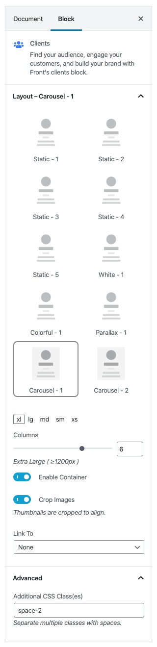
Clients
Settings
| Field | Type | Description | Default |
|---|---|---|---|
| Layout | Select Control | You can select layout style version. | Carousel – 1 |
| Columns | Range Control | You can choose width of column | xl = 6, lg = 6, md = 4, sm = 3 xs = 3 |
| Enable Container | Toggle | You can enable or disable block container. | Enable |
| Crop Image | Toggle | You can enable or disable clients image crop. | Enable |
| Link To | Select Control | You can choose the method of image on click. | None |
| Additional CSS Class | Text | Enter additional class name. | space-2 |
Output

Divider
This block used to add separator line in between two blocks.
You have to set value of as “100“, choose the value “#e7eaf3” in Diver Color (Custom Color) and add “my-0” on Addition CSS Class(es)
Info Section #11
Settings
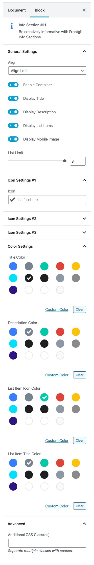
| Field | Type | Description | Default |
|---|---|---|---|
| Align | Select Control | You can select Image position of the blocks. | Align Left |
| Enable Container | Toggle | You can enable or disable block container. | Enable |
| Display Title | Toggle | You can enable or disable block title. | Enable |
| Display Description | Toggle | You can enable or disable block description. | Enable |
| Display List Items | Toggle | You can enable or disable list items of the block | Enable |
| Display Mobile Image | Toggle | You can enable or disable block image. | Enable |
| Limit | Range Control | You can choose limit of list items to display | 3 |
| Icon Settings | Icon Control | Enter your icon class or select available icon. | fas fa-check |
| Title Color | Color Palette | You can select any color for the title from color palette. | Dark |
| Description color | Color Palette | You can select any color for the description from color palette. | Secondary |
| List Item Icon Color | Color Palette | You can select any color for the list item icon from color palette. | Success |
| List Item Title Color | Color Palette | You can select any color for the list item text from color palette. | Secondary |
| Additional CSS Class | Text | Enter additional class name. | None |
Output

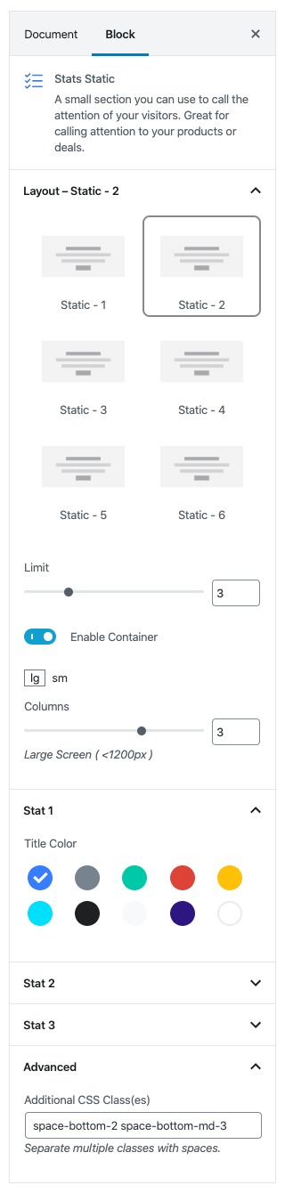
Stats Statics
Settings
| Field | Type | Description | Default |
|---|---|---|---|
| Layout | Select Control | You can select layout style version. | Static – 2 |
| Limit | Range Control | You can choose limit of stats to display | 3 |
| Enable Container | Toggle | You can enable or disable block container. | Enable |
| Columns | Range Contro | You can choose width of each column | lg = 3, sm = 2 |
| Title Color | Color Palette | You can select any color for the title from color palette. | Primary |
| Additional CSS Class | Text | Enter additional class name. | space-bottom-2 space-bottom-md-3 |
Output

Section With Divider
These blocks used to add separator line with the size of container width in between two blocks.
Block Navigation
Section Settings
You have to add “space-0” on Addition CSS Class(es)
Divider Settings
You have to set value of as “100“, choose the value “#e7eaf3” in Diver Color (Custom Color) and add “my-0” on Addition CSS Class(es)
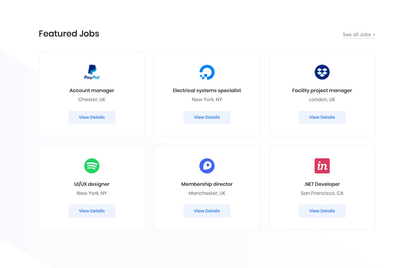
Jobs
Block Navigation
Jobs Settings

| Field | Type | Description | Default |
|---|---|---|---|
| Layout | Select Control | You can select layout style version. | Style 2 |
| Enable Container | Toggle | You can enable or disable block container. | Enable |
| Display Background SVG ? | Toggle | You can enable or disable background SVG. | Enable |
| Overflow Background SVG ? | Toggle | You can enable or disable overflow background SVG. | Disable |
| Display Title ? | Toggle | You can enable or disable block title. | Enable |
| Display Navlink ? | Toggle | You can enable or disable block nav link. | Enable |
| Additional CSS Class | Text | Enter additional class name. | None |
Jobs Content Settings
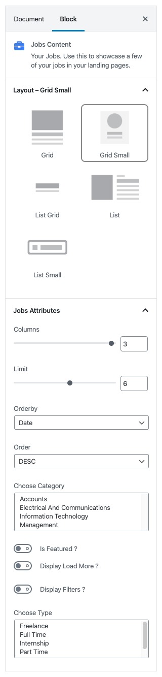
| Field | Type | Description | Default |
|---|---|---|---|
| Layout | Select Control | You can select layout style version. | Grid Small |
| Columns | Range Control | You can choose width of columns. | 3 |
| Limit | Range Control | You can select limits to display. | 6 |
| Orderby | Select Control | Choose the order of your jobs, either by Title, Date, Id.. | Date |
| Order | Select Control | Choose the order of your jobs to be displayed either in Ascending or Descending Order. | DESC |
| Choose Category | Multi-Select | Choose the category(ies) to display. | None |
| Is Featured ? | Toggle | You can enable or disable feature. | Disable |
| Display Load More ? | Toggle | You can enable or disable load more option. | Disable |
| Display Filters ? | Toggle | You can enable or disable filter option. | Disable |
| Choose Type | Multi-Select | Choose the type(s) of jobs to display. | None |
Output