Onepage Creative of Front is built using Gutenberg Blocks.It has 7 blocks.
Overview
1. Hero Form #7
Block Settings
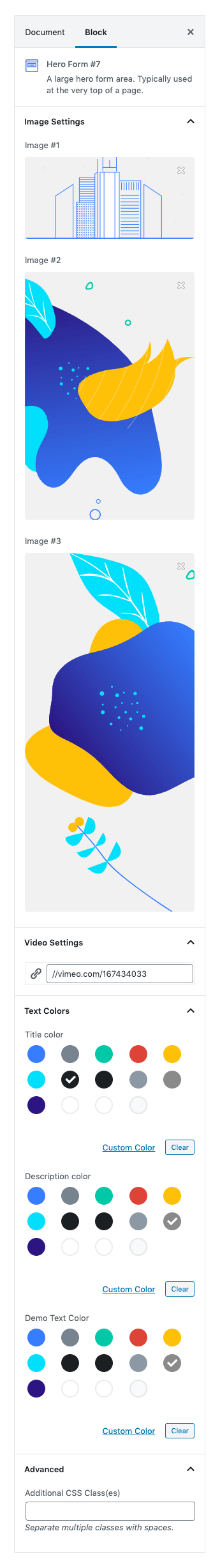
Image Settings :
Upload your right, left and bottom images.
Video Settings :
Upload your video for pop up paste your video link inot the link box.
Color Settings :
You can select color or custom color of title, Description and demo text in the color palette.
Advanced Css class :
Enter additional class name.
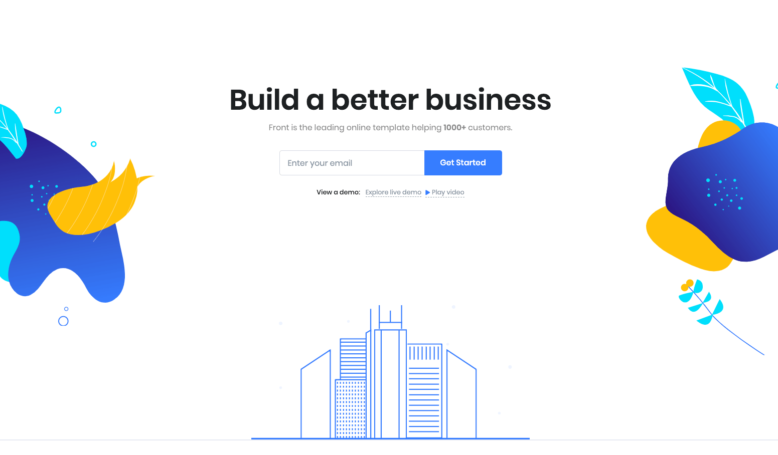
Hero Form 7 Output :
2. Tabs
Block Settings

Layout
There are two layout styles are available. In Default, Tab #1 is selected.
General Settings
- Limit: Drag the slider to set number of tabs to be displayed. Default: 3
- Enable Container: Enable or disable container. Default: Enable
- Enable Tab Title MaxWidth: Enable or disable tab title max-width. Default: Enable
Tab Settings
Enter the icon to display before the Tab title.
Display Settings
- Display Section Header: Enable or disable section header. Default: Enable
- Display Section Pretitle: Enable or disable section pretitle. Default: Enable
- Display Section Title: Enable or disable section title. Default: Enable
Additional CSS Class(es)
Enter the additional class for the block
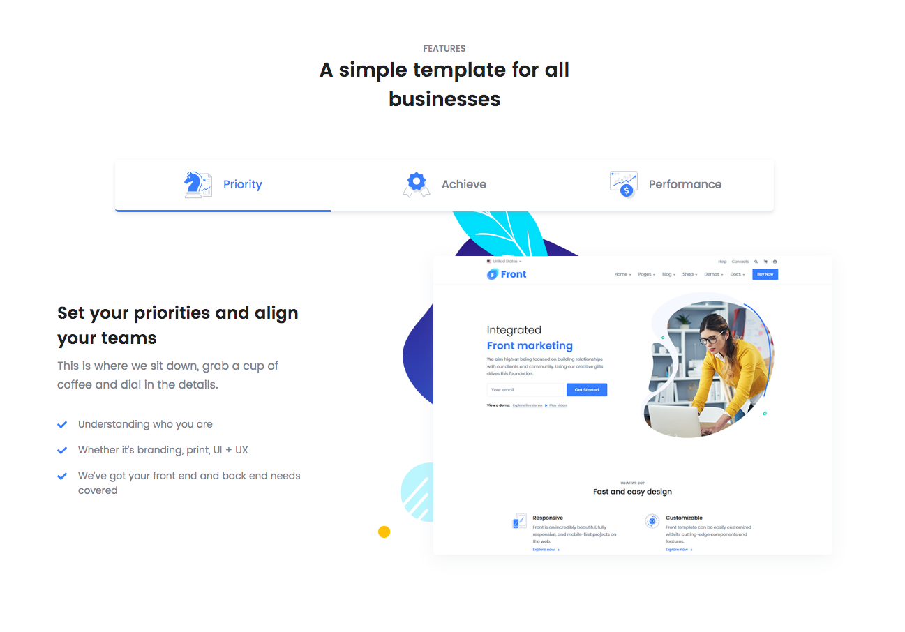
Output
3. Video Player
Block Settings
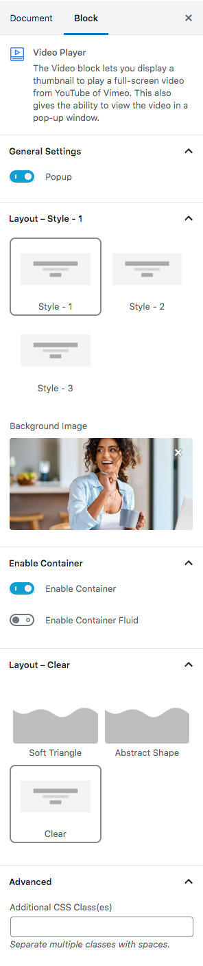
General Settings
Enable or disable video popup. Default: Enable
Style Layout
Three layout styles are available. Default: Style-1
Background Image
Upload image from your Media Library or import a new one.
Enable Container
- Enable Container: Enable or disable container. Default: Enable
- Enable Container Fluid: Enable or disable container fluid. Default: Disable
Layout
Soft Triangle, Abstract Shape and Clear are three layouts available. Default: Abstract Shape
Additional CSS Class(es)
Enter the additional class name
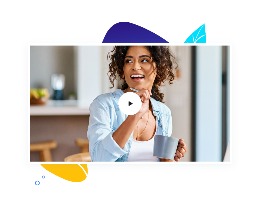
Block Output
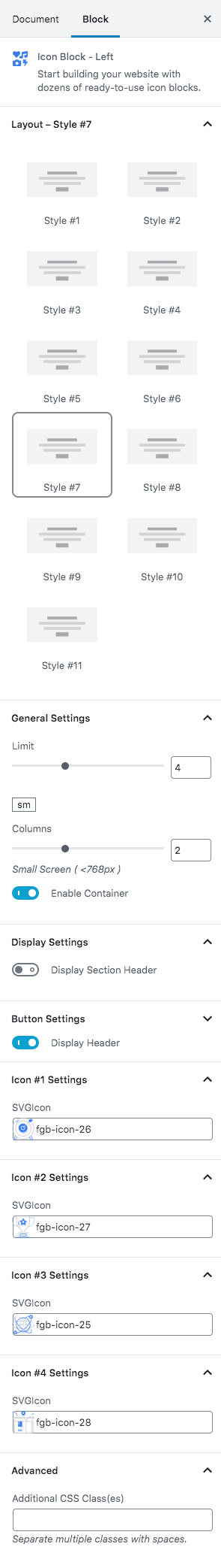
4. Icon Block – Left
Block Settings
Layout
Select style version for Icon Block Left. select Style #7 as default.
General Settings
Limit: Drag the slider to set the total number of blocks to be displayed. set 2 as the default limit.
Columns: Drag the slider to set no of columns for large screen. Default value i s 2.
Enable Container: Enable or Disable container class.
Icon Settings
SvgIcon: Select icons from the dropdown icons.Default is fgb-icon-15.
IconLink: Enter Link for icon.
Additional CSS Class
Enter the extra class name for the block
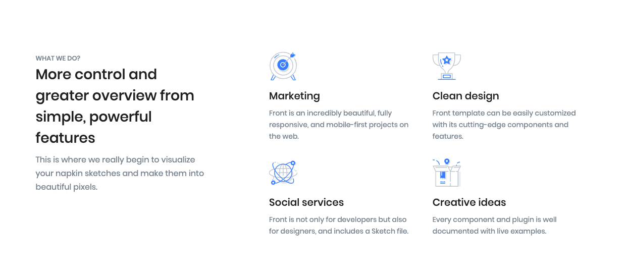
Output
5. Clients
Block Settings
Layout
Static, White, Colorful, Parallex and Carousel style layouts are available. Default: Parallex -1
Crop Images
Enable or disable thumbnails are cropped to align. Default: Enable
Link To
Link image to attachment page, media file or nothing. Default: None
Additional CSS Class(es)
Enter the additional class name needed for the block
Output

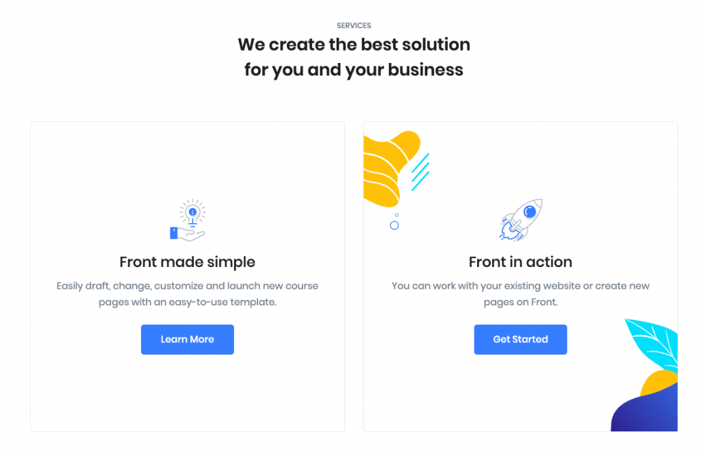
6. Info Grid #4
Block Settings

General Settings
- Limit: Drag the slider to set the info grid block. Default: 2
- Enable Container: Enable or disable container. Default: Enable
Display Settings
- Display Section Header: Enable or disable section header. Default: Enable
- Display Section Pretitle: Enable or disable section pretitle. Default: Enable
- Display Section Title: Enable or disable section title. Default: Enable
Button settings
Buttons allow you to take actions, and make choices, with a single tap.
- Button Design: There are 4 button designs are available. In default, Default button design is chosen.
- Button Background: Choose the background color for your button. White background color is chosen as default.
- Button Size: Extra Small, Small, Default and Large button size are available. The default size value for this block is Small
- Button Border Radius: Rounded, Default, Pill and Circle are the available border radius. The default border radius is Pill
- Button Icon: You can choose the icons for the button block. In default no icons are used for Deals Product button.
- Is Icon After text: Enable or disable the icon to position before the button text. set Disable option as default.
- Is Icon Button?: Enable or disable only icon ( without text ) as button. set Disable option as default.
- Enable Transition: Enable or disable transition effect for button. set Enable option as default.
Additional CSS Class
Enter the additional class name
Output
7. Call To Action
Block Settings
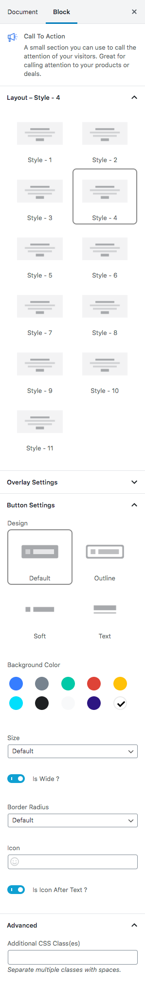
Layout
Select style version for Call To Action. select Style 4 as default.
Overlay Settings
- Overlay color: Select the overlay color.
- Overlay Image: Upload overlay image.
Icon Settings
Svg icon: Select the icon from the dropdown menu.
Button settings
Buttons allow you to take actions, and make choices, with a single tap.
- Button Design: There are 4 button designs available. Choose Default button design as default.
- Button Background: Choose the background color for your button. Choose warning as default button color.
- Button Size: Extra Small, Small, Default and Large button size are available. The default size for this block is Default
- Button Border Radius: Rounded, Default, Pill and Circle are the available border radius. The default border radius is Default
- Button Icon: You can choose the icons for the button block.The default icon is fa-angle-right .
- Is Icon After text: Enable or disable the icon to position before the button text. set Enable option as default.
Additional CSS Class
Enter the extra class name for the block
Output