Options available to customize the header of your website

General
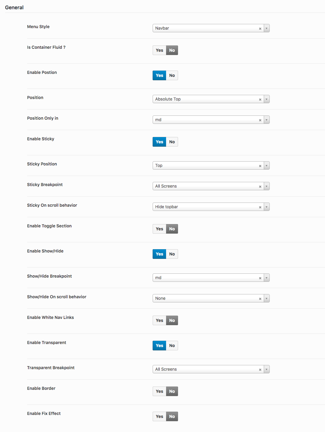
- Menu Style: Choose a menu style of header.
- Is Container ?: Enable or Disable to make header fullwidth.
- Enable Position: Enable or Disable header position.
- Position: Choose a position for header.
- Position Only in: Choose a screen size for position to apply in header.
- Enable Sticky: Enable or Disable sticky header.
- Sticky Position: Choose a position for sticky to apply in header.
- Sticky Breakpoint: Choose a screen size for sticky to apply in header.
- Sticky On scroll behavior: Choose a behaviour for header while on scroll.
- Enable Toggle Section: Enable or Disable toggle sections header.
- Enable Show/Hide: Enable or Disable show/hide sections header.
- Show/Hide Breakpoint: Choose a screen size for show/hide to apply in header.
- Show/Hide On scroll behavior: Choose a behaviour for show/hide in header while on scroll.
- Enable White Nav Links: Enable or Disable white color for links in navbar.
- Enable Transparent: Enable or Disable header transparent.
- Transparent Breakpoint: Choose a screen size for transparent to apply in header.
- Enable Border: Enable or Disable header border.
- Enable Fix Effect: Enable or Disable header fix effect.
Background
- Background: Choose a background for header.
Topbar
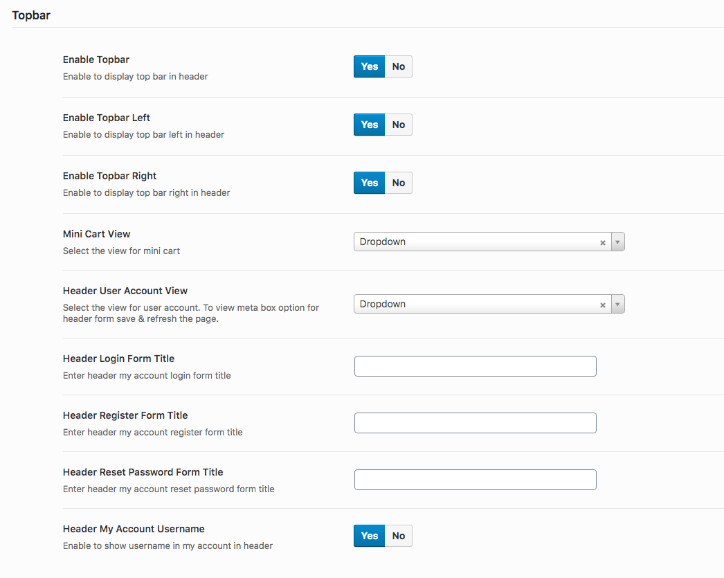
- Enable Topbar: Enable or Disable topbar in header.
- Enable Topbar Left: Enable or Disable topbar left in header.
- Enable Topbar Right: Enable or Disable topbar right in header.
- Mini Cart View: Choose a option to display view for mini cart in header.
- Header User Account View: Choose a option to display view for header user account in header.
- Header Login Form Title: Enter the title for login form.
- Header Register Form Title: Enter the title for register form.
- Header Reset Password Form Title: Enter the title for reset password form.
- Header My Account Username: Enable or Disable the username in header.
Logo
- Logo Align: Choose a option for logo to appear in header.
- Upload Scroll Logo: Add a different logo when scroll the header.
Navbar
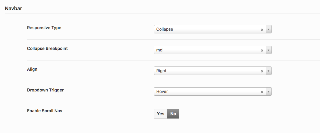
- Responsive Type: Choose responsive type for navbar for collapse or scroll in mobile/tablet.
- Collapse Breakpoint: Choose breakpoint for which screen size should collapse apply to navbar.
- Align: Choose align left/right for to display navbar in desktop.
- Dropdown Trigger: Choose dropdown trigger for navbar menu.
- Enable Scroll Nav: Enable or Disable scroll for navbar.
Button
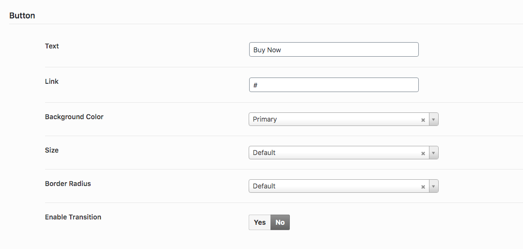
- Text: Enter the text for button that will be display at the header with no navbar menu style.
- Link: Enter the link for button that will be display at the header with no navbar menu style.
- Background Color: Choose a background color for button.
- Size: Choose a size for button.
- Border Radius: Choose a border radius for button.
- Enable Transition: Enable or Disable transition for button.
Fullscreen Modal
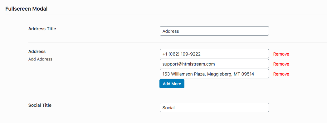
- Address Title: Enter the title for address that will be display at the modal.
- Address: Enter the address in multiple lines that will be display at the modal.
- Social Title: Enter the title for social links that will be display at the modal.
Search
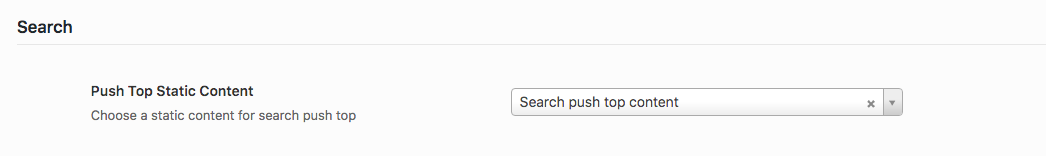
- Push Top Static Content: Choose a static content here that will be displayed at the header search area.