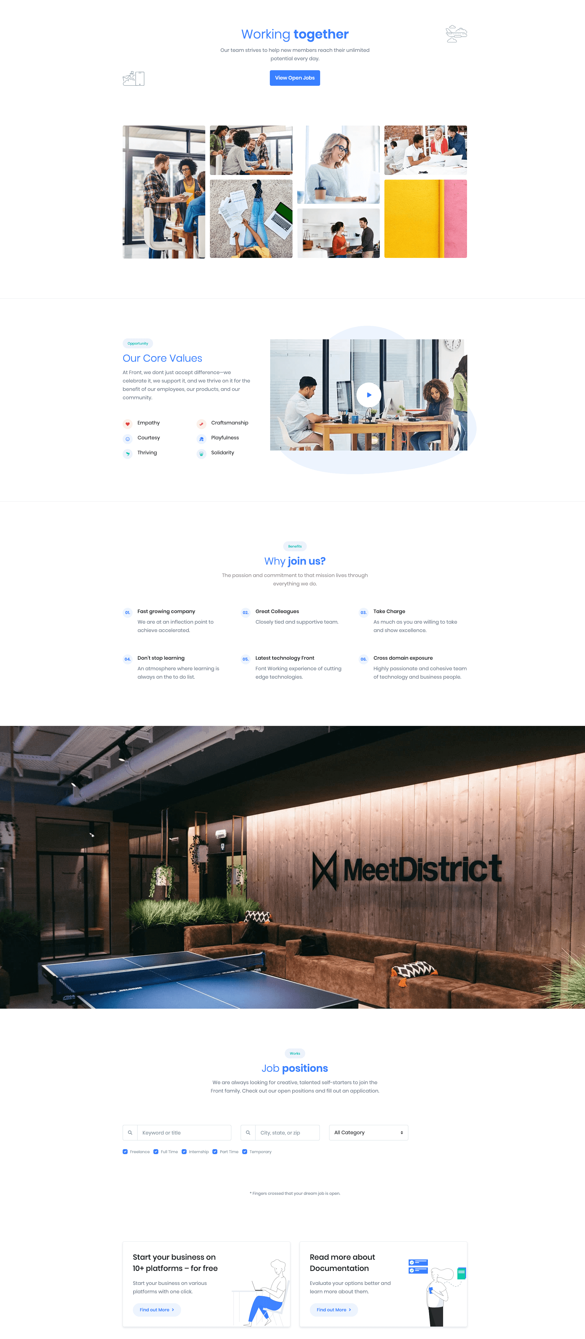
Careers of Front is built using Gutenberg.It has 6 blocks.
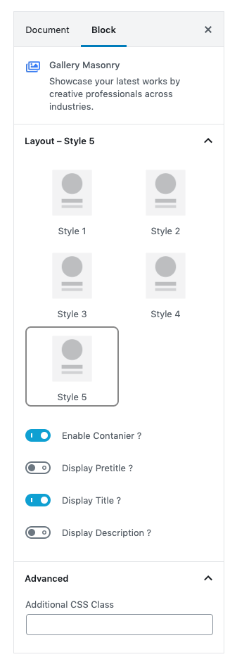
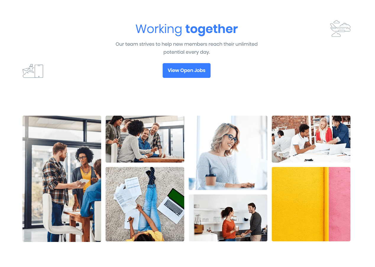
1. Gallery Masonry
Block Navigation :
Career Title Settings
Enter your block heading by using Career Title block. Make Gallery Masonry block as career title blocks’s inner. It is editable. You can edit or change heading and description in page editor.

| Field | Type | Description | Default |
|---|---|---|---|
| Enable Container | Toggle | You can enable or disable block container. | Enable |
| Display Button | Toggle | You can enable or disable button. | Enable |
| Title color | Select | You can select title color by color palette. | Primary |
| Description color | Select | You can select description color by color palette. | Secondary |
| Design | Select | You can select design for buttons. | Default |
| Background Color | Select | You can select button background color by color palette. | Primary |
| Size | Select | You can select size for buttons. | Default |
| Is wide? | Toggle | You can enable for button is wide. | Disable |
| Border Radius | Select | You can select button border radius. | Default |
| Additional CSS Class | Text | Enter additional class name. | None |
Settings
| Field | Type | Description | Default |
|---|---|---|---|
| Pop | Toggle | You can enable or disable video pop up style. | Disable |
| Layout | Select | You can select layout style version. | Style 2 |
| Enable Container | Toggle | You can enable or disable block container. | Enable |
| Enable Container fluid | Toggle | You can enable or disable block container fluid. | Disable |
| Layout | Select | You can select layout style. | Clear |
| Additional CSS Class | Text | Enter additional class name. | None |
For more details please visit Gallery Masonry.
Output
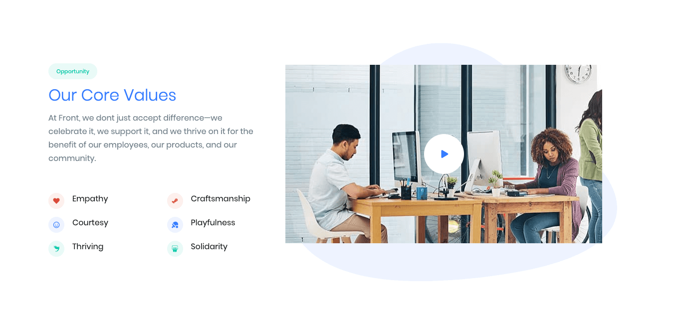
2. Video Player
Block Navigation :

Video Player Settings

| Field | Type | Description | Default |
|---|---|---|---|
| Pop | Toggle | You can enable or disable video pop up style. | Disable |
| Layout | Select | You can select layout style version. | Style 2 |
| Enable Container | Toggle | You can enable or disable block container. | Enable |
| Enable Container fluid | Toggle | You can enable or disable block container fluid. | Disable |
| Layout | Select | You can select layout style. | Clear |
| Additional CSS Class | Text | Enter additional class name. | None |
For more details please visit Video Player.
Video Player List Settings
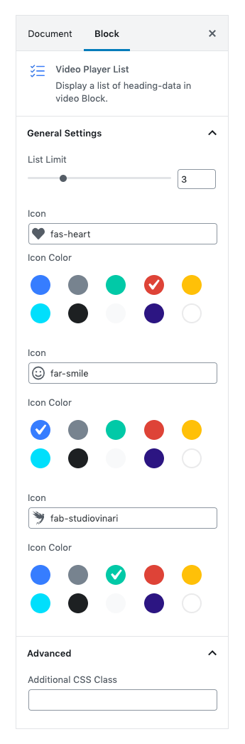
| Field | Type | Description | Default |
|---|---|---|---|
| List Limit | Rangecontrol | You can select list limit to display. | 3 |
| Icon | Text | Enter the icon. | Icon-class |
| Additional CSS Class | Text | Enter additional class name. | None |
For more details please visit Video Player List.
Output
3. FAQ
Settings
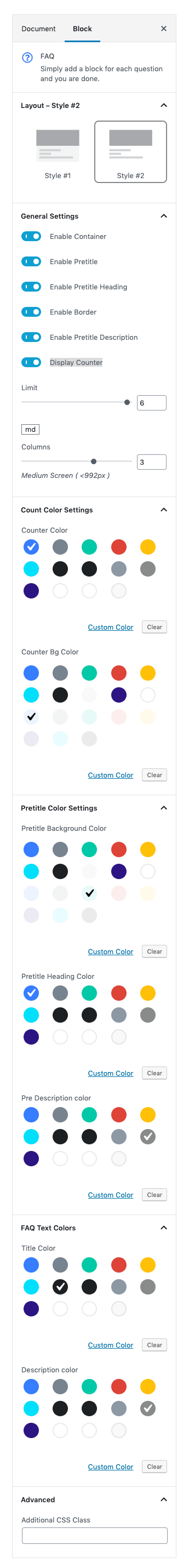
| Field | Type | Description | Default |
|---|---|---|---|
| Layout | Select | You can select layout style version. | Style 2 |
| Enable Container | Toggle | You can enable or disable block container. | Enable |
| Enable Pretitle | Toggle | You can enable or disable block pretitle. | Disable |
| Enable Pretitle Heading | Toggle | You can enable or disable block pretitle heading. | Enable |
| Enable Border | Toggle | You can enable or disable border. | Disable |
| Enable Pretitle Description | Toggle | You can enable or disable block pretitle description. | Disable |
| Display Counter | Toggle | You can enable or disable counter. | Disable |
| Limit | Rangecontrol | You can select limits to display. | 6 |
| Column( md ) | Range Control | You can choose width of column for small laptops – screens equal to or greater than 992px wide. | 3 |
| Counter Color | Select | You can select counter color by color palette. | Secondary |
| Counter Bg Color | Select | You can select counter bg color by color palette. | bg-soft-primary |
| Pretitle Background Color | Select | You can select pretitle background color by color palette. | soft-succes |
| Pretitle Heading Color | Select | You can select pretitle background color by color palette. | Primary |
| Pre Description color | Select | You can select pretitle background color by color palette. | text-black-50 |
| Title color | Select | You can select title color by color palette. | text-dark |
| Description color | Select | You can select title color by color palette. | text-black-50 |
| Additional CSS Class | Text | Enter additional class name. | None |
For more details please visit Faq.
Output

4. Parallaxer Image
Settings
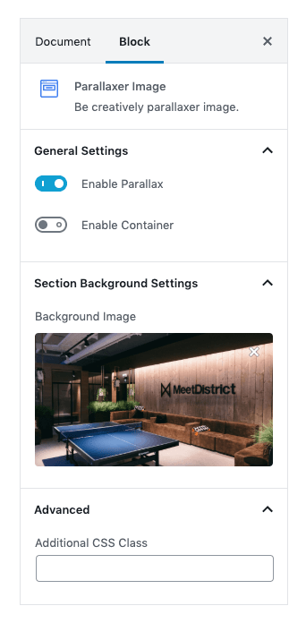
| Field | Type | Description | Default |
|---|---|---|---|
| Enable Parallax | Toggle | Eable or disable the parallax effect. | Enable |
| Enable Container | Toggle | Eable or disable the container. | Disable |
| Background Image | Media | Upload background image. | Image |
| Additional CSS Class | Text | Enter additional class name. | None |
For more details please visit Prallaxer Image.
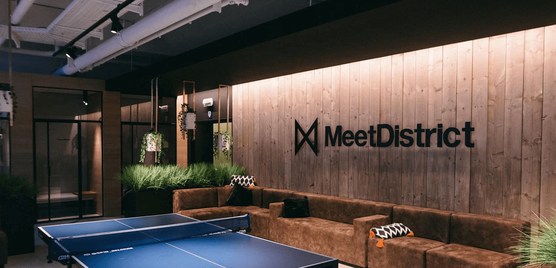
Output
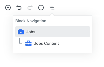
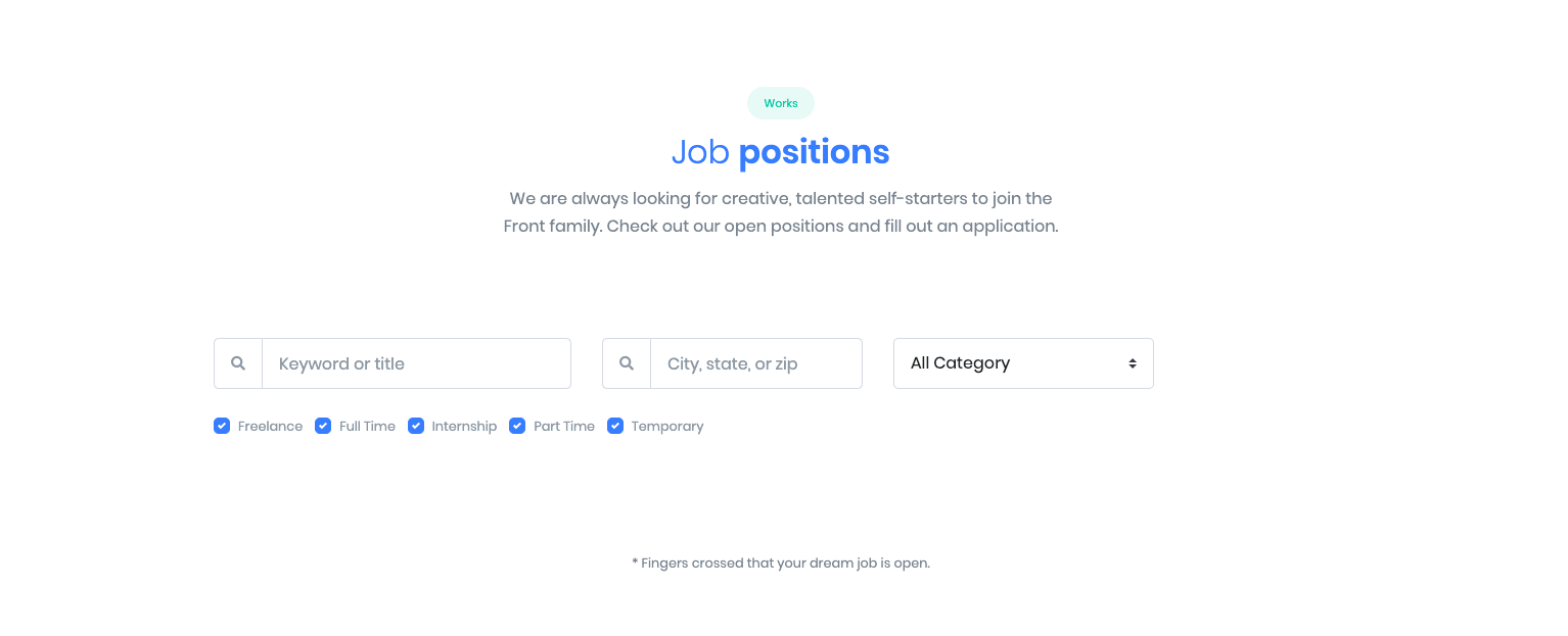
5. Jobs
Block Navigation :
Jobs Settings

| Field | Type | Description | Default |
|---|---|---|---|
| Layout | Select | You can select layout style version. | Style 1 |
| Enable Container | Toggle | You can enable or disable block container. | Enable |
| Display Background SVG ? | Toggle | You can enable or disable background SVG. | Disable |
| Display Pretitle ? | Toggle | You can enable or disable block pretitle. | Enable |
| Display Title ? | Toggle | You can enable or disable block title. | Enable |
| Display Subtitle ? | Toggle | You can enable or disable block subtitle. | Enable |
| Display Termtext ? | Toggle | You can enable or disable termtext. | Enable |
| Additional CSS Class | Text | Enter additional class name. | None |
For more details please visit Job.
Jobs Content Settings
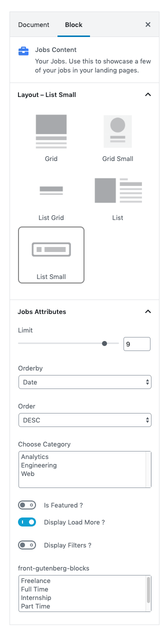
| Field | Type | Description | Default |
|---|---|---|---|
| Layout | Select | You can select layout style version. | List small |
| Limit | Rangecontrol | You can select limits to display. | 9 |
| Orderby | Select Control | Choose the order of your jobs, either by Title, Date, Id.. | Date |
| Order | Select Control | Choose the order of your jobs to be displayed either in Ascending or Descending Order.. | DESC |
| Choose Category | Text | Enter the category to display. | Analytics, Engineerin, Web |
| Is Featured ? | Toggle | You can enable or disable feature. | Enable |
| Display Load More ? | Toggle | You can enable or disable loadmore option. | Enable |
| Display Filters ? | Toggle | You can enable or disable filter option. | Enable |
| Choose Type | Text | Enter the type of jobs to display. | Analytics, Engineerin, Web |
| Additional CSS Class | Text | Enter additional class name. | Freelance, Full, Internship, Part Time, Temporary |
Jobs Output
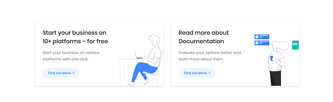
6. Info Grid 2
Settings
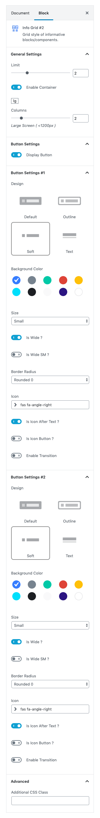
| Field | Type | Description | Default |
|---|---|---|---|
| Limits | Range Control | You can choose number of limits. | 2 |
| Column( lg ) | Range Control | You can choose width of column for laptops and desktops – screens equal to or greater than 1200px wide. | 2 |
| Display Buttons | Toggle | You can enable or disable button. | Enable |
| Background color | Select | You can select background color by color palette. | Primary |
| Title color | Select | You can select title color by color palette. | Secondary |
| Description color | Select | You can select description color by color palette. | white |
| Design | Select | You can select design for buttons. | Soft |
| Background Color | Select | You can select button background color by color palette. | Primary |
| Size | Select | You can select size for buttons. | Default |
| Is wide? | Toggle | You can enable for button is wide. | Enable |
| Is wide sm? | Toggle | You can enable for button is wide sm. | Disable |
| Border Radius | Select | You can select button border radius. | Default |
| Icon | Text | Enter your icon. | fa-angle-right |
| Is icon aftertext? | Toggle | You can enable or disable icon after text. | Enable |
| Is icon button? | Toggle | You can enable or disable icon is button. | Disable |
| Is transition? | Toggle | You can enable or disable button transition. | Disable |
| Additional CSS Class | Text | Enter additional class name. | None |
For more details please visit Info grid.
Output