Shop Classic of Front is built using Gutenberg. It has 7 blocks.
Overview
The Details
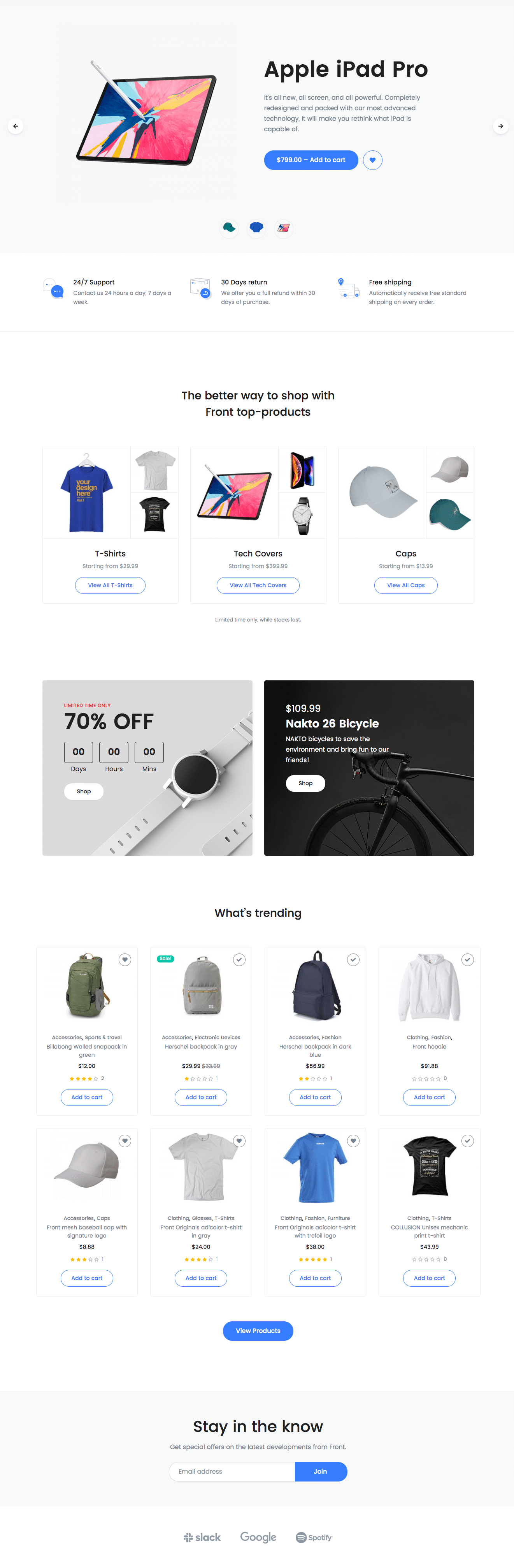
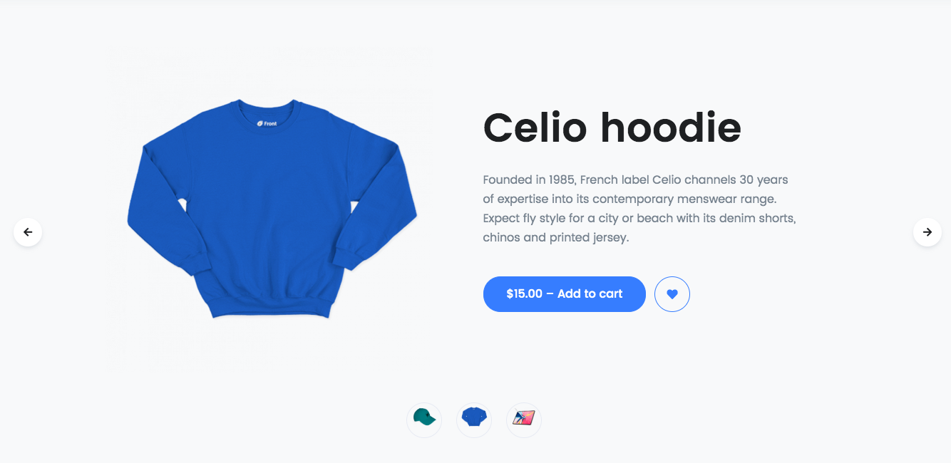
1. Shop Hero Slider
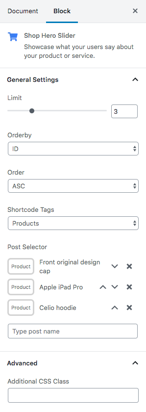
| Field | Type | Description | Default |
|---|---|---|---|
| Limit | Range Control | Drag the slider to set the total number of products to be displayed | 3 |
| Order By | Select Control | Choose the order of your products, either by Title, Date, Id. | ID |
| Order | Select Control | Choose the order of your products to be displayed either in Ascending or Descending Order. | ASC |
| Shortcode Tags | Select Control | Choose the type of products to be displayed | Products |
| Post Selector | Text | Type the post name | Front original design cap |
| Additional CSS Class | Text | Enter additional class name. | None |
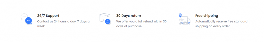
2. Icon Block – Left
Block Settings
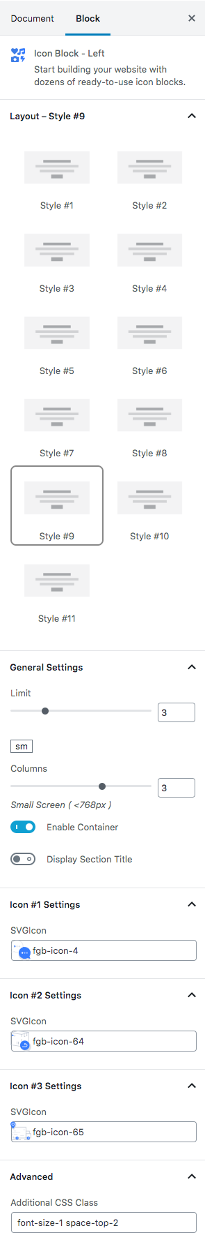
| Field | Type | Description | Default |
|---|---|---|---|
| Layout | Select | You can select layout style verion. | Style #9 |
| Limit | Range Control | Choose number of icons to be displayed. | 6 |
| Column( sm ) | Range Control | You can choose width of column for the screen greater than 768px wide. | 3 |
| Enable container? | Toggle | You can enable or disable block container | Enable. |
| Display section title? | Toggle | You can enable or disable section title. | Disable |
| Icon 1 settings | Text | Enter your icon. | fgb-icon-4 |
| Icon 2 settings | Text | Enter your icon. | fgb-icon-64 |
| Icon 3 settings | Text | Enter your icon. | fgb-icon-65 |
| Additional CSS Class | Text | Enter additional class name. | font-size-1 space-top-2 |
3. Products Category Content
Block Settings
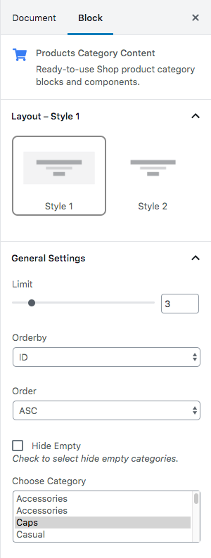
| Field | Type | Description | Default |
|---|---|---|---|
| Layout | Select | You can select layout style verion. | Style 1 |
| Limit | Range Control | Drag the slider to set the total number of products category to be displayed | 3 |
| Order By | Select Control | Choose the order of your category, either by Title, Date, Id. | ID |
| Order | Select Control | Choose the order of your category to be displayed either in Ascending or Descending Order. | ASC |
| Hide Empty | Checkbox | Check to select hide empty categories | Uncheck |
| Choose Category | Select Control | Choose the categories to be displayed | T-shirts, Tech Cover and Caps |

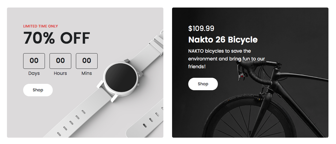
4. Deals Product
Block Settings

| Field | Type | Description | Default |
|---|---|---|---|
| Display Pretitle | Toggle | Enable or disable pretitle | Enable |
| Display Title | Toggle | Enable or disable title | Enable |
| Enable Timer | Toggle | Enable or disable timer | Enable |
| Display Button | Toggle | Enable or disable button | Enable |
| Border radius | Range Control | Drag the slider to set the pixel value for the border radius | 5 |
| – | – | Color Settings | – |
| Pretitle Color | Select | Choose the color for the pretitle | danger |
| Title Color | Select | Choose the color for the title | dark |
| – | – | Background Settings | – |
| Background Type | Select | Choose the type of background to displayed | image |
| Background Image | Media | Upload background image | image |
| – | – | Button Settings | – |
| Design | Select | You can select design for button. | Default |
| Background Color | Select | Select background color for button. | white |
| Size | Select | You can select size for buttons. | Small |
| Border radius | Select | Select border style for button | Pill |
| Icon | Select | Select the icon to displayed before or after the button text | none |
| Is icon aftertext? | Toggle | You can enable or disable icon after text. | Disable |
| Is icon button? | Toggle | You can enable or disable icon is button. | Disable |
| Enable transition? | Toggle | You can enable or disable button transition. | Enable |
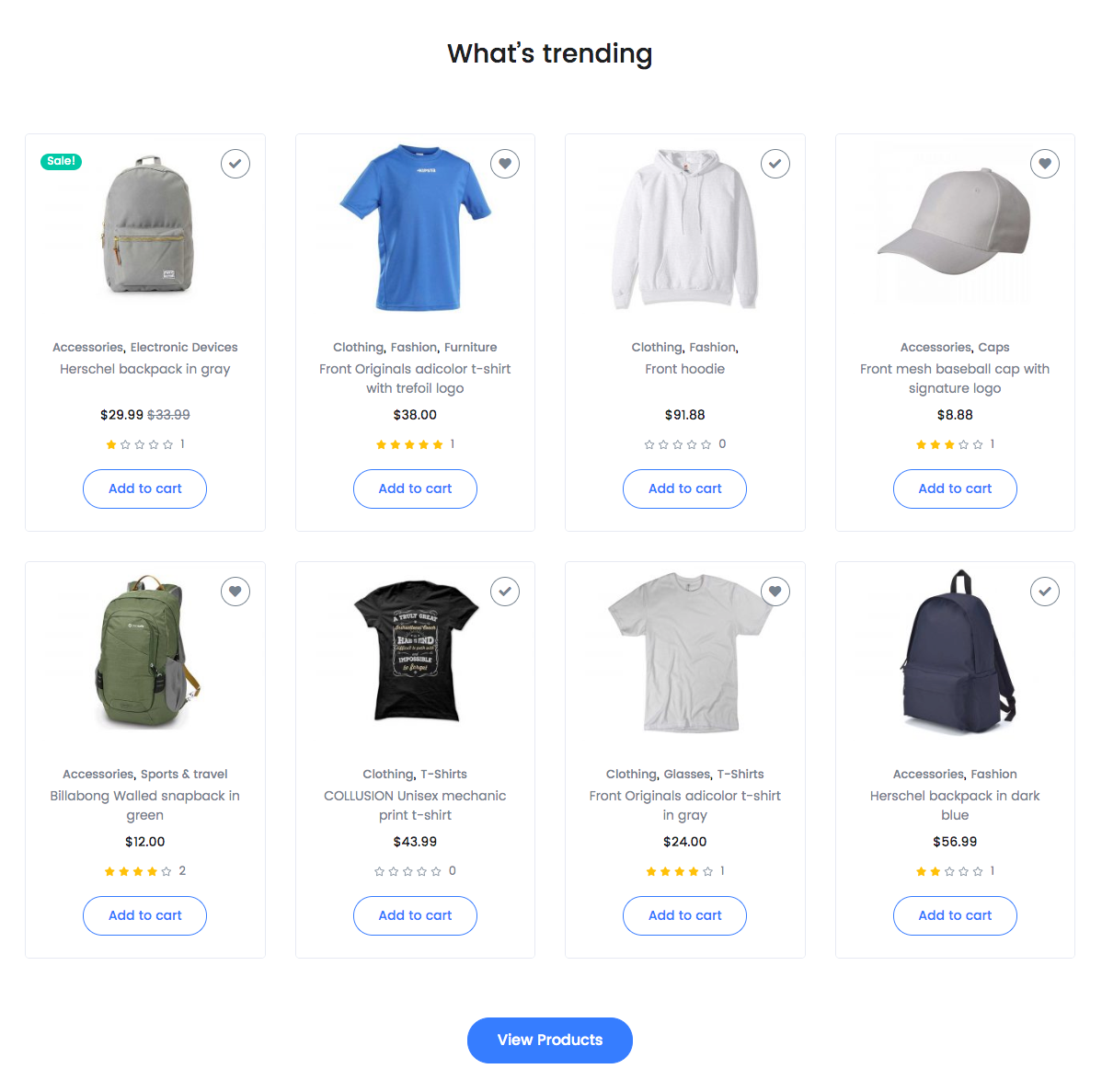
5. Products Carousel Block
Block Settings

ColumnsRange ControlDrag the slider to set the columns4
| Field | Type | Description | Default |
|---|---|---|---|
| Enable Carousel | Toggle | Enable or disable carousel | Disable |
| Limit | Range Control | Drag the slider to set the total number of products to be displayed | 8 |
| Order By | Select Control | Choose the order of your products, either by Title, Date, Id. | Random |
| Order | Select Control | Choose the order of your products to be displayed either in Ascending or Descending Order. | DESC |
| Shortcode Tags | Select Control | Choose the type of products to be displayed | Products |
| Post Selector | Text | Type the post name | Front original design cap |
| Additional CSS Class | Text | Enter additional class name. | None |
Block Output
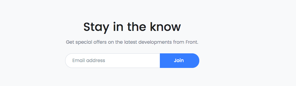
6. Hero Subscribe
Block Settings
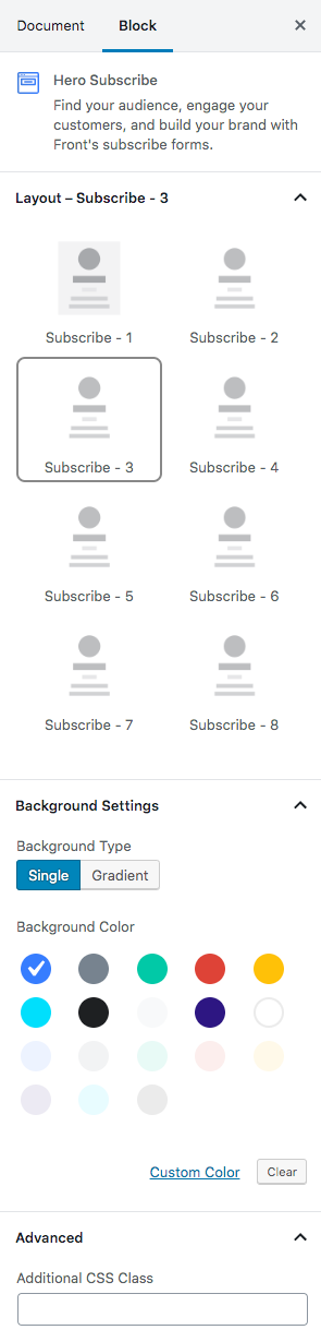
| Field | Type | Description | Default |
|---|---|---|---|
| layout | Select | Choose the style version | Subscribe-3 |
| – | – | Background Settings | – |
| Background Type | Select | Choose the type of background to displayed | Single |
| Background Color | Select | Select background color | primary | Additional CSS Class | Text | Enter additional class name. | None |
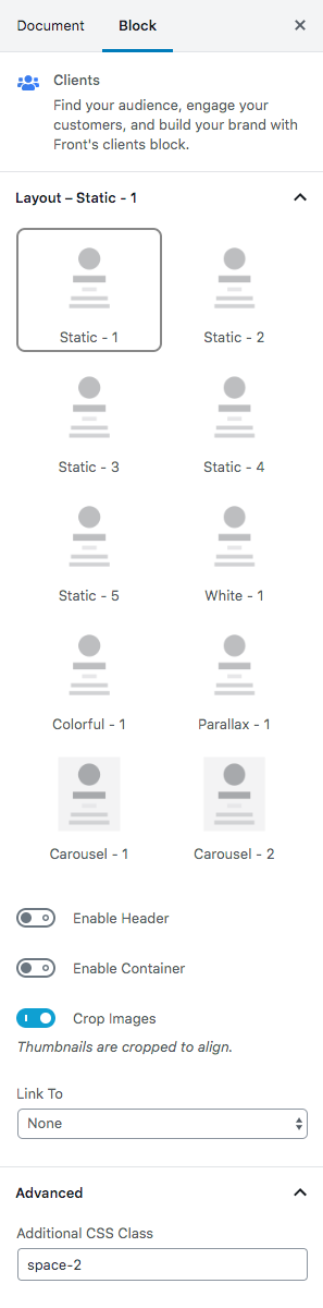
7. Clients
Block Settings
| Field | Type | Description | Default |
|---|---|---|---|
| Layout static | Select | You can select layout static verion. | Static – 1 |
| Enable header | Toggle | You can enable or disable block header. | Disable |
| Enable container | Toggle | You can enable or disable block container. | Disable |
| Crop images | Toggle | Thumbnail crop to align. | Enable |
| Link to | Select | You can link to media file or attachment page. | None |
| Additional CSS Class | Text | Enter additional class name. | space-2 |