A small section you can use to call the attention of your visitors. Great for calling attention to your products or deals.
Block Settings
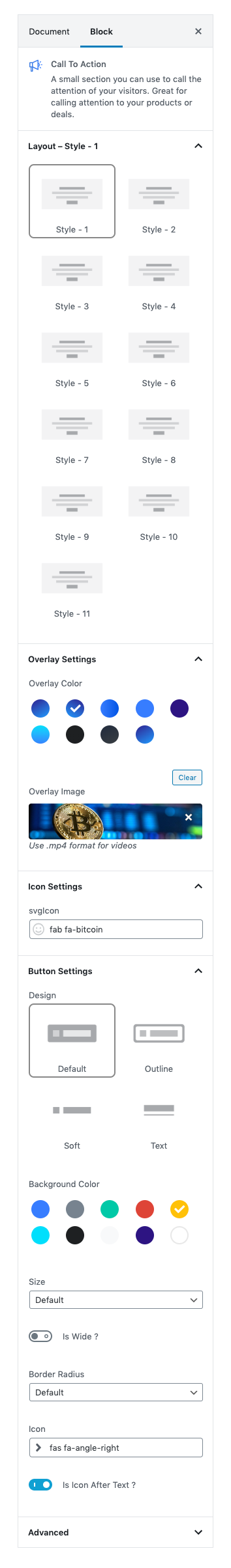
Layout
Select style version for Call To Action. select Style 1 as default.
Overlay Settings
- Overlay color: Select the overlay color.
- Overlay Image: Upload overlay image.
Icon Settings
Svg icon: Select the icon from the dropdown menu.
Button settings
Buttons allow you to take actions, and make choices, with a single tap.
- Button Design: There are 4 button designs available. Choose Default button design as default.
- Button Background: Choose the background color for your button. Choose warning as default button color.
- Button Size: Extra Small, Small, Default and Large button size are available. The default size for this block is Default
- Button Border Radius: Rounded, Default, Pill and Circle are the available border radius. The default border radius is Default
- Button Icon: You can choose the icons for the button block.The default icon is fa-angle-right .
- Is Icon After text: Enable or disable the icon to position before the button text. set Enable option as default.
Additional CSS Class
Enter the extra class name for the block
Block Output
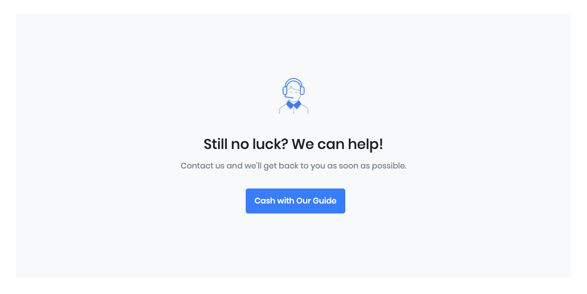
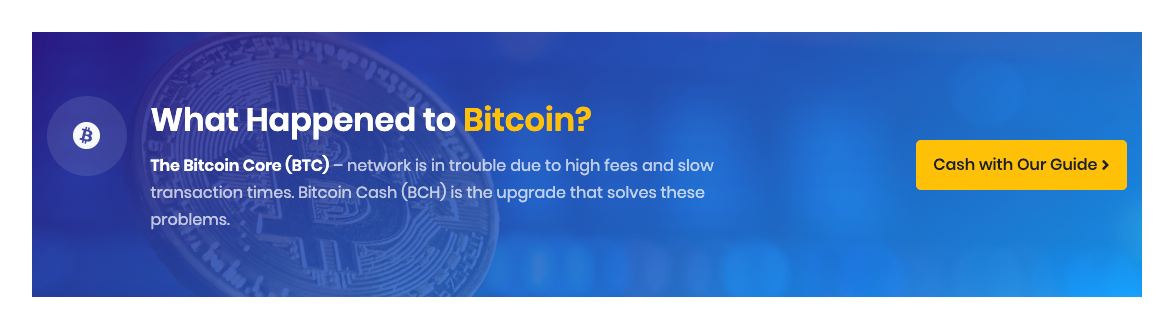
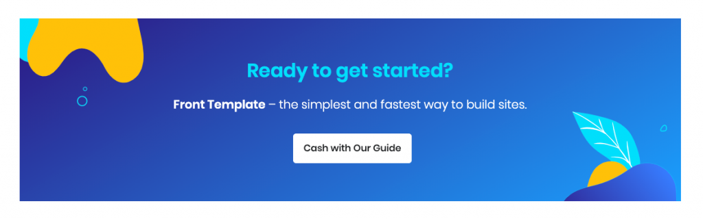
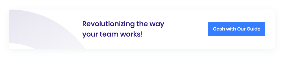
Style 1
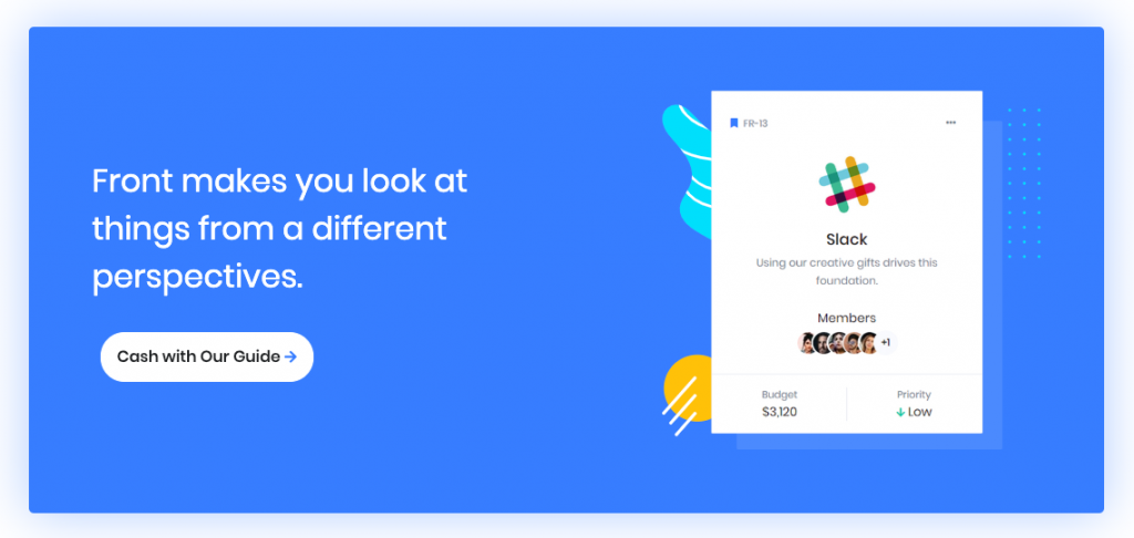
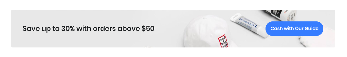
Style 2

Style 3
Style 4
Style 5
Style 6
Style 7
Style 8
Style 9

Style 10
Style 11