Front has predefined headers which can configure using theme options or create with Header block using Static Contents. We can also create unlimited custom headers using Headers Gutenberg Blocks.
Header Block Settings

General Panel
- You will find Menu Style option with Navbar, Off Screen, Full Screen and Logo Only.
- Full Screen Nav Style: Full Screen Nav Style has options of Modal, Sidebar left and Sidebar Right.
- Seperate Offcanvas Logo: Enable or disable Seperate Offcanvas header Logo.
- Is Container Fluid ?: Enable or disable container fluid.
- Enable Position: Enable or disable header position.
- Position: Position has options of Absolute Top, Absolute Bottom, Second Screen and Floating.
- Position Only in: Position only has options of All Screens, sm, md, lg and xl.
- Enable Sticky: Enable or disable sticky header.
- Sticky Position: Sticky position has options of Top and Bottom.
- Sticky Breakpoint: Sticky breakpoint has options of All Screens, sm, md, lg and xl.
- Sticky On scroll Behavior: Sticky on scroll behavior has options of None, Hide topbar, Toggle topbar, Changing logo on scroll and White Background on Scroll.
- Enable Toggle Section: Enable or disable toggle section.
- Enable Show/Hide: Enable or disable header show/hide.
- Show/Hide Breakpoint: Show/hide breakpoint has options of All Screens, sm, md, lg and xl.
- Show/Hide On scroll behavior: Show/hide on scroll behavior has options of None, Hide topbar and Changing logo on scroll.
- Enable White Nav Links: Enable or disable header white nav links.
- White Nav Links Breakpoint: White nav links breakpoint has options of All Screens, sm, md, lg and xl.
- Enable Transparent: Enable or disable transparent header.
- Transparent Breakpoint: Transparent breakpoint has options of All Screens, sm, md, lg and xl.
- Enable Border: Enable or disable header border.
- Enable Fix Effect: Enable or disable header Fix Effect.
Background Panel
- You will find Background option with Default, Dark, Navbar Primary, Navbar Gradient, Navbar Dark, White-to-dark on scroll, Dark-to-white on scroll and Submenu dark.
Top Bar Panel
- Enable Top Bar: Enable or disable top bar.
- Enable Top Bar Left: Enable or disable top bar left.
- Enable Top Bar Right: Enable or disable top bar right.
- Enable Mini Cart: Enable or disable header mini cart.
- Enable User Account: Enable or disable header my account.
- Enable Header Search: Enable or disable header search.
Logo Panel
- Enable Logo White: Enable or disable header white logo.
- Logo Align: Logo align has options of Left and Center.
- Logo Align Breakpoint: Logo align breakpoint has options of All Screens, sm, md, lg and xl.
- Upload logo: Upload header custom logo.
- Upload scroll Logo: Upload header scroll logo
Off Canvas Logo Panel
- Enable Logo White: Enable or disable off canvas white logo.
- Upload logo: Upload off canvas custom logo.
Navbar Panel
- Select a menu: Select a header primary menu.
- Responsive Type: Responsive type has options of None, Collapse and Scroll.
- Collapse Breakpoint: Collapse breakpoint has options of sm, md, lg and xl.
- Align: Align has options of menu align Left, Right and Center.
- Dropdown Trigger: Dropdown trigger has option of Hover and Click for menu.
- Enable Scroll Nav: Enable or disable scroll nav
Button Panel
- Buttons allow you to take actions, and make choices, with a single tap.
- Design: There are 4 button designs available. Choose Default button design as default.
- Background: Choose the background color for your button. Choose Primary as default button color.
- Size: Extra Small, Small, Default and Large button size are available. The default size for this block is Default
- Is Wide: Enable or disable is wide button. set Disable option as default.
- Is Wide Sm: Enable or disable is wide sm button. set Disable option as default.
- Is Block: Enable or disable is block button. set Disable option as default.
- Border Radius: Rounded, Default, Pill and Circle are the available border radius. The default border radius is Default
- Icon: You can choose the icons for the button block.
- Is Icon After text: Enable or disable the icon to position before the button text.
- Is Icon Button ?: Enable or disable icon button without text.
- Text: Enter button text.
- Button Link: Insert button link.
- Enable Transition: Enable or disable the button hover transition. set Enable option as default.
Advanced panel
- Additional CSS Class(es): Enter additional class.
Header Block Output
Default

Full container

No navbar

Fullscreen

Default with topbar

Default left aligned nav

Default right aligned nav

Default center aligned nav

Default with topbar center aligned logo on top
Default Dark

Default navbar gradient

Default navbar primary

Job Demo

Search push to top content
Header Components
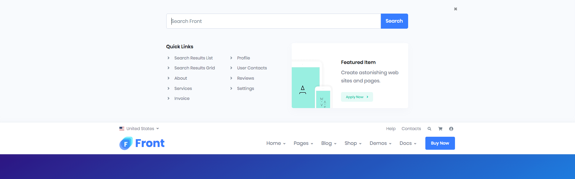
Top Bar
Output

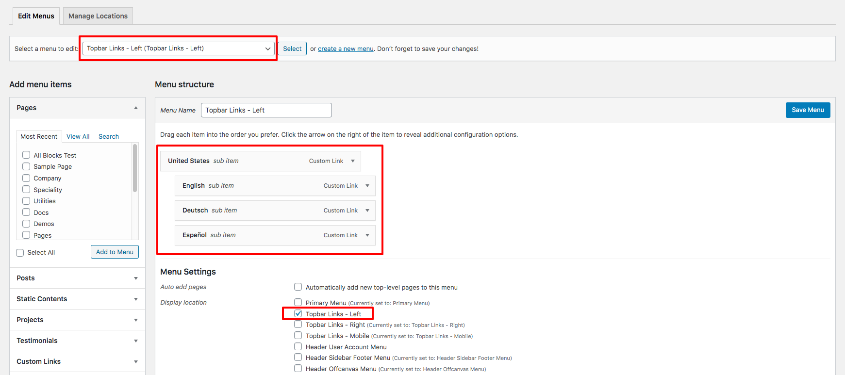
Top Bar Left Setting:
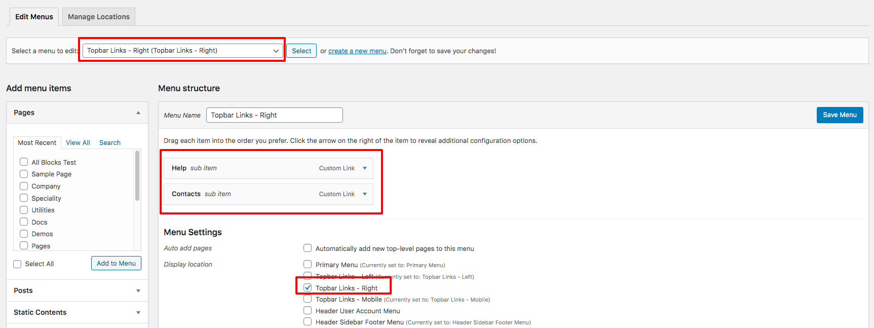
Top Bar Right Setting:
Top Bar style remain same for all Headers. It has two sections: left and right section. In our theme, top bar includes Custom Links.
You can edit the Top Bar from Appearance > Menus > Edit menus and choose “Topbar Links – Right” or “Topbar Links – Left”.