Hero Fancybox is a large hero area with video popup. This block lets you display a thumbnail to play a full-screen video from YouTube of Vimeo. This gives your users the ability to view the video in a pop-up window.
Block Settings

Layout
In Hero Fancybox block, there are 4 different styles are available. You can select the style as your choice
General Settings
- Enable Container: Enable or disable container option. Default: Enable
- Display Title: Enable or disable block title. Default: Enable
- Display Description: Enable or disable block description. Default: Enable
- Enable Fancy Box: Enable or disable video popup. Default: Enable
- Display Background Image: Enable or disable background image. Default: Enable
- Enable Button: Enable or disable button. Default: Enable
- Play Video Icon: Choose the icon to display. Default: fas fa-play
Image Settings
You can either upload an image or select one from your Media Library. Note: For style 1, add mt-12 class name to position image
Video Settings
- Video Link – In the Video Link box, type in or paste in the link address for the video.
- Video Caption Text – Enter the video caption which is appear in the video popup
Color Settings
Use color picker to change block title, subtitle and description color.
Background Settings
Backgrounds have a significant impact on the design of a website. They help create a site’s look and feel. There are two types of settings are available: Single and Gradient.
- Single: Solid background color
- Gradient: Gradient ( Combination of two or more colors ) background color
In every style layout, different background types are used.
Button settings
Buttons allow you to take actions, and make choices, with a single tap.
- Button Design: There are 4 button designs are available. In default, Default button design is chosen.
- Button Background: Choose the background color for your button. White background color is chosen as default.
- Button Size: Extra Small, Small, Default and Large button size are available. The default size value for this block is Small
- Button Border Radius: Rounded, Default, Pill and Circle are the available border radius. The default border radius is Pill
- Button Icon: You can choose the icons for the button block. In default no icons are used for Deals Product button.
- Is Icon After text: Enable or disable the icon to position before the button text. set Disable option as default.
- Is Icon Button?: Enable or disable only icon ( without text ) as button. set Disable option as default.
- Enable Transition: Enable or disable transition effect for button. set Enable option as default.
- Button Link: Enter the button link
Additional CSS Class
Enter the additional class name
Block Output
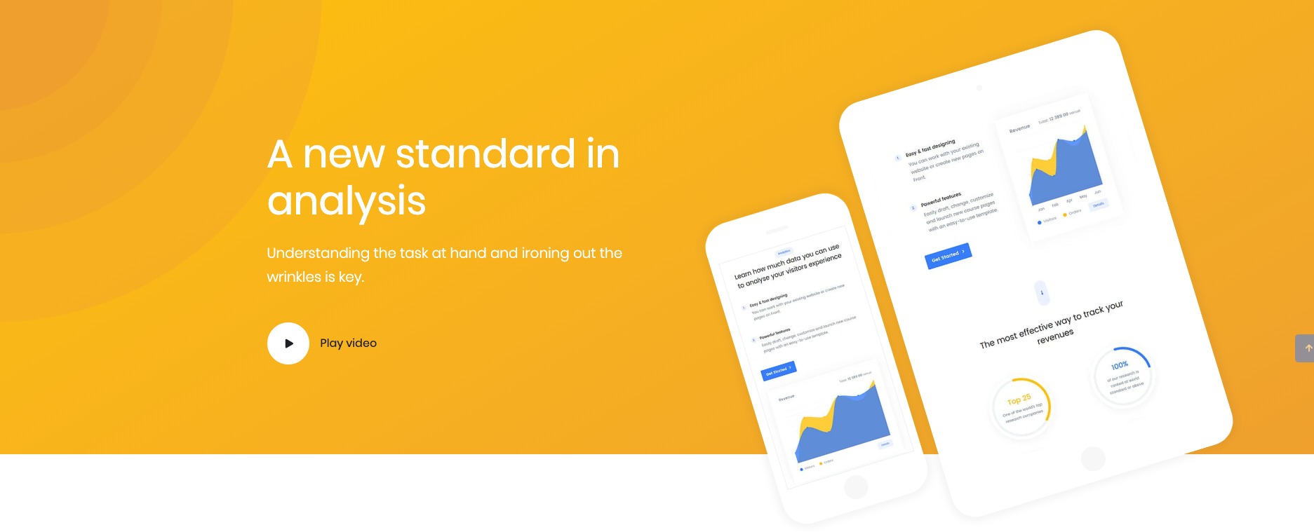
Style 1

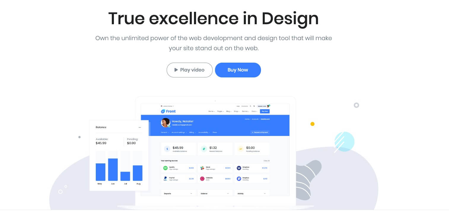
Style 2
Style 3
Style 4