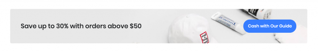
Lightweight, flexible component for showcasing hero unit style content.
Block Settings
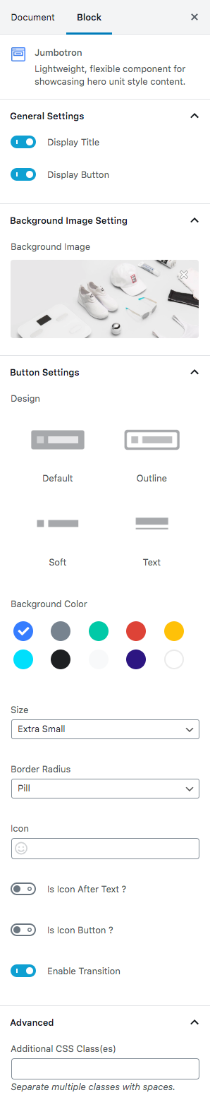
General Settings
- Display Title: Enable or disable title. Default: Enable
- Display Button: Enable or disable button. Default: Enable
Background Image Setting
Backgrounds have a significant impact on the design of a website. They help create a site’s look and feel. Import a image from your media library or upload a new one.
Button settings
Buttons allow you to take actions, and make choices, with a single tap.
- Button Design: There are 4 button designs are available. In default, Default button design is chosen.
- Button Background: Choose the background color for your button. White background color is chosen as default.
- Button Size: Extra Small, Small, Default and Large button size are available. The default size value for this block is Small
- Button Border Radius: Rounded, Default, Pill and Circle are the available border radius. The default border radius is Pill
- Button Icon: You can choose the icons for the button block. In default no icons are used for Deals Product button.
- Is Icon After text: Enable or disable the icon to position before the button text. set Disable option as default.
- Is Icon Button?: Enable or disable only icon ( without text ) as button. set Disable option as default.
- Enable Transition: Enable or disable transition effect for button. set Enable option as default.
Additional CSS Class
Enter the additional class name
Block Output