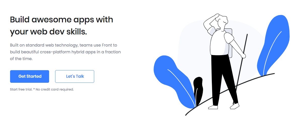
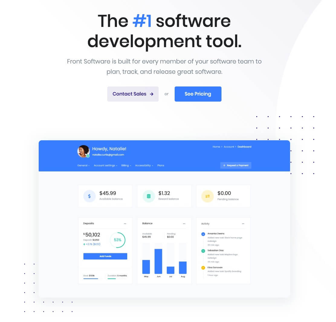
Hero Actions is a large hero area. Typically used at the very top of a page. With the Hero Actions, you can use a attractive design to catch your visitors’ attention while showing what your page is all about. You can also include a detailed description and a call to action to make sure people are encouraged to explore further.
Block Settings

Layout
In Hero Actions, there are 4 layout styles are available. You can choose any one of the style as your choice.
General Settings
- Enable Container: Enable or disable container option. Default: Enable
- Display Icon: Enable or disable icon. Default: Enable
- Display Title: Enable or disable block title. Default: Enable
- Display Description: Enable or disable block description. Default: Enable
- Display Buttons: Enable or disable button. Default: Enable
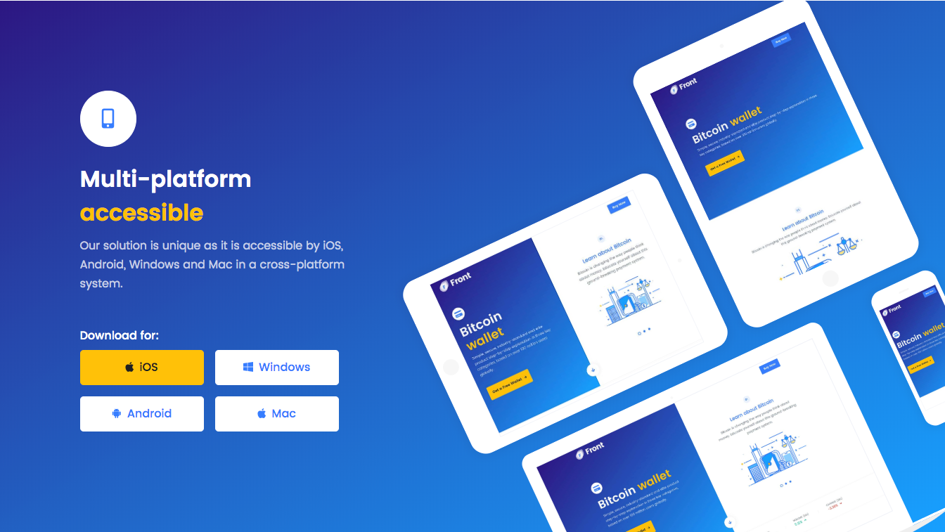
- Landscape Tablet Image: Enable or disable landscape tablet image. Default: Enable
- Portrait Tablet Image: Enable or disable portrait tablet image. Default: Enable
- Laptop Image: Enable or disable laptop image. Default: Enable
- Phone Image: Enable or disable phone image. Default: Enable
- Number of Buttons: Drag the slider to set number of action buttons to displayed. Default: 4
- Icon: Choose or enter the icon to displayed. Default: fas fa-mobile-alt
Color Settings
Use color picker to change block title, subtitle and description color.
Icon Color Settings
Use color picker to change the icon color. Default: primary
Background Settings
Backgrounds have a significant impact on the design of a website. They help create a site’s look and feel. There are three types of settings are available: Single and Gradient.
- Single: Solid background color
- Gradient: Gradient ( Combination of two or more colors ) background color
In every style layout, different background types are used.
Upload Image
In style 1, there are 4 different background images are used. you can either upload an image or select one from your Media Library.
Button settings
Buttons allow you to take actions, and make choices, with a single tap.
- Button Design: There are 4 button designs are available. In default, Default button design is chosen.
- Button Background: Choose the background color for your button. White background color is chosen as default.
- Button Size: Extra Small, Small, Default and Large button size are available. The default size value for this block is Small
- Button Border Radius: Rounded, Default, Pill and Circle are the available border radius. The default border radius is Pill
- Button Icon: You can choose the icons for the button block. In default no icons are used for Deals Product button.
- Is Icon After text: Enable or disable the icon to position before the button text. set Disable option as default.
- Is Icon Button?: Enable or disable only icon ( without text ) as button. set Disable option as default.
- Enable Transition: Enable or disable transition effect for button. set Enable option as default.
Additional CSS Class
Enter the additional class name
Block Output
Style 1
Style 2

Style 3
Style 4