Grid style #4 of informative blocks/components.
Block Settings
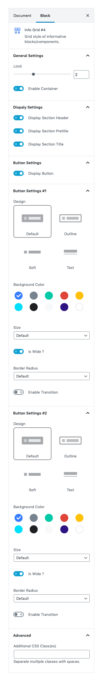
General Settings
Limit: Drag the slider to set the total number of blocks to be displayed. set 2 as the default limit.
Enable Container: Enable or Disable container class.
Display Header: Enable to show header options.
Display PreTitle: Enable to show block’s PreTitle.Set default as Enable.
Display Title: Enable to show block Title.Set default as Enable.
Button Settings
Enable Button: Enable to show button in the grid block.
Buttons allow you to take actions, and make choices, with a single tap.
- Button Design: There are 4 button designs are available.Default button is chosen as default design.
- Button Background: Choose the background color for your button. Primary background color is chosen as default.
- Is wide: Enable for wide button. The default is Enable
- Button Size: Extra Small, Small, Default and Large button size are available. The default size value for this block is Default
- Button Border Radius: Rounded, Default, Pill and Circle are the available border radius. The default border radius is Default
- Enable Transition: Enable or disable transition effect for button. set Disable option as default.
Additional CSS Class
Add extra class name for the block.
Block Output