Hero Carousel #4 gutenberg block is a large hero area. Typically used at the very top of a page.
Hero Carousel #4 Block Settings
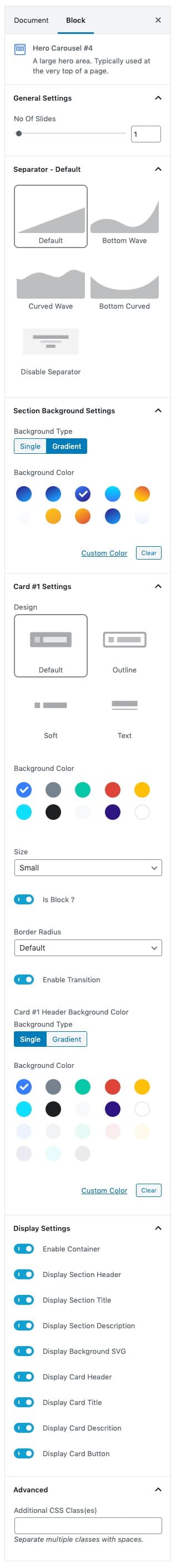
General Settings Panel
- No Of Slides: Choose the slides limit.
Seperator Panel
- Seperator Create a break between ideas or sections with a horizontal separator.
- Choose the list of SVG to use as a seperator.
Section Background Settings Panel
- Backgrounds have a significant impact on the design of a website. They help create a site’s look and feel. There are two types of settings are available: Single and Gradient.
- Background Type: Choose single or gradient background.
- Single: Solid background color.
- Gradient: Gradient ( Combination of two or more colors ) background color.
- Background Color: Choose the section background color.
Card Settings Panel
- Buttons allow you to take actions, and make choices, with a single tap.
- Button Design: There are 4 button designs available. Choose Default button design as default.
- Button Background: Choose the background color for your button. Choose Primary as default button color.
- Button Size: Extra Small, Small, Default and Large button size are available. The default size for this block is Small
- Button Border Radius: Rounded, Default, Pill and Circle are the available border radius. The default border radius is Default
- Button Is Block: Enable or disable is block button. set Enable option as default.
- Button Enable Transition: Enable or disable the button hover transition. set Enable option as default.
Card Header Background Color
- Backgrounds have a significant impact on the design of a website. They help create a site’s look and feel. There are two types of settings are available: Single and Gradient.
- Background Type: Choose single or gradient background.
- Single: Solid background color.
- Gradient: Gradient ( Combination of two or more colors ) background color.
- Background Color: Choose the section background color.
Display Settings panel
- Enable or disable the content in the block.
Advanced panel
- Additional CSS Class(es): Enter additional class.
Hero Carousel #4 Block Output