Hero Carousel #1 gutenberg block is a large hero area. Typically used at the very top of a page. It contains an inner block of Info Section #18.
Hero Carousel #1 Block Settings
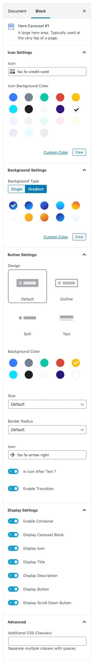
Icon Settings panel
- Icon: Search and select the icon. For SVG icon search icon in icon control text box. The default icon is fas fa-credit-card .
- Icon Background Color: Choose icon background color.
Background Settings panel
- Backgrounds have a significant impact on the design of a website. They help create a site’s look and feel. There are two types of settings are available: Single and Gradient.
- Background Type: Choose single or gradient background.
- Single: Solid background color.
- Gradient: Gradient ( Combination of two or more colors ) background color.
Button Settings panel
- Buttons allow you to take actions, and make choices, with a single tap.
- Design: There are 4 button designs available. Choose Default button design as default.
- Background: Choose the background color for your button. Choose warning as default button color.
- Size: Extra Small, Small, Default and Large button size are available. The default size for this block is Default
- Border Radius: Rounded, Default, Pill and Circle are the available border radius. The default border radius is Default
- Icon: You can choose the icons for the button block.The default icon is fas fa-arrow-right .
- Is Icon After text: Enable or disable the icon to position before the button text. set Enable option as default.
- Enable Transition: Enable or disable the button hover transition. set Enable option as default.
Display Settings panel
- Enable or disable the content in the block.
Advanced panel
- Additional CSS Class(es): Enter additional class.
Hero Carousel #1 Block Output