Classic Marketing of Front is built Using Gutenberg blocks. It has 7 blocks.
The Details
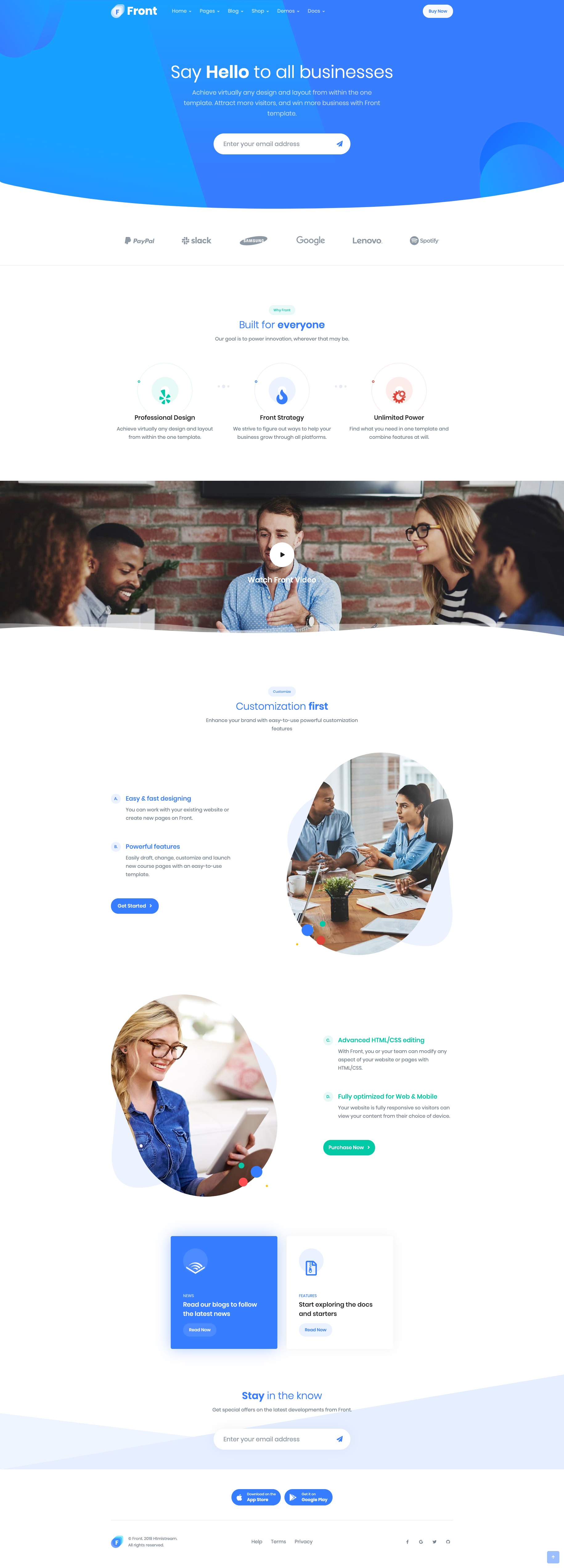
Hero Form #1
Hero Form #1 Settings
Enable Container :
You can enable or disable block container.
Enable Separator :
You can enable or disable separator.
Color Settings :
You can select color or custom color of title and description in the color palette.
Advanced Css class :
Enter additional class name.
For more details please visit Hero Form.
Hero Form #1 Output

2. Clients
Clients Settings

Layout :
You can select layout style verion.
Number of cards :
You can choose number of limits by using rangecontrol.
Column( lg ) :
You can choose width of column for laptops and desktops – screens equal to or greater than 1200px wide.
Enable header :
You can enable or disable header by using toggle control.
Enable Container :
You can Enable or disable container.
Crop images :
Thumbnail crop to align.
Margin bottom :
You can select margin bottom for block by using rangecontrol.
Link to :
You can link to media file or attachment page.
Advanced Css class :
Enter additional class name.
Clients Output

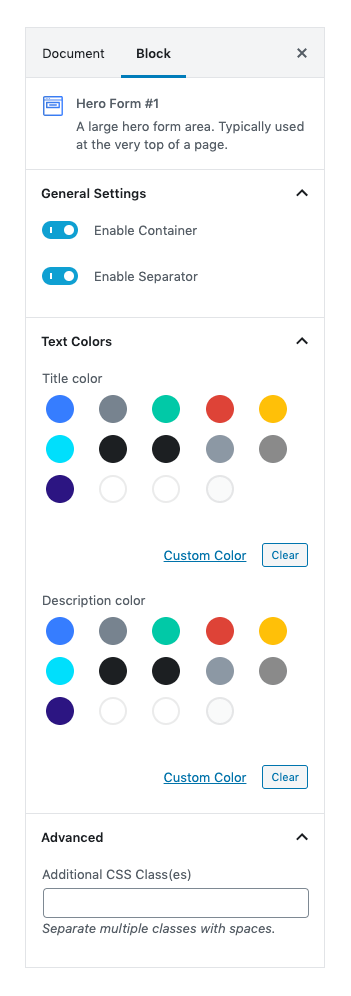
3. Icon Block – Center
Icon Block Center Settings
Layout
Select style version for Icon Block Center. select Style 1 as default.
Enable Container: Enable or Disable container class.
Columns: Drag the slider to select number of columns for medium screen. set 3 as the default column.
No of icons: Drag the slider to select number of icon you want to display. set 3 as the default no of icon.
Display Settings
Enable Divider: Enable to show divider.Disable to hide divider.
Display Header: Enable to show header options.
Display Title: Enable to show block Title.Default is Enable.
Display PreTitle: Enable to show block Pretitle.Default is Enable.
Display Description: Enable to show block Description.Default is Disable.
Icon Settings
SvgIcon : Select icons for style 1 from the dropdown icons.
Design : Two designs are available for icons they are Default and Soft.
Background Color: Select background color for icons using color palette.
Additional CSS Class
Add extra class name for the block.
For more details please visit Icon Block Center.
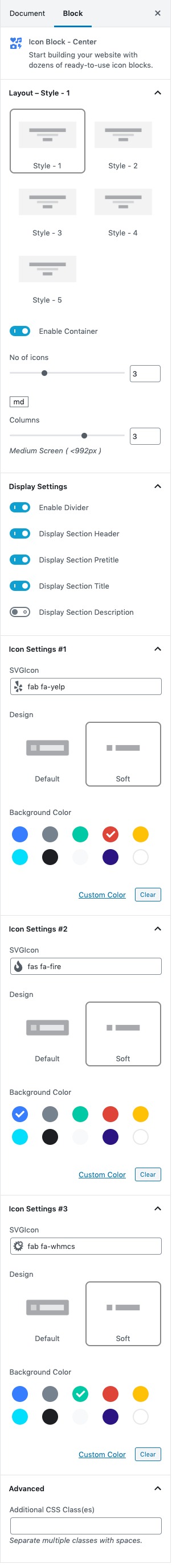
Icon Block Center Output
4. Video Player
Video Player Settings
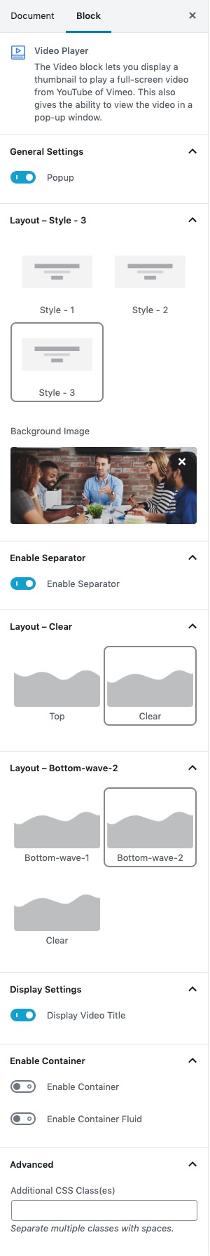
General Settings
Enable for popup video styles.Disable for Inline video Styles Default: Enable
Style Layout
Three layout styles are available. Default: Style-3
Background Image
Upload image from your Media Library or import a new one.
Enable Separator :
You can enable or disable separator.
Layout :
You can select bottom wave. Default : bottom-wave-2
Display Video title :
You can enable or disable video title.
Enable Container
- Enable Container: Enable or disable container. Default: Enable
- Enable Container Fluid: Enable or disable container fluid. Default: Disable
Layout
Soft Triangle, Abstract Shape and Clear are three layouts available. Default:Abstract Shape.
Additional CSS Class(es)
Enter the additional class name
For more details please visit Video player.
Video Player Output

5. Info Section #3
Info Section #3 Settings

Number of Mockups :
You can select number of mockups by using rangecontrol.
Enable Container :
You can Enable or disable container.
Enable Pretitle :
You can Enable or disable Pretitle.
Enable Pretitle Heading :
You can Enable or disable pretitle heading.
Enable Pretitle Descrition:
You can Enable or disable Pretitle Descrition.
Display Counter:
You can Enable or disable counter.
Display Button:
You can Enable or disable button.
Color Settings :
You can select color or custom color of pretitle bg, pretitle heading, pretitle description in the color palette.
Align :
You can align mockups right and left by using select control.
Number of List :
You can select the number of list per mockups by using rangeconrol.
Color Settings :
You can select color or custom color of counter, counter bg, title, description in the color palette.
Background Image :
Upload your background image.
Button Settings :
- You can choose button designs for your cover page buttons. It has four type styles default, outline, soft, text.
- You can select button background color in the color palette.
- You can select button sizes. It has three type of sizes Extra small , Small, Large.
- Enable or disable is wide option for button.
- You can select border radius for button. It has three types Rounded 0, Pill, Circle
- You can enter the icon by using icon-class.
- Enable or disable is icon after text option for button.
- Enable or disable is icon button option for button.
- Enable or disable transition option for button.
Advanced Css class :
Enter additional class name.
For more details please visit Info Section.
Info Section #3 Output

6. News Blog
News Blog Settings
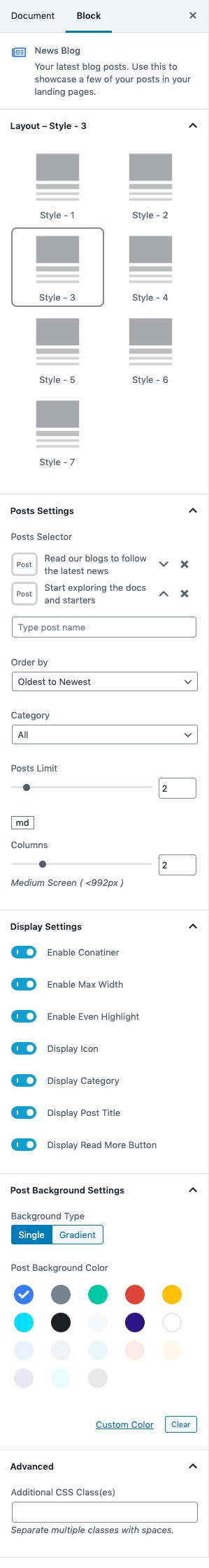
News Blog Output

7. Hero Subscribe
Hero Subscribe Settings
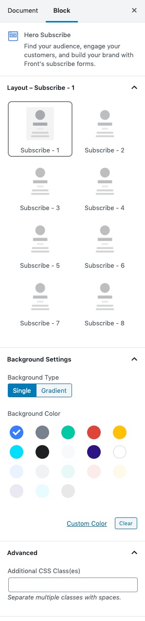
Layout :
You can select layout style verion.
Background Color :
You can select background color by color palette.
Hero Subscribe output
