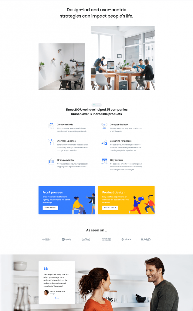
Services Agency of Front is built using Gutenberg.It has 5 blocks.
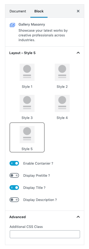
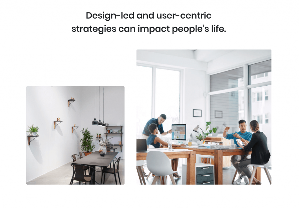
1. Gallery Masonry
Settings
| Field | Type | Description | Default |
|---|---|---|---|
| Layout | Select | You can select layout style verion. | Style 6 |
| Display container? | Toggle | You can enable or disable block container. | Enable |
| Display pretitle? | Toggle | You can enable or disable block pretitle. | Disable |
| Display title? | Toggle | You can enable or disable block title. | Enable |
| Additional CSS Class | Text | Enter additional class name. | None |
For more details please visit Gallery Masonry.
Output
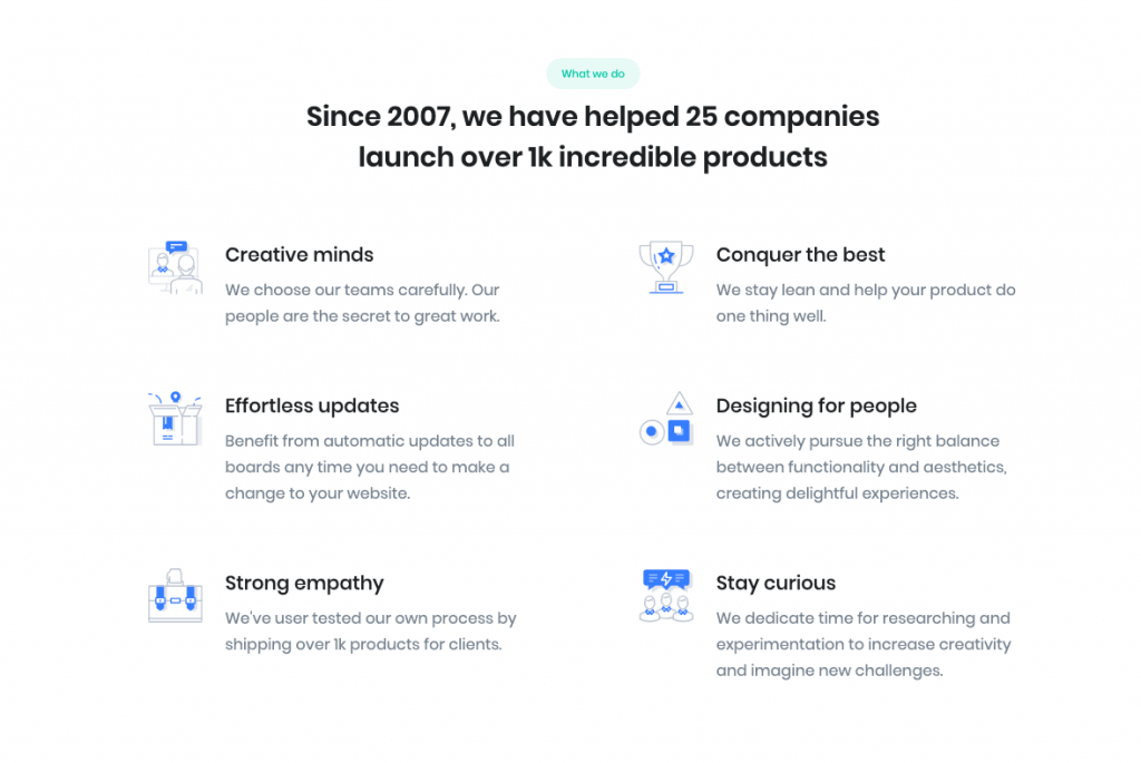
2. Icon Block Left
Settings
| Field | Type | Description | Default |
|---|---|---|---|
| Layout | Select | You can select layout style verion. | Style 11 |
| Limit | Range Control | You can choose number of limits. | 6 |
| Column width | Range Control | You can choose width of column. | 5 |
| Column( md ) | Range Control | You can choose width of column for small laptops – screens equal to or greater than 992px wide. | 5 |
| Enable container? | Toggle | You can enable or disable block container | Enable. |
| Section Pretitle Background | Select | You can select color or custom color of pretitle backgrond in color palette | succes |
| Display section header? | Toggle | You can enable or disable section header. | Enable |
| Display section pretitle? | Toggle | You can enable or disable section pretitle. | Enable |
| Display section title? | Toggle | You can enable or disable section title. | Enable |
| Icon 1 settings | Text | Enter your icon. | fgb-icon-18 |
| Icon 2 settings | Text | Enter your icon. | fgb-icon-27 |
| Icon 3 settings | Text | Enter your icon. | fgb-icon-28 |
| Icon 4 settings | Text | Enter your icon. | fgb-icon-45 |
| Icon 5 settings | Text | Enter your icon. | fgb-icon-19 |
| Icon 6 settings | Text | Enter your icon. | fgb-icon-7 |
| Additional CSS Class | Text | Enter additional class name. | None |
For more details please visit Icon Block Left.
Output
3. Info Colourful
Settings
| Field | Type | Description | Default |
|---|---|---|---|
| Layout | Select | You can select layout style verion. | Style 5 |
| Number of cards | Range Control | You can choose number of limits. | 2 |
| Column( lg ) | Range Control | You can choose width of column for laptops and desktops – screens equal to or greater than 1200px wide. | 5 |
| Display Buttons | Toggle | You can enable or disable button. | Enable |
| Background color | Select | You can select background color by color palette. | Primary |
| Title color | Select | You can select title color by color palette. | Secondary |
| Description color | Select | You can select description color by color palette. | white |
| Design | Select | You can select design for buttons. | Default |
| Size | Select | You can select size for buttons. | Default |
| Is wide? | Toggle | You can enable for button is wide. | Disable |
| Is disable? | Toggle | You can enable for button is disable. | Disable |
| Is block? | Toggle | You can enable for button is block. | Disable |
| Border Radius | Select | You can select button border radius. | Default |
| Icon | Text | Enter your icon. | fa-angle-right |
| Is icon aftertext? | Toggle | You can enable or disable icon after text. | Enable |
| Is icon button? | Toggle | You can enable or disable icon is button. | Disable |
| Is transition? | Toggle | You can enable or disable button transition. | Disable |
| Additional CSS Class | Text | Enter additional class name. | None |
For more details please visit Info colorfull.
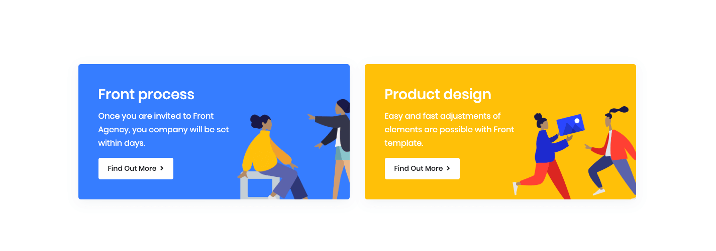
Output
4. Clients
Settings
Upload Image :

You can upload your image here.
| Field | Type | Description | Default |
|---|---|---|---|
| Layout static | Select | You can select layout static verion. | Static 5 |
| Column( lg ) | Range Control | You can choose width of column for laptops and desktops – screens equal to or greater than 1200px wide. | 6 |
| Enable header | Toggle | You can enable or disable block header. | Enable |
| Enable container | Toggle | You can enable or disable block container. | Disable |
| Crop images | Toggle | Thumbnail crop to align. | Enable |
| Margin bottom | Range control | You can select margin bottom for block. | 4 |
| Link to | Select | You can link to media file or attachment page. | None |
| Additional CSS Class | Text | Enter additional class name. | space-2 space-lg-3 |
For more details please visit Clients.
Output

5. Testimonial Carousel
Settings
| Field | Type | Description | Default |
|---|---|---|---|
| Layout style | Select | You can select layout style verion. | Style 2 |
| Layout Align | Select | You can align the block left or right. | Align Left |
| Testimonial Selector | Text | You can enter the post names. | None |
| Testimonial Limit | Range Control | You can choose testimonial limits to show. | 4 |
| Order by | Select | You can select order by for posts. | A -> Z |
| Enable Container | Toggle | You can enable or disable block container. | Enable |
| Display Quote | Toggle | You can enable or disable the qoutes. | Enable |
| Display Author Name | Toggle | You can enable or disable author name. | Enable |
| Display Author Designation | Toggle | You can enable or disable author designation. | Enable |
| Display Author Image | Toggle | You can enable or disable author image. | Enable |
| Display Author Message | Toggle | You can enable or disable author message. | Enable |
| Background image | Media | Upload the image. | Image |
| Additional CSS Class | Text | Enter additional class name. | None |
For more details please visit Testimonial Carousel.
Output

