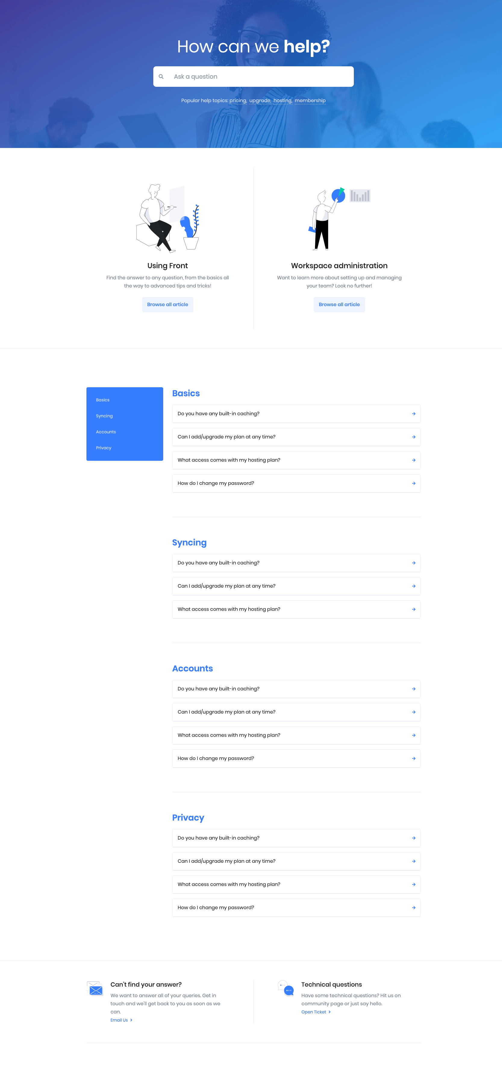
Faq of Front is built using Gutenberg.It has 4 blocks.

1. Hero Form 5
Settings
| Field | Type | Description | Default |
|---|---|---|---|
| Enable Container | Toggle | You can enable or disable container. | Enable |
| Background Image | Media | Upload your image. | None |
| Overlay Color | Select | You can select background overlay color by color palette. | Primary |
| Title color | Select | You can select title color by color palette. | None |
| Tags Title color | Select | You can select tags title color by color palette. | None |
| Additional CSS Class | Text | Enter additional class name. | None |
For more details please visit Hero Form.
Output

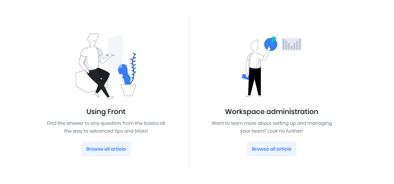
2. Info Grid 8
Settings
| Field | Type | Description | Default |
|---|---|---|---|
| Limit | Range Control | You can choose number of limits. | 2 |
| Enable Container | Toggle | You can enable or disable container. | Enable |
| Column( lg ) | Range Control | You can choose width of column for laptops and desktops – screens equal to or greater than 1200px wide. | 2 |
| Display Buttons | Toggle | You can enable or disable button. | Enable |
| Design | Select | You can select design for buttons. | Default |
| Background color | Select | You can select background color by color palette. | Primary |
| Size | Select | You can select size for buttons. | Default |
| Is wide? | Toggle | You can enable for button is wide. | Enable |
| Is wide sm? | Toggle | You can enable for button is wide sm. | Disable |
| Border Radius | Select | You can select button border radius. | Rounded 0 |
| Icon | Text | Enter your icon. | fa-angle-right |
| Is icon aftertext? | Toggle | You can enable or disable icon after text. | Enable |
| Is icon button? | Toggle | You can enable or disable icon is button. | Disable |
| Enable transition? | Toggle | You can enable or disable button transition. | Disable |
For more details please visit Info Grid.
Output

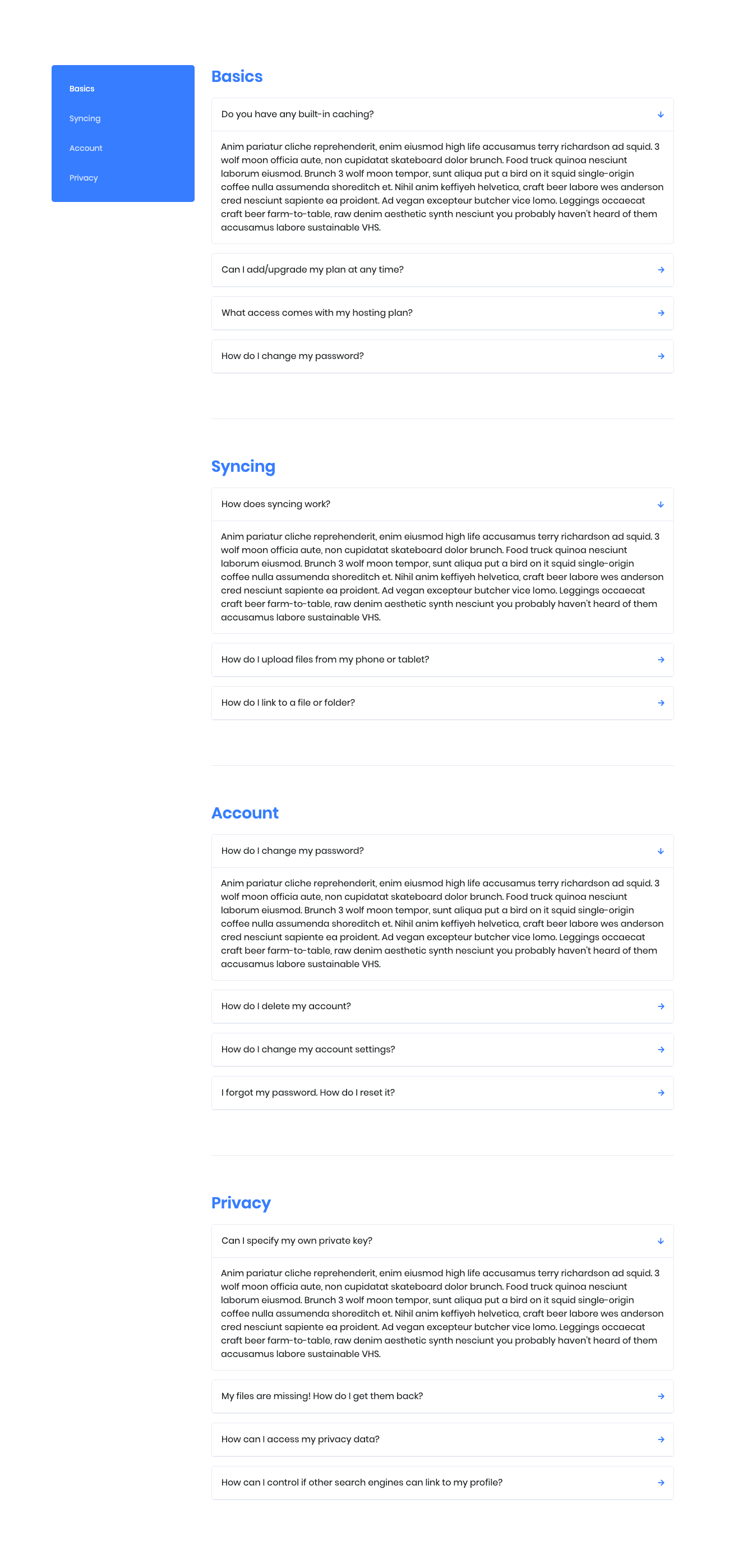
3. List Group
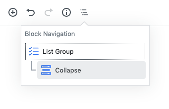
Block Navigation :
Settings
The collapse block is inner block of the list group block. You can add heading ( h3 ) for tabs. It is editable. You can edit or change in the page editor.
| Field | Type | Description | Default |
|---|---|---|---|
| Layout | Select | You can select layout style version. | Style 1 |
| Limits | Range Control | You can choose number of limits. | 4 |
| Enable Container | Toggle | You can enable or disable container. | Enable |
| Enable Title | Toggle | You can enable or disable title. | Enable |
| Enable Arrow | Toggle | You can enable or disable arrow. | Enable |
| List Limits | Range Control | You can choose number of list limits. | 4 |
| Column( lg ) | Range Control | You can choose width of column for laptops and desktops – screens equal to or greater than 1200px wide. | 2 |
| Title color | Select | You can select title color by color palette. | Primary |
| Additional CSS Class | Text | Enter additional class name. | None |
For more details please visit Collapse.
Output

4. Icon Block – Left
Settings
| Field | Type | Description | Default |
|---|---|---|---|
| Layout | Select | You can select layout style version. | Style 1 |
| Limits | Range Control | You can choose number of limits. | 2 |
| Column( lg ) | Range Control | You can choose width of column for laptops and desktops – screens equal to or greater than 1200px wide. | 2 |
| Enable Container | Toggle | You can enable or disable container. | Enable |
| Display Section Header | Toggle | You can enable or disable section header. | Disable |
| SVGIcon | Text | Enter icon class. | fgb-icon-15 |
| Icon Link | Text | Enter Icon link. | # |
| Additional CSS Class | Text | Enter additional class name. | None |
For more details please visit Icon Block Left.
Output


