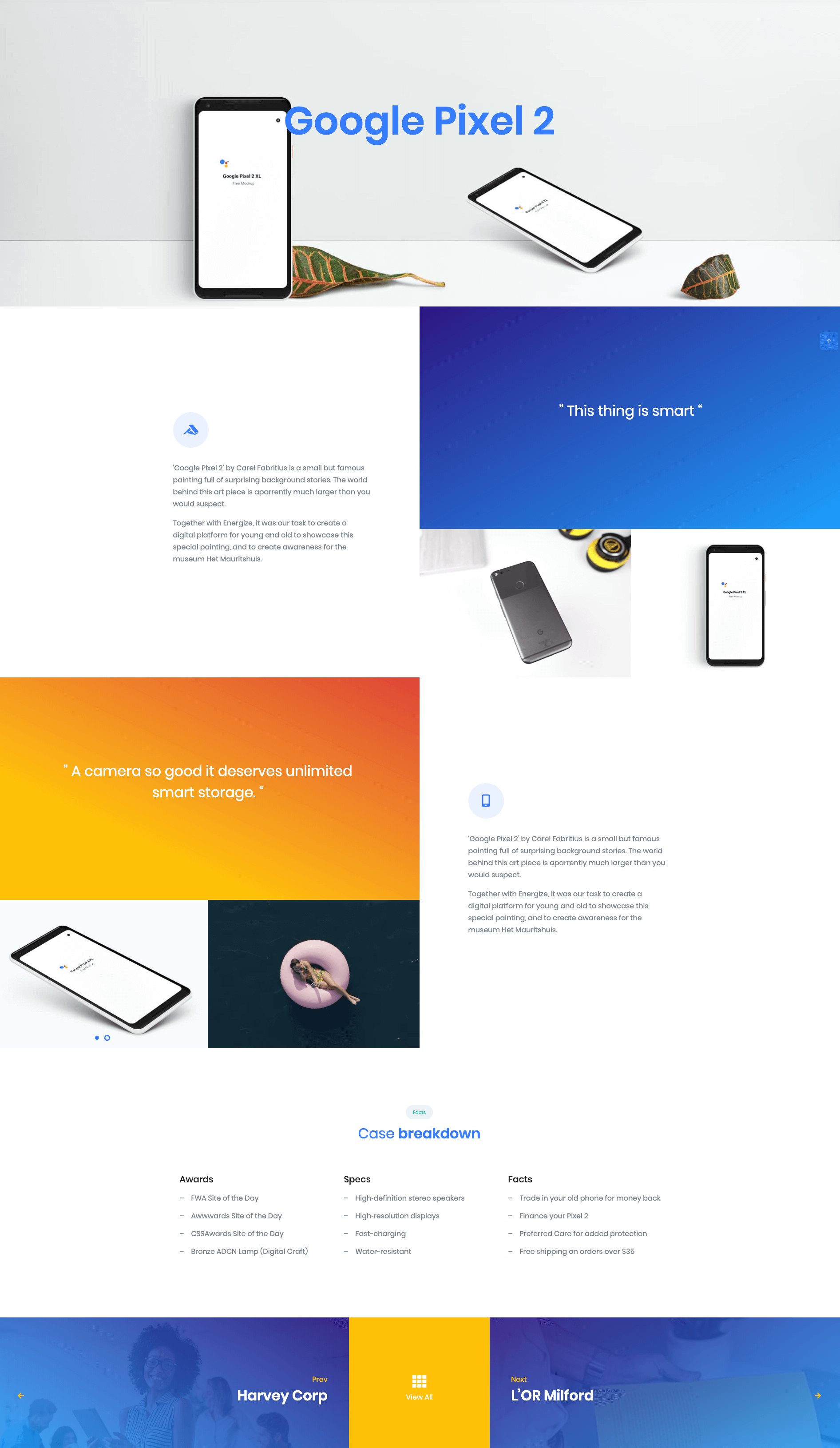
Case Studies Simple of Front is built using Gutenberg.It has 5 blocks.
The Details
1. Hero
Hero Settings

| Field | Type | Description | Default |
|---|---|---|---|
| Layout | Select | You can select layout style verion. | Style v6 |
| Enable Parallex Effect | Toggle | You can enable or disable parallex effect | Enable. |
| Enable container | Toggle | You can enable or disable block container | Enable. |
| Enable Separator | Toggle | You can enable or disable separator | Disable. |
| Title Color | Select | You can select color or custom color for title in color palette | primary |
| Background Image | Media | Upload the image | Image |
| Additional CSS Class | Text | Enter additional class name. | None |
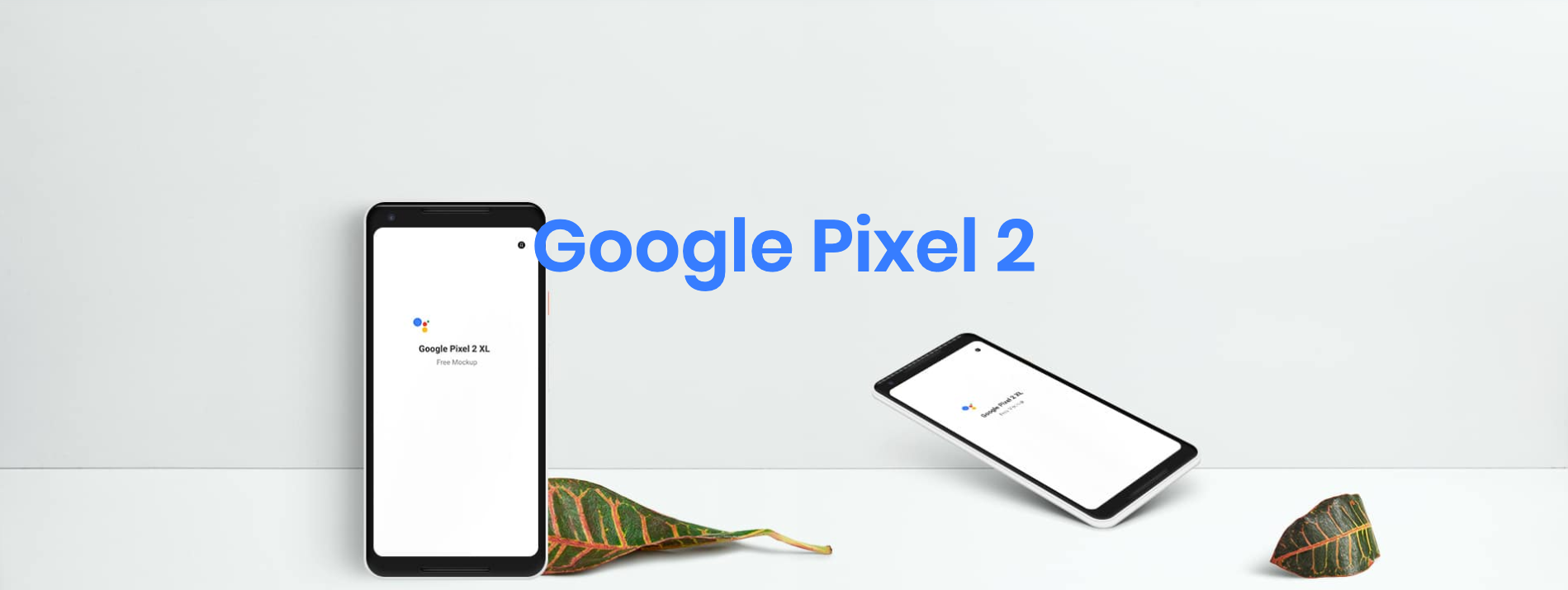
Hero Output
2. Simple Block
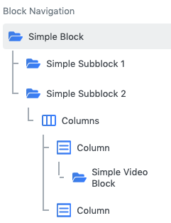
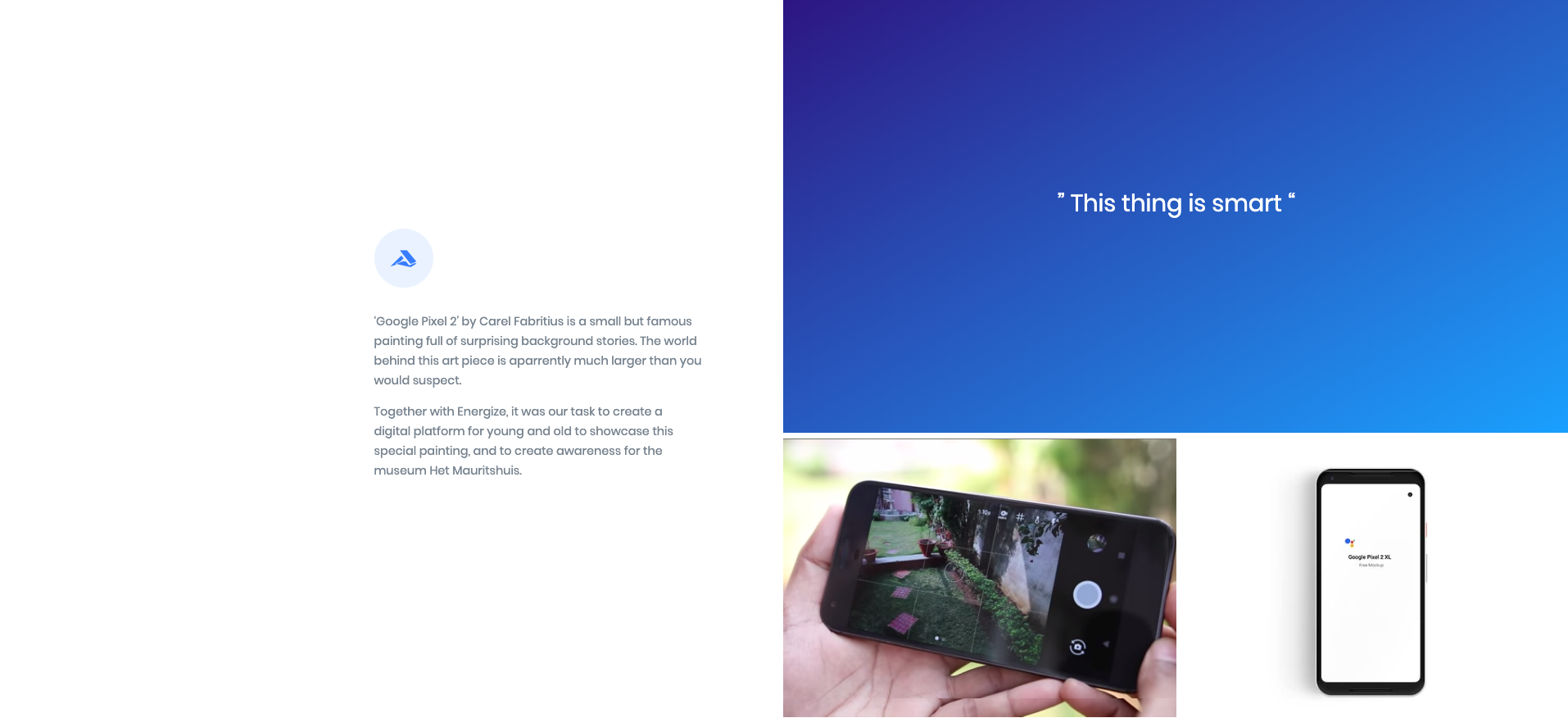
- In SimpleBlock add simpe subblock 1 and simple subblock 2 as innerblocks.
- In simple subblock 2 add columns as inner block.
- In column block set no of columns as 2.
- In first column add simple video block as inner block.(Note : Add p-0 as a additional css class for first column )
- In second column add Background image.(Note : Add bg-img-hero-center height-40vh p-0 as a additional css class for second column )
Simple Block Settings
| Field | Type | Description | Default |
|---|---|---|---|
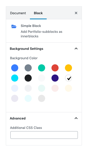
| Background Color | Select | You can select background color or custom background color using color palette | bg-white |
| Additional CSS Class | Text | Enter additional class name. | None |
Subblock 1 Settings
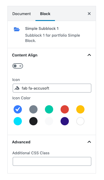
| Field | Type | Description | Default |
|---|---|---|---|
| Content Align | Toggle | Enable Content to align the content to right Disable Content to align the content to left | Disable. |
| Icon Color | Select | You can select color or custom color for icon using color palette | btn-soft-primary |
| Additional CSS Class | Text | Enter additional class name. | None |
Subblock 2 Settings
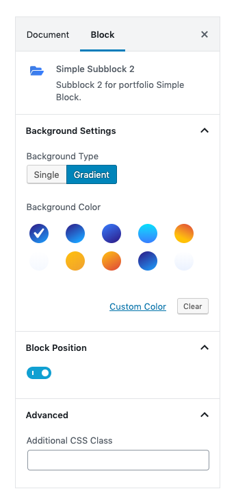
| Field | Type | Description | Default |
|---|---|---|---|
| Background Type | Select | You can select background type | gradient |
| Background Color | Select | You can select background color or custom background color using color palette | gradient-half-primary-v1 |
| Block Position | Toggle | Enable Block Position to align the content to right Disable Block Position to align the content to left | Enable. |
| Additional CSS Class | Text | Enter additional class name. | None |
Simple Video Block
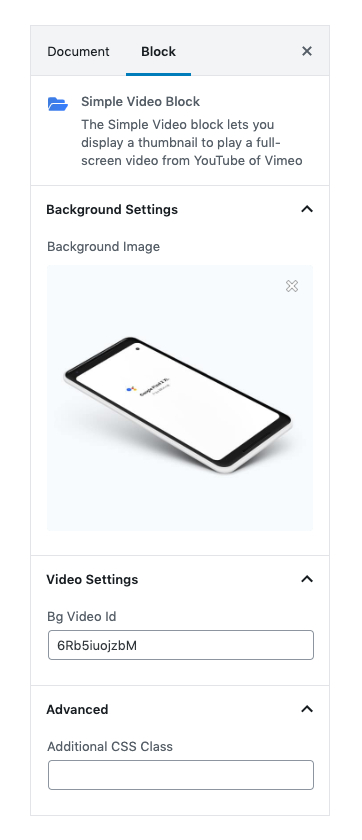
| Field | Type | Description | Default |
|---|---|---|---|
| Background Settings | Media | You can select background Image | Media |
| Video Id | Text area | You can write the id of the video which you want to upload | 6Rb5iuojzbM |
| Additional CSS Class | Text | Enter additional class name. | None |
Simple Block Output
3. Simple Block
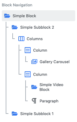
- In SimpleBlock add simpe subblock 2 and simple subblock 1 as innerblocks.
- In simple subblock 2 add columns as inner block.
- In column block set no of columns as 2.
- In First column add Gallery Carousel block.(Note : Add p-0 as a additional css class for second column )
- In second column add Simple Video block.(Note : Add p-0 as a additional css class for second column )
Simple Block Settings
| Field | Type | Description | Default |
|---|---|---|---|
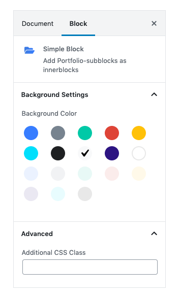
| Background Color | Select | You can select background color or custom background color using color palette | bg-light |
| Additional CSS Class | Text | Enter additional class name. | None |
Simple Subblock 2 Settings

| Field | Type | Description | Default |
|---|---|---|---|
| Background Type | Select | You can select background type | gradient |
| Background Color | Select | You can select background color or custom background color using color palette | gradient-half-warning-v1 |
| Block Position | Toggle | Enable Block Position to align the content to right Disable Block Position to align the content to left | Enable. |
| Additional CSS Class | Text | Enter additional class name. | None |
Simple Subblock 1 Settings
| Field | Type | Description | Default |
|---|---|---|---|
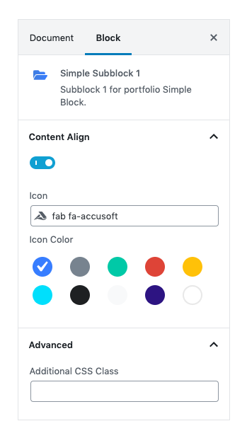
| Content Align | Toggle | Enable Content to align the content to right Disable Content to align the content to left | Enable. |
| Icon Color | Select | You can select color or custom color for icon using color palette | btn-soft-primary |
| Additional CSS Class | Text | Enter additional class name. | None |
Gallery Carousel Settings

Video Block Settings
| Field | Type | Description | Default |
|---|---|---|---|
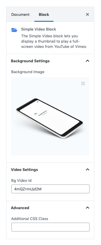
| Background Settings | Media | You can select background Image | Media |
| Video Id | Text area | You can write the id of the video which you want to upload | 4mQZrmUjd2M |
| Additional CSS Class | Text | Enter additional class name. | None |
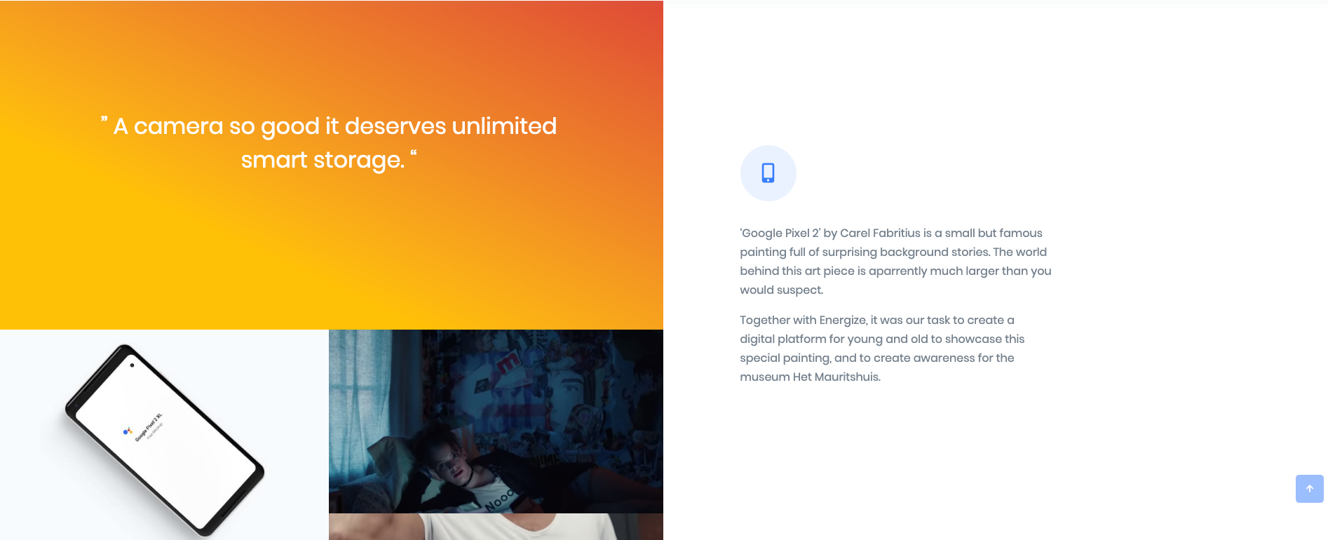
Simple Block Output
4. Case Breakdown List
Enter your block heading by using section block. Add Columns block as section blocks’s inner.
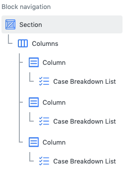
Section Block
Settings

| Field | Type | Description | Default |
|---|---|---|---|
| Layout | Select | You can select layout style verion. | Default |
| Font size | Select | Select your font size or type font size in pixels. | Large |
| Font Weight | Select | Select your font weight or type font weight in pixels. | Font Normal |
| Enable Container | Toggle | Enable container to add container class | Enable |
| Enable Inner Section Maxwidth | Toggle | Enable Inner Section Maxwidth to apply max width for inner blocks | Enable |
| Enable Pretitle | Toggle | Enable to add pretitle to your block | Enable |
| Enable Title | Toggle | Enable to add Title to your block | Enable |
| Enable Description | Toggle | Enable to add Description to your block | Disable |
| Additional CSS Class | Text | Enter additional class name. | None |
Column Block
In columnns block set no of column as 3 with column width 4 for each column.
- In columns block add no of column as 3.
- Set column Width 4 for all 3 columns.
- Add Case Breakdown list as innerblock for each column.
Case Breakdown List setting

General Settings
- You can set list limit by using range control.
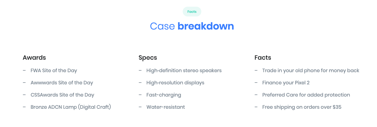
- Add Title for each column. Title text can be edited in editor.
- Add list content for each column
Case Breakdown List Output
5. Case Studies Simple Footer
Simple Footer displays two recent Projects and a menu that shows all projects of portfolio.
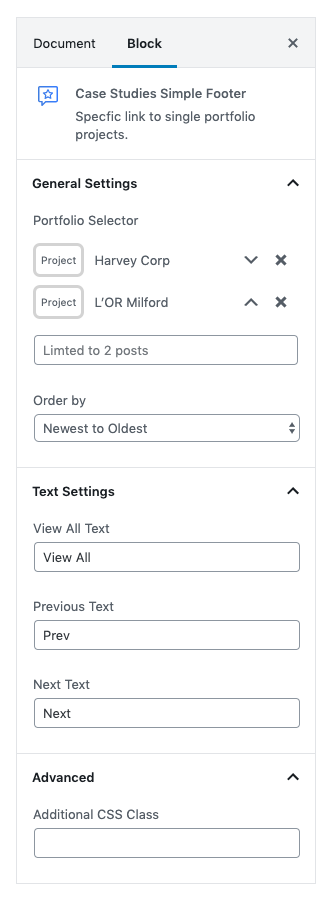
Simple Footer Settings
| Field | Type | Description | Default |
|---|---|---|---|
| Portfolio Selector | Select | You can select any 2 projects from portfolio | Default |
| Order By | Select | You can assemble your projects by orderby options | Newest to Oldest |
| Text | Text area | You can edit and change the text | Newest to Oldest |
| Additional CSS Class | Text | Enter additional class name. | None |
Simple Footer Output
