Block Settings

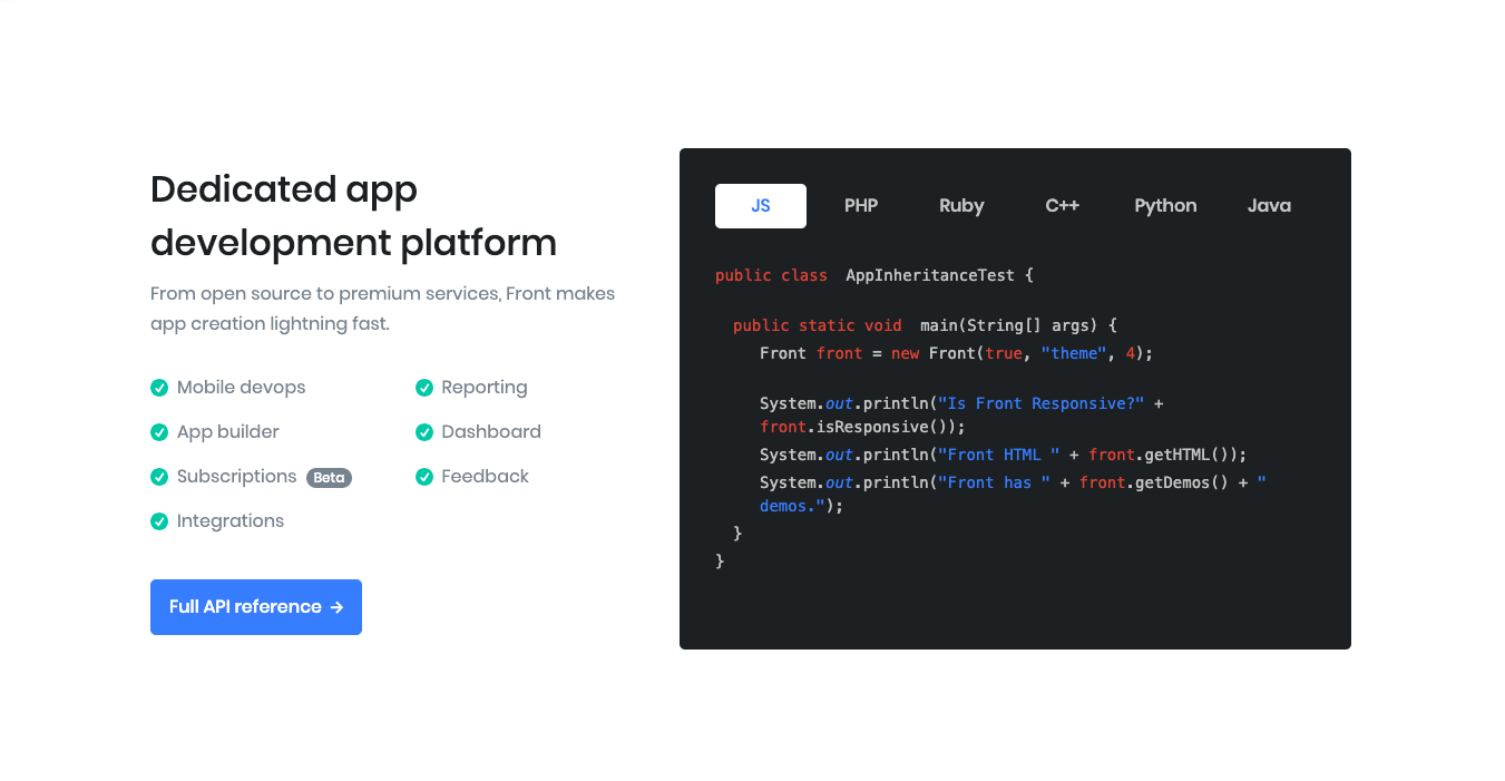
No of Tabs: Drag the slider to set the total number of tabs to be displayed. set 6 as the default limit.
Tab Alignment: You can align tab left or tab right by the tab alignment dropdown option.
Enable Container: Enable or Disable container class.
No of Lists: Drag the slider to set the total number of lists to be displayed. set 7 as the default limit.
List icon: Select icon for list by using list icon dropdown.
Display Badge: Enable to show badge in tab.
Badge Color: Select badge color from color palette.
Display Badge: Enable to show badge in tab.
Buttons allow you to take actions, and make choices, with a single tap.
- Button Design: There are 4 button designs available. Choose Default button design as default.
- Button Background: Choose the background color for your button. Choose Primary as default button color.
- Button Size: Extra Small, Small, Default and Large button size are available. The default size for this block is Default
- Button Border Radius: Rounded, Default, Pill and Circle are the available border radius. The default border radius is Default
- Button Icon: You can choose the icons for the button block.The default icon is fa-angle-right .
- Is Icon After text: Enable or disable the icon to position before the button text. set Enable option as default.
- Enable Transition: Enable or disable the button transition. set Disable option as default.
Display Title: Enable to show block Title.Set default as Enable.
Display Description: Enable to show block’s description. Set default as Enable.
Display List: Enable or Disable list.Set default as Enable.
Display Content: Enable to show content.Set default as Enable.
Display Tabs: Enable or Disable Tabs.Set default as Enable.
Additional CSS Class: Add extra class name for the block.
Block Output
