Output
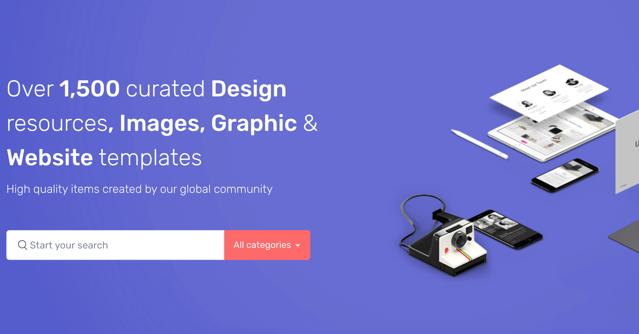
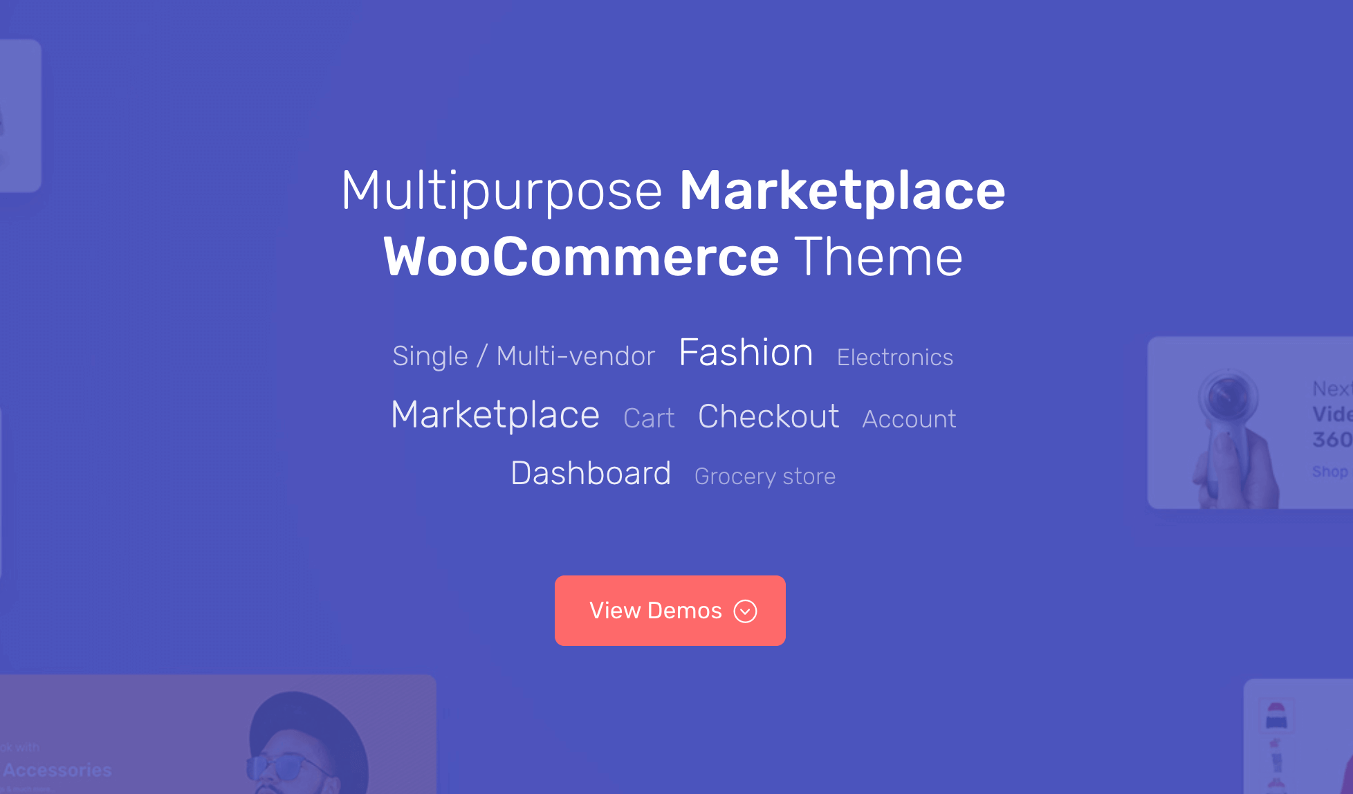
Hero block have two styles.
Style-1
Style-2
Settings
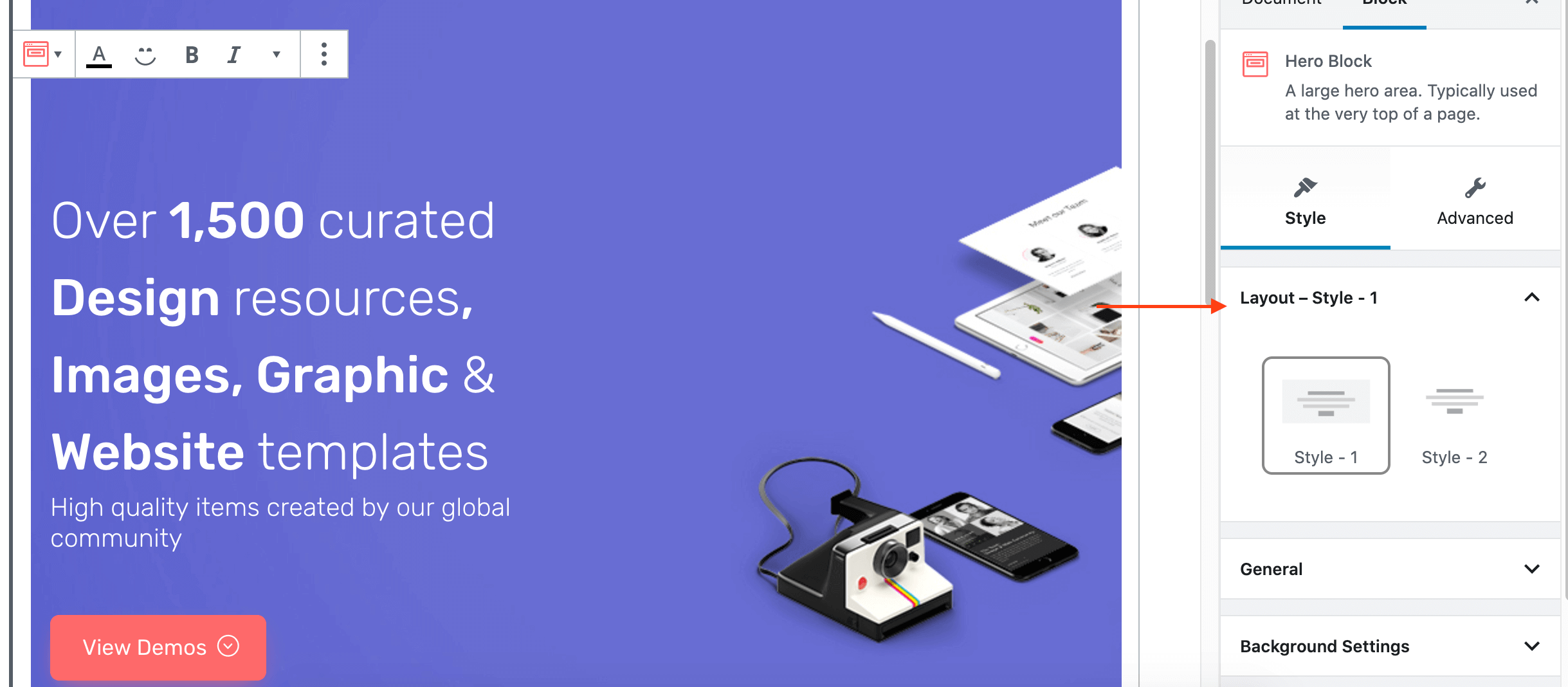
layout
- Choose your layout style.
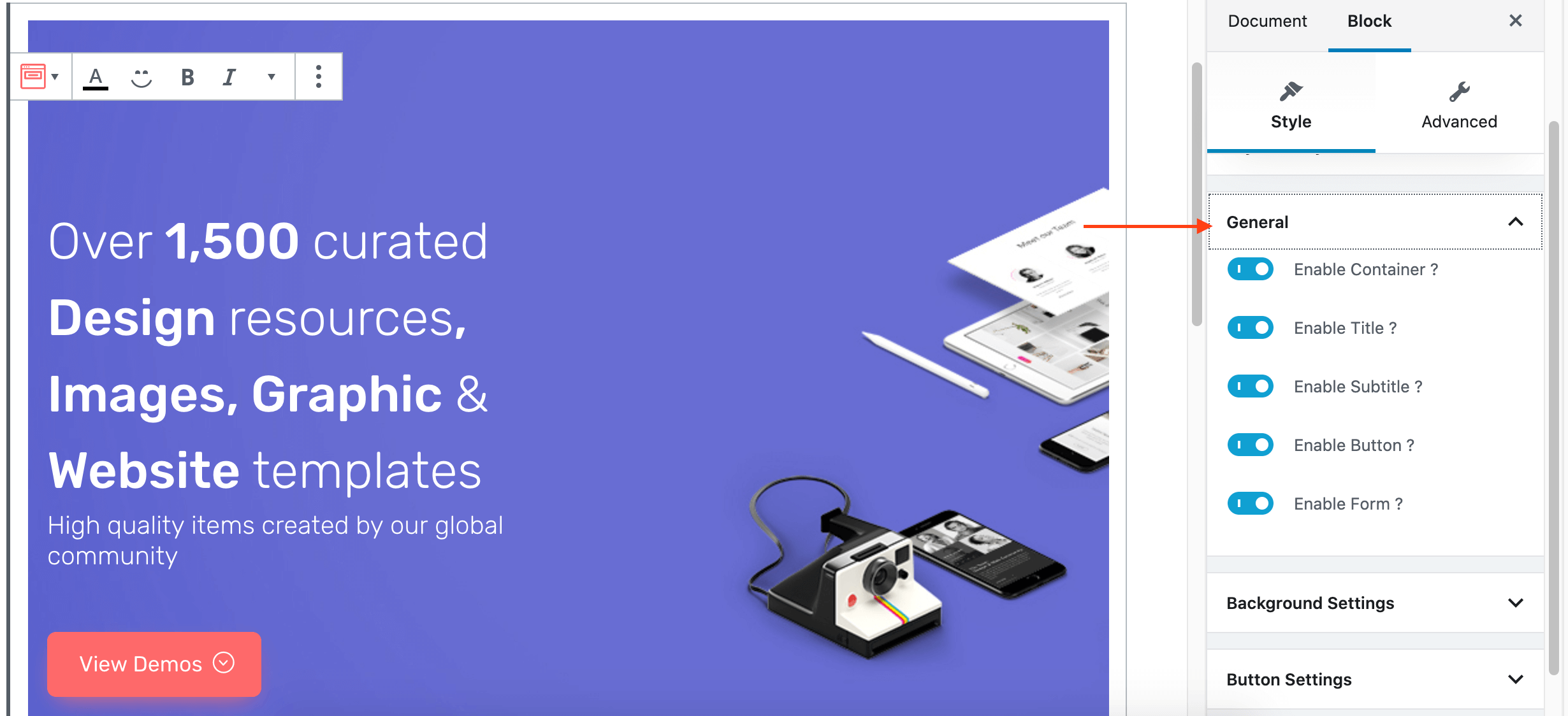
General:
- Enable Container: Enable or Disable container.
- Enable Title: Enable or Disable title.
- Enable Subtitle: Enable or Disable subtitle.
- Enable Buttton: Enable or Disable button.
- Enable Form: Enable or Disable form.
Background Setting:
- You can change Background image or color in Color palette.

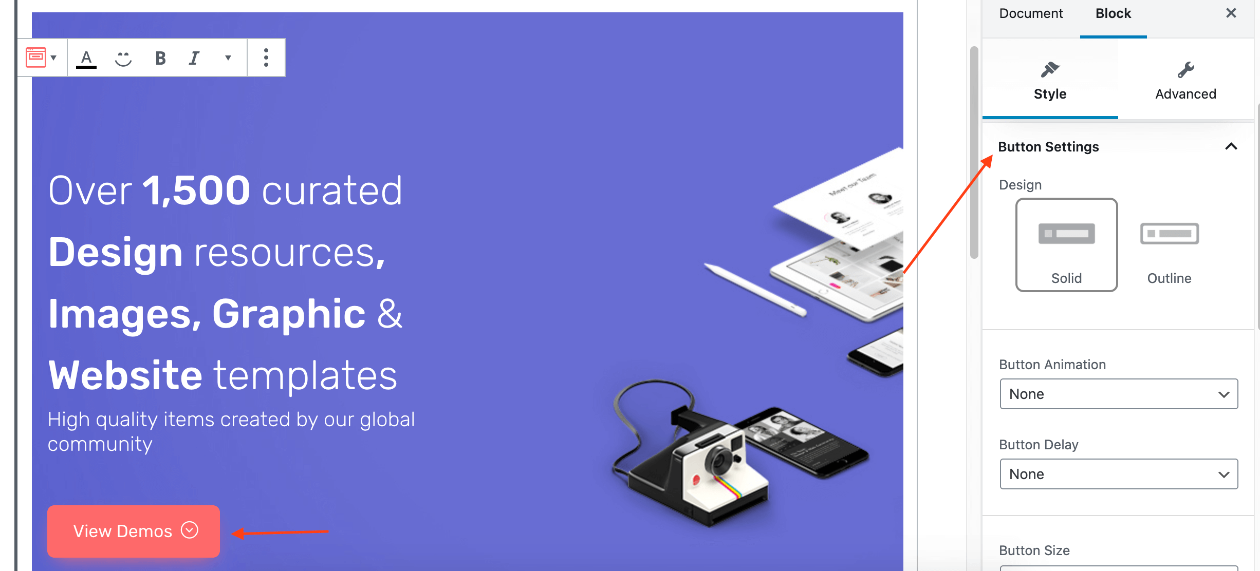
Button Settings:
- Button Design: Choose button design solid or outline.
- Button Animation: Select animation style.
- Button Delay: Select delay
- Button size: Select size.
- Button shape: Select shape.
- Enable Shadow: Enable or disable button shadow.
- Background color: Select button background color by using color palette.
- Icon: Select button icon.
- Is icon button: Enable or disable button is icon.
- Icon after text: Enable or disable Icon is aftertext.
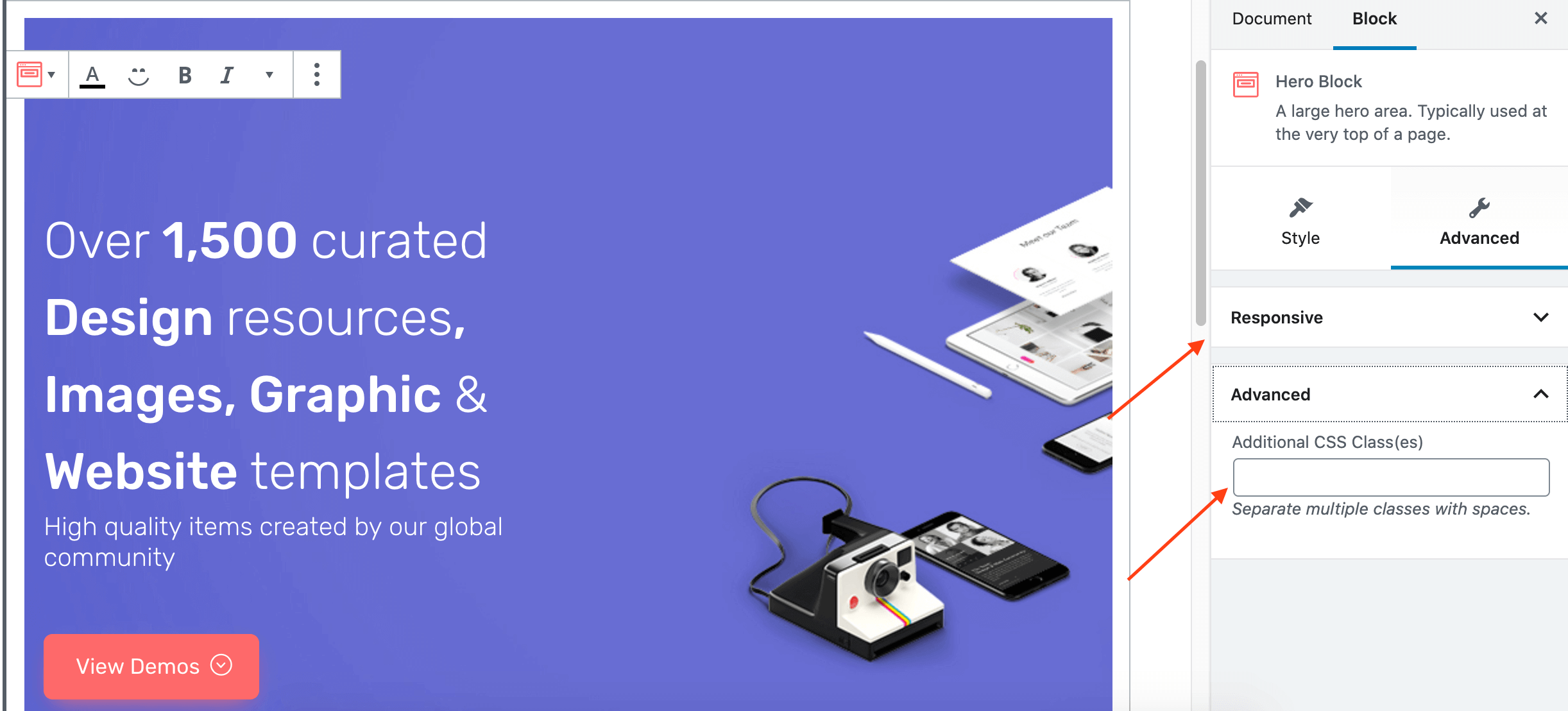
Responsive
- You can hide the block in Desktop, Tablet or Mobile views.
- You can add additional class in Advanced.