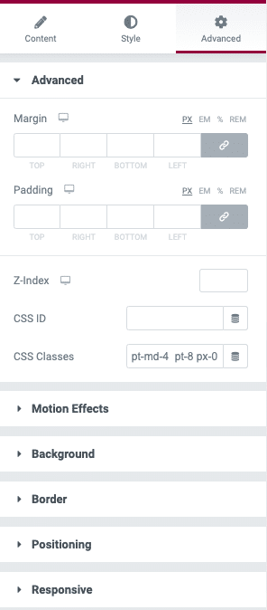
Skola makes use of Bootstrap’s utility classes with CSS Classes option provided in Elementor for various purposes.
Display
Display utility classes that apply to all breakpoints, from xs to xl, have no breakpoint abbreviation in them. This is because those classes are applied from min-width: 0; and up, and thus are not bound by a media query. The remaining breakpoints, however, do include a breakpoint abbreviation.
As such, the classes are named using the format:
.d-{value}forxs.d-{breakpoint}-{value}forsm,md,lg, andxl.
Where value is one of:
noneinlineinline-blockblocktabletable-celltable-rowflexinline-flex
The media queries affect screen widths with the given breakpoint or larger. For example, .d-lg-none sets display: none; on both lg and xl screens.
Flex
Justify Content
Use justify-content utilities on flexbox containers to change the alignment of flex items on the main axis (the x-axis to start, y-axis if flex-direction: column). Choose from start (browser default), end, center, between, or skola.
.justify-content-start.justify-content-end.justify-content-center.justify-content-between.justify-content-around.justify-content-sm-start.justify-content-sm-end.justify-content-sm-center.justify-content-sm-between.justify-content-sm-around.justify-content-md-start.justify-content-md-end.justify-content-md-center.justify-content-md-between.justify-content-md-around.justify-content-lg-start.justify-content-lg-end.justify-content-lg-center.justify-content-lg-between.justify-content-lg-around.justify-content-xl-start.justify-content-xl-end.justify-content-xl-center.justify-content-xl-between.justify-content-xl-around
Align Items
Use align-items utilities on flexbox containers to change the alignment of flex items on the cross axis (the y-axis to start, x-axis if flex-direction: column). Choose from start, end, center, baseline, or stretch (browser default).
.align-items-start.align-items-end.align-items-center.align-items-baseline.align-items-stretch.align-items-sm-start.align-items-sm-end.align-items-sm-center.align-items-sm-baseline.align-items-sm-stretch.align-items-md-start.align-items-md-end.align-items-md-center.align-items-md-baseline.align-items-md-stretch.align-items-lg-start.align-items-lg-end.align-items-lg-center.align-items-lg-baseline.align-items-lg-stretch.align-items-xl-start.align-items-xl-end.align-items-xl-center.align-items-xl-baseline.align-items-xl-stretch
Spacing
Assign responsive-friendly margin or padding values to an element or a subset of its sides with shorthand classes. Includes support for individual properties, all properties, and vertical and horizontal properties. Classes are built from a default Sass map ranging from .25rem to 3rem.
Spacing utilities that apply to all breakpoints, from xs to xl, have no breakpoint abbreviation in them. This is because those classes are applied from min-width: 0 and up, and thus are not bound by a media query. The remaining breakpoints, however, do include a breakpoint abbreviation.
The classes are named using the format {property}{sides}-{size} for xs and {property}{sides}-{breakpoint}-{size} for sm, md, lg, and xl.
Where property is one of:
m– for classes that setmarginp– for classes that setpadding
Where sides is one of:
t– for classes that setmargin-toporpadding-topb– for classes that setmargin-bottomorpadding-bottoml– for classes that setmargin-leftorpadding-leftr– for classes that setmargin-rightorpadding-rightx– for classes that set both*-leftand*-righty– for classes that set both*-topand*-bottom- blank – for classes that set a
marginorpaddingon all 4 sides of the element
Where size is one of:
0– for classes that eliminate themarginorpaddingby setting it to01– (by default) for classes that set themarginorpaddingto$spacer * .252– (by default) for classes that set themarginorpaddingto$spacer * .53– (by default) for classes that set themarginorpaddingto$spacer4– (by default) for classes that set themarginorpaddingto$spacer * 1.55– (by default) for classes that set themarginorpaddingto$spacer * 3auto– for classes that set themarginto auto
More details here: https://getbootstrap.com/docs/4.5/utilities/flex/#justify-content
Text Utilities
Text alignment
Easily realign text to components with text alignment classes.
text-left– Left aligned text on all viewport sizes.text-center– Center aligned text on all viewport sizes.text-right– Right aligned text on all viewport sizes.
text-sm-left– Left aligned text on viewports sized SM (small) or wider.text-md-left– Left aligned text on viewports sized MD (medium) or wider.text-lg-left– Left aligned text on viewports sized LG (large) or wider.text-xl-left– Left aligned text on viewports sized XL (extra-large) or wider.
Font weight and italics
font-weight-bold– Bold text.font-weight-bolder– Bolder weight text (relative to the parent element).font-weight-normal– Normal weight text.font-weight-light– Light weight text.font-weight-lighter– Lighter weight text (relative to the parent element).font-italic– Italic text.