Add an add to cart button, linked dynamically to a specific product, anywhere on your site by dragging the Custom Add to Cart widget wherever you need it.
Content Tab

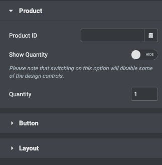
Product
- Product: Select the product to be added to the cart
- Show Quantity: Set to Yes to allow the user to change the quantity
- Quantity: If Show Quantity is set to No, this option becomes available so that you can pre-determine the number of items to add to the cart.
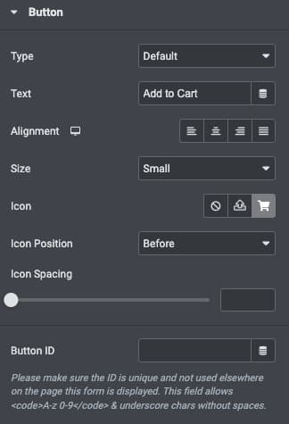
Button

- Type: Select the type of button to use, choosing from Default, Info, Success, Warning, and Danger
- Text: Enter the text to be displayed on the button
- Alignment: Align the [widget] to the left, right, center, or justified
- Size: Select the preset button sizes, from Extra Small to Extra Large
- Icon: Select a Font Awesome icon to display on the button
- Icon Position: Choose to display the Icon Before or After the button text
- Icon Spacing: Set the amount of space between the Icon and the button text
- Button ID: (Optional) Assign a unique button ID to use for situations such as Google Analytics events
Layout
From the dropdown selector, choose your desired layout. The default layout is Inline (flex); however, this may need to be adjusted for integration. Stacked layout is ideal for online stores that allow Apple Pay. Auto layout will adjust the button to the other components available in the widget. The responsive control options can be adjusted by breakpoint by ticking on the breakpoint icon.
Style Tab

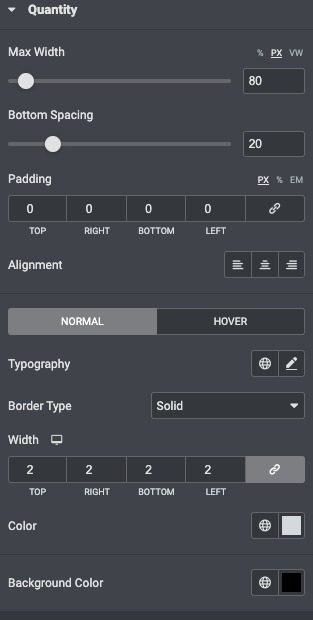
Quantity
- Max-width : Set the max width.
- Bottom Spacing : Set the Bottom spacing
- Padding : Set the padding within the quantity
- Alignment: Align to the left, right, center, or justified
- Background Color : Set the Background colour.
Button
Typography Options
Typography: From the pencil icon, click to open the font option panel to choose the family, weight, transform, style, decoration, line height, and letter spacing options
These options may be set independently for both the normal and hover states.
- Text Color: Choose the color of the button text
- Background Color: Choose the background color of the button
- Hover Animation: Choose an animation effect when hovering over the icon, such as Grow, Pulse, Skew, etc.
Borders
- Border Type: Select the type of border, choosing from none, solid, double, dotted, dashed, or grooved
- Border Radius: Control border roundness of the button
- Box Shadow: Adjust box shadow options
Padding
- Padding: Set the padding within the button