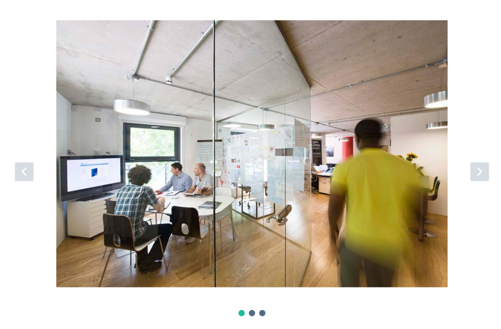
A large hero area. Typically used at the very top of a page.
Block Settings
Layout
There are 2 styles are available. Choose the style as you wish. Default: Style 1
General Settings
- No Of Slides: Drag the slider to set number of slider to be displayed. Default: 5
- Enable Animation Filter Tabs: Enable or disable animation filters. Default: Disable
- Enable Container: Enable or disable container. Default: Enable
- Display Caption: Enable or disable caption. Default: Enable
- Display Title: Enable or disable title. Default: Enable
- Display Desc: Enable or disable desc. Default: Enable
- Display Button: Enable or disable button. Default: Enable
- Slider Height: Choose the slider height. Default: Medium
Background Settings
- Background Image: Choose the slider image from Media Library or upload a new one.
- Caption Horizontal Alignment: Choose the caption text horizontal alignment. Default: Text Center
- Caption Vertical Alignment: Choose the caption text vertical alignment. Default: Vertical Center
- Enable Dark Bg: Enable or disable background for caption. Default: Disable
- Animation for Title: Choose the animation effect for title. Default: FadeInDown
- Animation for Description: Choose the animation effect for description. Default: FadeInDown
- Animation for Button: Choose the animation effect for button. Default: FadeInDown
Button settings
Buttons allow you to take actions, and make choices, with a single tap.
- Button Background: Choose the background color for your button. Green background color is chosen as default.
- Button Size: Small, Default and Large button sizes are available. The default size value for this block is Small
Carousel Settings
- Autoplay: Enable or disable autoplay. Default: Enable
- Dots: Show dots navigation. Default: Enable
- Navigation: Show next/prev buttons. Default: Enable
- Nav Previous Text: HTML allowed. Default: <i class=’icon-left-open-mini’></i>
- Nav Next Text: HTML allowed. Default: <i class=’icon-right-open-mini’></i>
- Choose Owl Nav Icon Position: Choose navigation position. Default: Inner
- Choose Nav Icon Size: There are three nav icon sizes are available. You can choose any one of them as per your requirement. Default: Large
Advanced
Additional Css Class – Enter the additional class name. Default: none
Block Output
Style 1

Style 2

